Is your feature request related to a problem? Please describe.
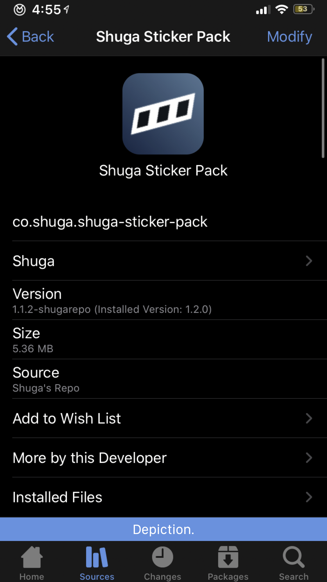
Zebra has a slight UI problem when it comes to packages. It provides a lot of information above the depiction, pushing the repo's depiction down off screen on many devices, hiding screenshots and descriptions and making it harder for users to make quick decisions about whether a package is worth a look. I feel this is a problem that can, and should be, be fixed.
A visual of how this problem affects depiction viewing on an iPhone 8-sized screen can be seen below (the blue highlight represents a depiction):
Describe the solution you'd like
I think this view should be completely redesigned to something more akin to what other package managers do, with the icon, package name, version, file size, author name, and other metadata compressed into the header. I made a mock-up of how this could look if implemented:
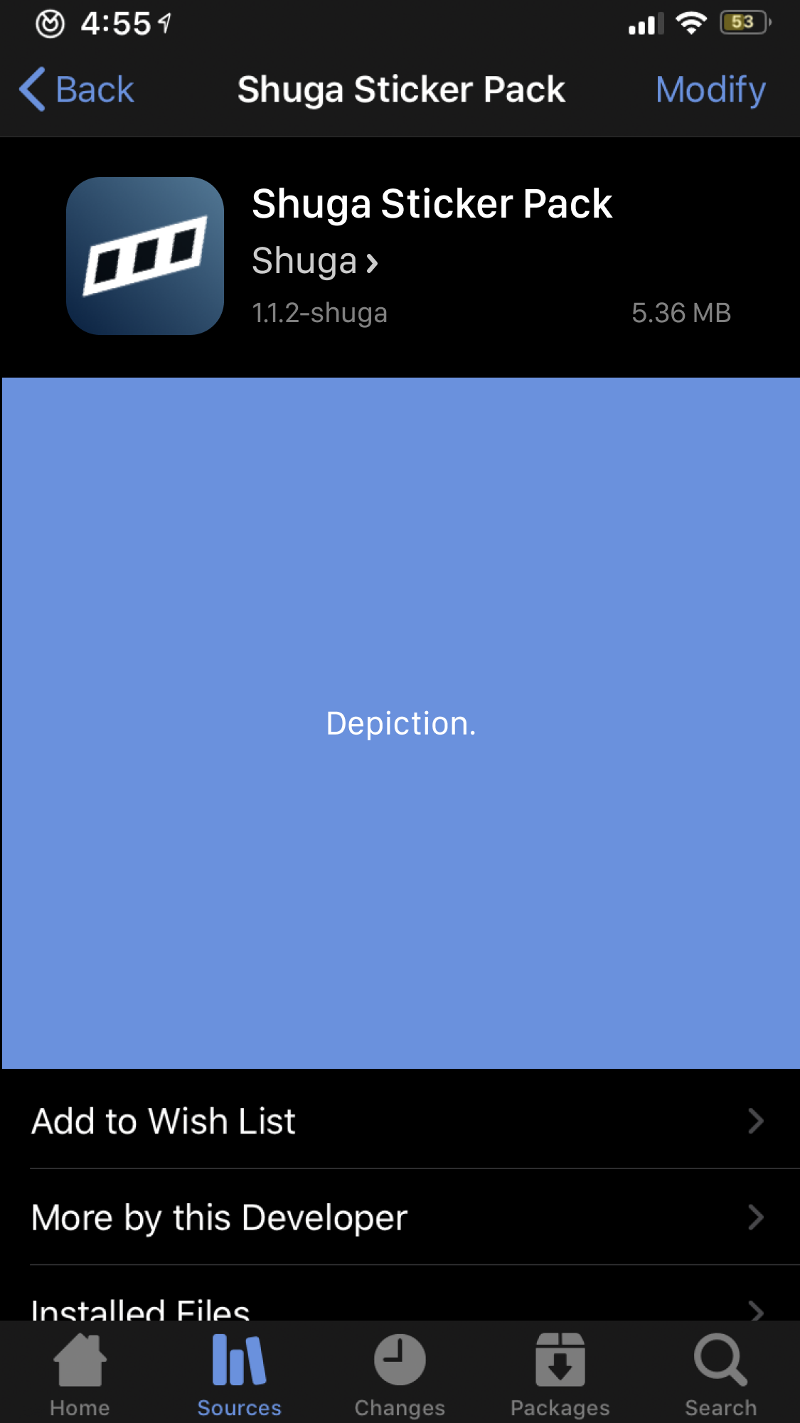
Some cells, such as installed packages, can be moved to the bottom of the page while cells that can drive download decisions were implemented in the header design, saving screen real estate. This is an approach akin to those in Cydia, Sileo, Installer, and Apple's App Store (among others).
Note that a redesigned approach allows for the top of the depiction to be visible for users (especially those on iPhone 8-sized/non-notched displays), while the current cell-filled approach leaves only a tiny sliver of the depiction visible (even less for those on the iPhone SE).
Describe alternatives you've considered
I know styling for iOS isn't straightforward, so another possible option would to move most cells (excluding those like author name and version) to be below the depiction while either:
- The package name is removed from the navbar and is replaced with the package icon (an approach similar to Sileo's), or
- The icon's sizing is reduced and the package name text is removed from the rendered depiction view to prevent redundancy that wastes screen real estate.
Additional context
I hope some of these ideas are implemented to allow for web depictions to be more easily visible for users. This will allow for a better user experience for both users and repo maintainers and make using Zebra a more elegant experience to use overall.
 Shugabuga
All 8 comments
This is an awesome idea, would help a lot imo
 conorthedev
on 6 May 2020
conorthedev
on 6 May 2020
I think two tabs on the package page would be better so you don't have to scroll down all the way for the details. e.g. Sileo's detail and changelog tabs
(copypasta btw)
 kyondev
on 7 May 2020
kyondev
on 7 May 2020
I think two tabs on the package page would be better so you don't have to scroll down all the way for the details. e.g. Sileo's detail and changelog tabs
Possibly. I know Sileo's native depiction API has those two tabs controlled by repo maintainers (and really, it can be more or less than that), so it may be weird from a design standpoint to do so.
Just something to consider.
Shugabuga
on 7 May 2020
We're planning a big redesign for Zebra 1.2, we've already done the mockups for the new depiction page but we're not quite ready to reveal them. For now I will leave the issue open but we might close this one and open a new one up once we've revealed the new depictions for discussion there.
 wstyres
on 8 May 2020
wstyres
on 8 May 2020
@wstyres Glad to hear this! If the design proposals are put out to a public forum for discussion, I'll definitely get involved with it.
Shugabuga
on 8 May 2020
I feel exactly the opposite, the info being on top was a killer feature in Zebra, for me (also on my ip5s, ip8, whatever). It's now gone in 1.2beta so I headed here to find a discussion or create one. Surely I cannot talk for everyone, but earlier (before any alternatives to Cydia) I had developed a habbit of just swiping looong down as soon as I opened any package depiciton, just so I could see the version info, any dates and other details there, like from which repo it's coming from. No matter if it was an update for something I had already installed or a pkg I clicked on for the 1st time (for any updates of course, this concept applies with utmost importance). I loved Zebra having the info right there on top layed out for me in a table, without needing to target bits of info left/right/below/above the heading with my eyes, I probably cannot stress enough how much I loved this, again and again.
(didn't want to stick this note into the 1.2 Design Discussion - Community Depictions #1309 , although it might sort of belong there as well)
EDIT: owh, @wstyres , should probably somehow show both versions if it's an update, ie. what's installed and what's being offered, side by side. (absolutely loved this in v.1.1)
 blanxd
on 28 May 2020
blanxd
on 28 May 2020
@blanxd perhaps a setting could be added to toggle the position of this info? I think most people prefer images and description over this information, but I can see how it being up top might be preferable to some.
 cj81499
on 28 May 2020
cj81499
on 28 May 2020
yeah @cj81499 absolutely, I can imagine I'm a bit more technical and into details than the majority or an _end user_ per se. Since there are often situations where a pkg is hosted on some developer's own beta repo, then later it goes to a major repo publicly, et al, it's a pain with most pkg managers to get an overview of what's happening. Zebra is a superb tool for these situations. Yeah if more people feel like I do, perhaps a user choice about the presentation could be the way to go...
blanxd
on 28 May 2020
Related issues
 ashbruh
·
4Comments
ashbruh
·
4Comments
 aRvedk
·
5Comments
aRvedk
·
5Comments
 worldlydev
·
6Comments
worldlydev
·
6Comments
 SeMoOo
·
3Comments
SeMoOo
·
3Comments
 VanishingTacos
·
3Comments
VanishingTacos
·
3Comments
Most helpful comment
We're planning a big redesign for Zebra 1.2, we've already done the mockups for the new depiction page but we're not quite ready to reveal them. For now I will leave the issue open but we might close this one and open a new one up once we've revealed the new depictions for discussion there.