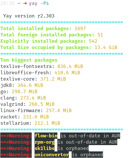
Hi there, the current colors are pretty hard to read in a light-on-dark terminal. An alternative color setting would be appreciated. Cheers.
 ijanos
All 2 comments
Can you screenshot some of the current bad contrasts? I believe I know the cause of the problem
 Jguer
on 31 Jan 2018
Jguer
on 31 Jan 2018
Maybe the hard-to-read was a bit hyperbole on my part, sorry about that :) but the grey has really low contrast, the yellow is hard to read and some random things have a dark background, I don't know if that is intentional but it does not look good in my opinion.
ijanos
on 1 Feb 2018
👍2
Was this page helpful?
0 / 5 - 0 ratings
Related issues
 pantuts
·
3Comments
pantuts
·
3Comments
 ricochet1k
·
4Comments
ricochet1k
·
4Comments
 captn3m0
·
4Comments
captn3m0
·
4Comments
 makeworld-the-better-one
·
3Comments
makeworld-the-better-one
·
3Comments
 tapir
·
3Comments
tapir
·
3Comments
Most helpful comment
Maybe the hard-to-read was a bit hyperbole on my part, sorry about that :) but the grey has really low contrast, the yellow is hard to read and some random things have a dark background, I don't know if that is intentional but it does not look good in my opinion.