This is a centralised issue for discussing formatting and printing text to the user. This issue was created with the new install algorithm in mind but is not limited to that.
If you are suggesting a change It can be useful to provide images or markup examples of what you wish to see.
Planned Changes
- [x] Refactor escape codes from strings to dedicated functions
- [x] Add option to disable coloured output
- [x] Number menu for clean build and edit pkgbuild
- [x] Remove excess/unnecessary questions during install
[ ] Add a (abort) option to y/n choices
- Added in the number menu instead
Regressions
- [x] Colour formatting broken when showing difference in versions on upgrade menu
 Morganamilo
All 14 comments
Firstly I think wee need a refactor for most of the printing. I hate seeing magic escape codes in strings all over the code base and would much rather have these mapped to either const strings or functions.
For example the arrow prefix
==>
Could be a constant.
While printing it in red could be achieved via a function.
fmt.Println(red(arrow + "Edit PKGBUILD?"))
I would also add escape codes as an on by default option but an option nonetheless since I know some users prefer to have no color coding or it makes their custom setup display black on black or other weird contrasts.
 Jguer
on 22 Jan 2018
Jguer
on 22 Jan 2018
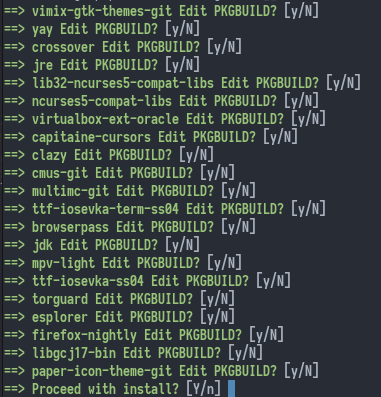
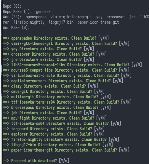
Just updated a machine that had seen no updates for 4 months. Good news, it worked. On other regards, if we're installing several packages maybe displaying a number menu of which to edit is better.
Jguer
on 22 Jan 2018
Yeah that's a really good idea actually. I was just trying to follow along with pacaur, never thought of a menu.
Morganamilo
on 22 Jan 2018
- [x] Upgrade doesn't highlight correctly the exact difference in package versions anymore:
- [ ] Besides combining "Edit PKGBUILD" and "Clean build" questions into a number menu (which I think is an awesome idea), I feel there are still too many unnecessary questions such as "Proceed with download" / "Proceed with install". I can anyway cancel with Ctrl+C at any time, I see little need in these questions.
 maximbaz
on 22 Jan 2018
maximbaz
on 22 Jan 2018
For the first point it looks like the package name is just too long to be displayed fully. Can you confirm this doesn't happen on the release version?
Added the second point.
Morganamilo
on 22 Jan 2018
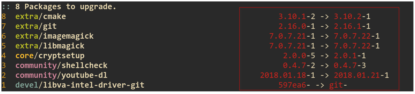
The problem is not with misalignment (it was always like that), the problem is with coloring. I can't make a screenshot right now as everything is up to date, but I'll try to explain... Previously it was highlighted what exactly is different in the versions, so for example in the picture above:
community/shellcheckupdated pkgrel, so0.4.7would be in the same color, but-2and-3would be highlightedcore/cryptsetupupdated minor version, so only the minor version would be highlighted (0and1).
Now for all packages the full version is red and pkgrel is white, regardless of what has actually changed.
maximbaz
on 22 Jan 2018
Actually I can show a screenshot, it is easier to explain this way - look at the colors on the right side. I was not correct that for core/cryptsetup only the minor version is highlighted, it's the whole version that is highlighted.

maximbaz
on 22 Jan 2018
Yes it looks like you're right. Might have even been me in fact, I'm useless with terminal formatting.
Morganamilo
on 22 Jan 2018
The y/N prompts for each package get quite annoying when you have a package with many deps (for example, the various ros-* packages with over 200 AUR dependencies). At the same time, you don't want to miss out on viewing any of the relevant PKGBUILDs.
That's why an approach which displays all PKGBUILDs in one step is more efficient, for example through a suitable file manager.
 AladW
on 24 Jan 2018
AladW
on 24 Jan 2018
Colour formatting still needs to be fixed but to add to the regression list the left padding on version strings is an annoying but necessary thing to fix which has been akin to CSS (https://i.imgur.com/Q3cUg29.gif).
Jguer
on 26 Jan 2018
To add to the idea of displaying all PKGBUILDs in one step, I've just learned about another very cool trick that aurutils does - when you are upgrading a package, besides showing you PKGBUILD it also shows you a diff between the latest PKGBUILD and the one you installed last time. No need to review full PKGBUILDs every time you upgrade 🙂. It shows the diff as just another file among all PKGBUILDs, all of them are opened at once in vifm file manager.
maximbaz
on 26 Jan 2018
pacaur does that too. It's easy to do with git diff although we are not using the git method.
Morganamilo
on 26 Jan 2018
Everything here is pretty much done. Closing.
Morganamilo
on 11 Mar 2018
Related issues
 torvic9
·
4Comments
torvic9
·
4Comments
 ricochet1k
·
4Comments
ricochet1k
·
4Comments
 makeworld-the-better-one
·
3Comments
makeworld-the-better-one
·
3Comments
 Qyriad
·
4Comments
Qyriad
·
4Comments
 ixevix
·
3Comments
ixevix
·
3Comments
Most helpful comment
Firstly I think wee need a refactor for most of the printing. I hate seeing magic escape codes in strings all over the code base and would much rather have these mapped to either const strings or functions.
For example the arrow prefix
Could be a constant.
While printing it in red could be achieved via a function.