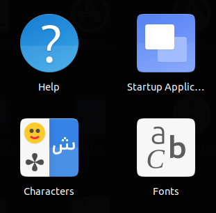
The upstream icon of gnome-characters, in my opinion, represents the nature of the app better than the Yaru icon. The upstream icon has an Asian character, an Arabic letter, an emoji and a symbol, which are really the things that are searched for in the app. On the other hand, the Yaru icon has only an accented "a" letter. So I think the Yaru icon could be improved.


icon theme
 Amr-Ibra
👍3
All 4 comments
Is this any good?
 ubuntujaggers
on 10 Jan 2021
ubuntujaggers
on 10 Jan 2021
👍3
Yes, but I prefer the look of the Arabic letter ش on the upstream icon because the three dots look more symmetrical there.
Also, the eyes in the emoji look a bit too large in the suggested Yaru icon.
Amr-Ibra
on 10 Jan 2021
👍1
??
ubuntujaggers
on 10 Jan 2021
👍3
Much better.
Amr-Ibra
on 11 Jan 2021
Was this page helpful?
0 / 5 - 0 ratings
Related issues
 CDrummond
·
3Comments
CDrummond
·
3Comments
 sicklylife-jp
·
3Comments
sicklylife-jp
·
3Comments
 matthewpaulthomas
·
3Comments
matthewpaulthomas
·
3Comments
 Muqtxdir
·
3Comments
Muqtxdir
·
3Comments
 Feichtmeier
·
3Comments
Feichtmeier
·
3Comments
Most helpful comment
??