Yaru: Suggestion: Less orange (in backdrop)
This is a continuation of the gray sidebar discussion started by @Feichtmeier, where the goal was to reduce the amount of orange.
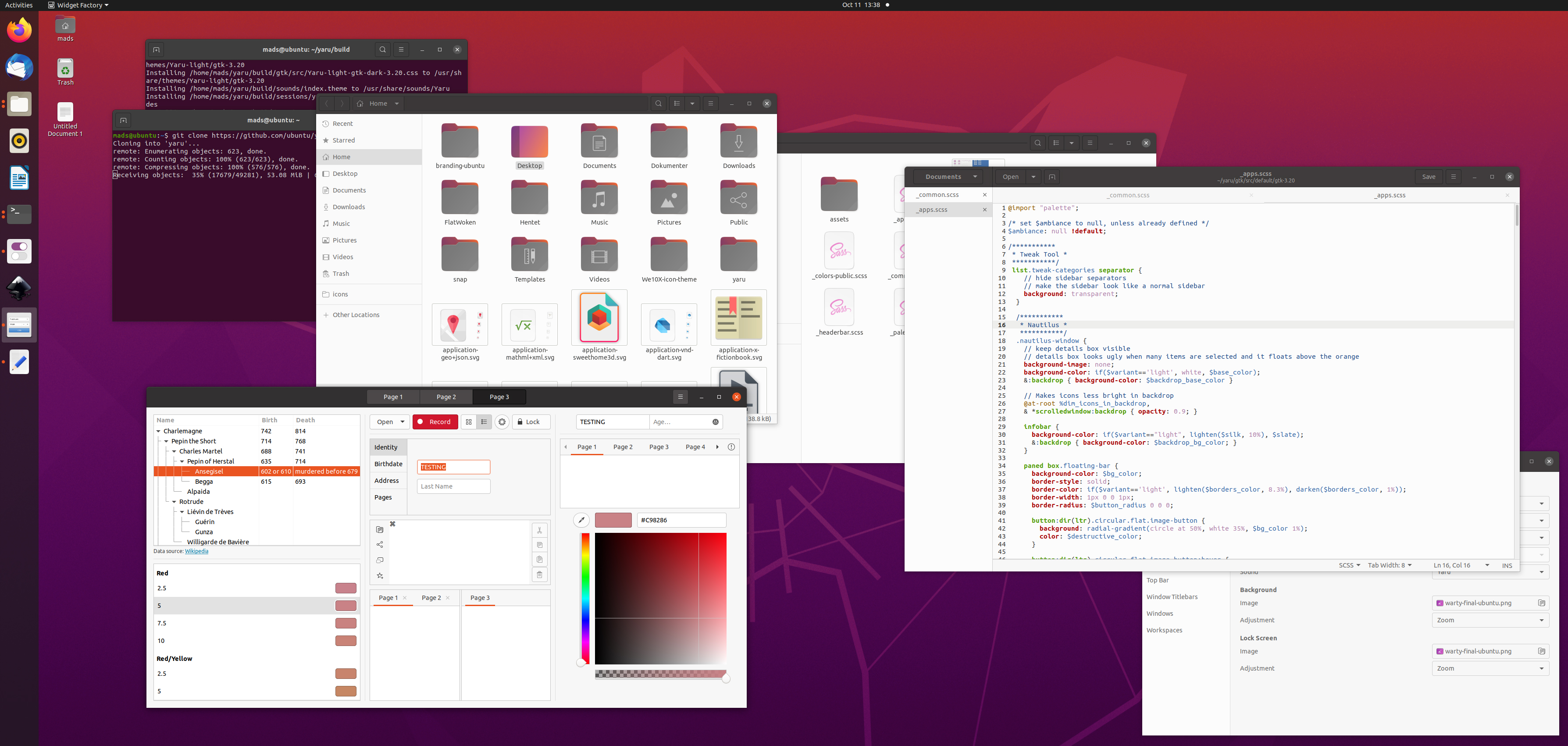
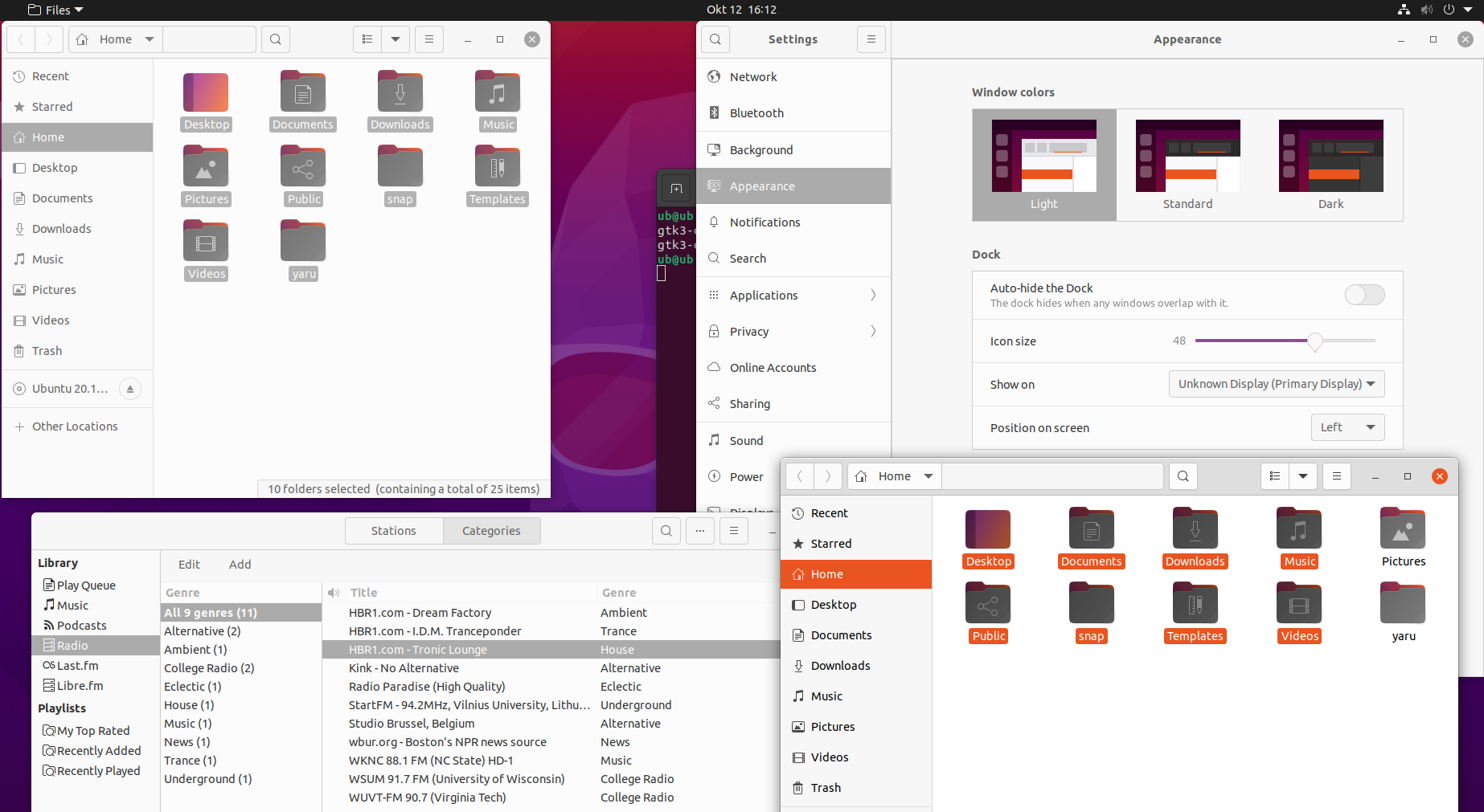
As you can see in this example, there's a lot of attention grabbing orange in the window that's actually in backdrop. Only the ❌ is colored in the active window. This is a bit misleading. So my suggestion is that there's no orange in backdrop (obviously nothing changes in the shell). There's some quick mockups below. If someone could make a testing PR that would be great, because this is something you need to feel and judging from a few screenshots, really isn't fair.
I think, this is also what @Feichtmeier was saying here - he just uses them fancy word 😜
The problem is, as madsrh pointed out, that there is always something orange leaking out of the backdrop, unless we change selected_bg_color from orange to gray and selected_fg_color from white to fg_color and then explicitly color things orange we want to be orange, like the close button or the tab underlines.
If anyone thinks that this is TOO MUCH GRAY, I would suggest reverting https://github.com/ubuntu/yaru/pull/2376 but still applying the "orange -> gray backdrop" 🙈 Like this...
 madsrh
All 14 comments
It looks less annoying in the backdrop with gray!
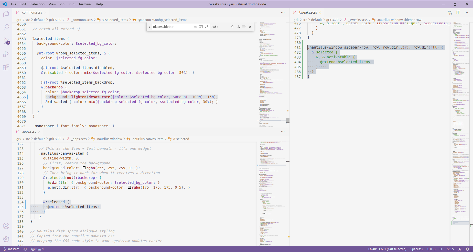
Problem: upstream doesn't have a$backdrop_selected_bg_color they only have a $backdrop_selected_fg_color
After fiddling around with this hecticly in the last PRs, I think the easiest would be to add this new color, and change %selected_items in _common.scss to include a backdrop section. Could be maybe only some lines of diff. Plus that one line for nautilus.
But one thing could always happen, since Adwaita doesn't have it, some app might have their new widget colored in the backdrop 🤷
Let's see
 Feichtmeier
on 12 Oct 2020
Feichtmeier
on 12 Oct 2020
Would it be a solution use the desaturate function to whatever color we use?
 clobrano
on 12 Oct 2020
clobrano
on 12 Oct 2020
Would it be a solution use the desaturate function to whatever color we use?
You think this would be "safer" @clobrano? 100% desaturated would make the orange gray, right?
madsrh
on 12 Oct 2020
Yes, that's what I meant. Instead than choosing a color, which we cannot export because upstream doesn't have it, we can modify the color with the same function.
Thinking twice, this wouldn't work anyway in applications we have no access to :disappointed:
clobrano
on 12 Oct 2020
Hm if set with the mixin or a var it should be put into a place that hits most targets, which is %selected_items
Maybe we can try if upstream likes this change? :angel:
Feichtmeier
on 12 Oct 2020
It makes sense :+1:
clobrano
on 12 Oct 2020
Okay that is quiet effect and not so much diff.
1 line diff in _common, 7 in tweaks, 2 in apps
Edit: and apps in tweaks doesnt exist in upstream ofc... so its 1 line of diff :smile:
Feichtmeier
on 12 Oct 2020
It looks good to me, just a bit too strong the grey color, but as proof of concept is fine :)
clobrano
on 12 Oct 2020
yep! That grey is not really perfect. What do you think? super soft gray + dark text ? Or just like the pictures but a little bit lighter?
Feichtmeier
on 12 Oct 2020
hi,
What do you think? super soft gray + dark text
yes for super soft gray, but by dark text do you mean bold text for selected items in backdrop?
 Muqtxdir
on 12 Oct 2020
Muqtxdir
on 12 Oct 2020
I was thinking about $backdrop_fg_color or something like this. If you lighten up the grey you maybe need to darken the text from white to something different to have contrast so the text is at least readable :)
Feichtmeier
on 12 Oct 2020
We could find first the best gray, then use Contrast to find a readable foreground color.
clobrano
on 12 Oct 2020
@Feichtmeier
This is definitely a path to explore 👌 but I wonder, is the return of the orange sidebar in your screenshot intentionally?

madsrh
on 13 Oct 2020
Independently of what happens with gtk4 (looks like no more colored sidebar selection)
why didn't we come to the idea of changing the tone of the organge to be less agressive?
Feichtmeier
on 3 Dec 2020
Related issues
 pojntfx
·
3Comments
pojntfx
·
3Comments
 chrisjbillington
·
3Comments
chrisjbillington
·
3Comments
 8none1
·
3Comments
Muqtxdir
·
3Comments
Feichtmeier
·
3Comments
8none1
·
3Comments
Muqtxdir
·
3Comments
Feichtmeier
·
3Comments
Most helpful comment
We could find first the best gray, then use Contrast to find a readable foreground color.