Yaru: Enhancement: Change Icon for "Software & Updates"
I'm writing here, because I was "forwarded" from ubuntu discourse .
Digest of my ubuntu discourse post:
Current situation:
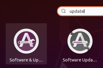
Current look of "Software & Updates": current situation
Problem:
"Software & updates" and "Software Update" look pretty much the same.
Suggestion:
Add a gear to "Software & Updates" because it's for settings
example image (this is not a final version; just to get the idea)
Edit:
The above is apparently difficult, so I added two other suggestions:
Base gimp file (just as reference):
https://www.dropbox.com/s/fjp1f0yyi5stwo5/updater_suggestions.xcf?dl=0
obsolete:
Regarding a new design I would suggestion using something cogwheel-like. I feel it is consistent to current systems - internally and externally.
- Internal: This is already used as Settings icon.
- External: tablets/smartphones use it (huge user base).
 DarkTrick
All 20 comments
Nice idea @DarkTrick
What do you think @ubuntujaggers ?
https://i.imgur.com/S6zTmja_d.webp?maxwidth=640&shape=thumb&fidelity=medium
 madsrh
on 28 Jul 2020
madsrh
on 28 Jul 2020
Unfortunately we have a policy nowadays of not making a superimposed emblem part of the icons (because emblems can already be superimposed on icons) :( We eventually settled on the distinction of having a progress bar for the updater and a matching slider for settings (and hopefully the colour makes it easy to distinguish when you know which is which - but half the problem is the fact we have two offerings with almost the same name, rather than one icon to stand for both!).
 ubuntujaggers
on 28 Jul 2020
ubuntujaggers
on 28 Jul 2020
Ahh, I couldn't find the issue where this discussion took place but luckily you have the mind of an elephant 😄
Aren't emblems only/mostly for files and not apps? I've never seen one in the dock (except for the counter batch ofc).
madsrh
on 28 Jul 2020
I'm not entirely certain about the exact meaning of "superimpose".
Also something like this would be not possible?
https://imgur.com/a/eRrfPZI
edit: Or https://imgur.com/a/tCauBzo
because emblems can already be superimposed on icons
Just for my personal understanding: Could someone provide an example of this. I have no idea what to imagine here.
DarkTrick
on 28 Jul 2020
Apologies, it means "put on top of". Gnome already overlay circular emblems onto icons in certain contexts so we try to avoid using them in designs (we still need to come up with a new design for startup disk creator!).
That first linked image is really nice and I'll have a go at incorporating it into the icon for the next release :+1:
ubuntujaggers
on 28 Jul 2020
I still love eaglers version where the progressbar in the A was replaced by a :gear: :shrug:
 Feichtmeier
on 28 Jul 2020
Feichtmeier
on 28 Jul 2020
I still love eaglers version where the progressbar in the A was replaced by a ⚙️ 🤷
Do you have a link because I can't find it 🙈
madsrh
on 28 Jul 2020
This thread has nice design ideas https://github.com/ubuntu/yaru/issues/1940
Feichtmeier
on 28 Jul 2020
Okay, this is pretty poorly executed but you get the idea which is to use a wrench for the line in the A

madsrh
on 28 Jul 2020
That's another nice concept!
I can't remember why we didn't go for Eagler's concept. I know he never provided the SVG and I dimly recall it was hard making it clear at small sizes (possibly a reflection of my skill rather than the design).
ubuntujaggers
on 28 Jul 2020
(possibly a reflection of my skill rather than the design)
I doubt that. Your skills are much improved with every release 🥇
I know you have other stuff pending, but is this something you would/could take a stab at?
madsrh
on 28 Jul 2020
Looks cool.
Additionally I would go away from the purple for this icon so it also is different in colour
Feichtmeier
on 28 Jul 2020
Maybe it's worth running a poll for some designs?
I personally would vote for something with a cogwheel. I feel it would be more consistent - internally and externally.
Internal: This is already used as Settings icon.
External: tablets/smartphones use it (huge user base).
DarkTrick
on 29 Jul 2020
We made bad experiences with polls, but we appreciate your opinion and feedback :+1:
Just reading the issues here is okay to get impressions imo
Feichtmeier
on 29 Jul 2020
Just for reference, here is my base gimp-file.
https://www.dropbox.com/s/fjp1f0yyi5stwo5/updater_suggestions.xcf?dl=0
I also consolidated my discussion content in the first post.
DarkTrick
on 29 Jul 2020
Needs work to make it clearer:
...but that's the spanner concept so far. Personally I'm quite fond of the slider?
ubuntujaggers
on 30 Jul 2020
I think the color is also a problem. Maybe play with the ubuntu orange as a background for software + updates instead? Maybe even drop the A for this one ? :shrug:
Feichtmeier
on 30 Jul 2020
I made the screenshot a little bigger for my initial test-images and the wrench one here:
https://imgur.com/a/EjSyrAY
Tbh... the wrench one looks the best to _me_.
edit:
Please note, that the imgur link contains 4 images. The original wrench-one is in the bottom
DarkTrick
on 31 Jul 2020
I made the screenshot a little bigger for my initial test-images and the wrench one here:
https://imgur.com/a/EjSyrAYTbh... the wrench one looks the best to _me_.
Thanks for sharing your idea!
Feichtmeier
on 31 Jul 2020
@DarkTrick we decided to keep the current icon until these functionalities are merged into the snap store. Thanks for contributing
Feichtmeier
on 25 Sep 2020
Related issues
Feichtmeier
·
3Comments
 pojntfx
·
3Comments
pojntfx
·
3Comments
 chrisjbillington
·
3Comments
chrisjbillington
·
3Comments
 matthewpaulthomas
·
3Comments
matthewpaulthomas
·
3Comments
 Muqtxdir
·
3Comments
Muqtxdir
·
3Comments
Most helpful comment
Okay, this is pretty poorly executed but you get the idea which is to use a wrench for the line in the A