Yaru: Enhance the current curl or add a paper fold on file icons
This issue is for discussing enhancing curl at the bottom of the mimetype icons or adding a paper fold at the top!
_Enhanced, Fold and current_ 👆
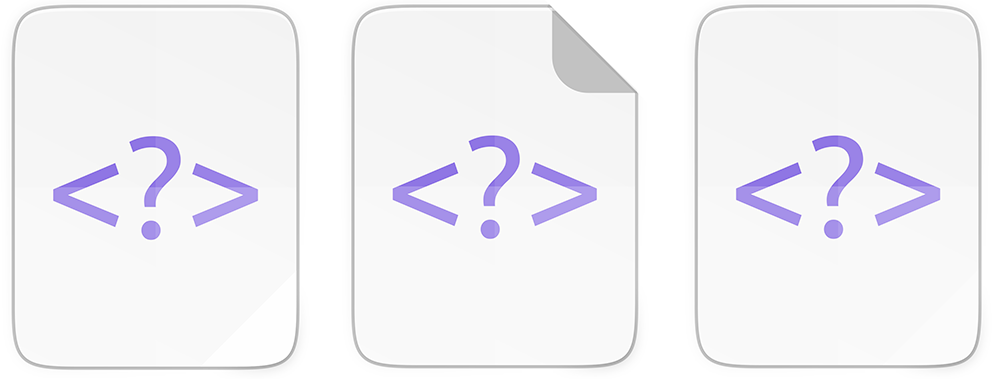
For a long time now, I've found the paper curl at the bottom of the mimetype icons to be too subtle. At the moment, the current curl is only present at 256 px (and above ofc).
The fold would be a clear distinction between the application and file icons.
Adding the top fold, is a very controversial suggestion and it's also a massive amount of work to adapt the current 54 icons. A less intrusive suggestion is to increase the current curl.
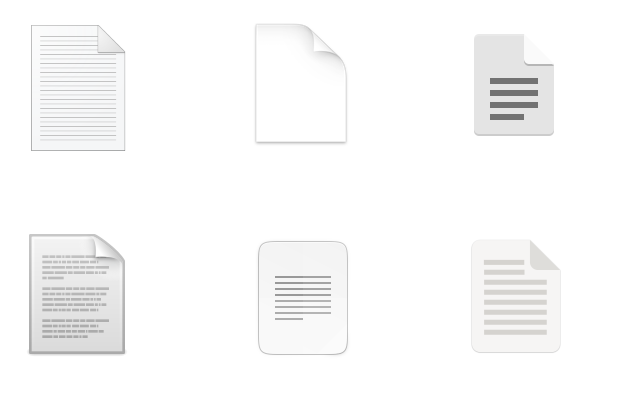
In no particular order, here's document icons from OSX, Windows, Humanity, Adwaita, Papirus and Yaru 📄
 madsrh
All 10 comments
This is a nice idea. My preference would go to a neat fold, like the examples in the third column :+1:
 clobrano
on 23 Jul 2020
clobrano
on 23 Jul 2020
I'd prefer to not change the base plate do I'd go with option 1
 Feichtmeier
on 23 Jul 2020
Feichtmeier
on 23 Jul 2020
If we wanted to try an actual fold, we could take the shape of the folded corner (and very well executed shadow!) from this:
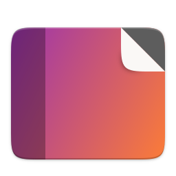
(Minus the black behind it.)
 ubuntujaggers
on 30 Jul 2020
ubuntujaggers
on 30 Jul 2020
Guys - do we want a test branch to try the folded corner?
ubuntujaggers
on 27 Sep 2020
do we want a test branch to try the folded corner?
That would be great but also a ton of work for you, just to test this 🤷♂️
madsrh
on 29 Sep 2020
I actually really like this! I've done the backplate for 48px and tried a few out:
ubuntujaggers
on 1 Oct 2020
This looks really good!
Edit: And it is synced with symbolic document icon moreover!
 Jupiter007-43
on 1 Oct 2020
Jupiter007-43
on 1 Oct 2020
Suggested backplate at all five sizes:

ubuntujaggers
on 2 Oct 2020
Do it @ubuntujaggers ;)
Feichtmeier
on 2 Oct 2020
WIP:
ubuntujaggers
on 4 Oct 2020
Related issues
 sicklylife-jp
·
3Comments
Feichtmeier
·
3Comments
sicklylife-jp
·
3Comments
Feichtmeier
·
3Comments
 matthewpaulthomas
·
3Comments
matthewpaulthomas
·
3Comments
 CDrummond
·
3Comments
CDrummond
·
3Comments
 eaglersdeveloper
·
3Comments
eaglersdeveloper
·
3Comments
Most helpful comment
Suggested backplate at all five sizes: