Yaru: Gtk3: context menus are hard to distinguish from the background
Similar to the shell shadows, I preferred the "Yaru 1.0" shadows. I think @madsrh could remember what I mean.
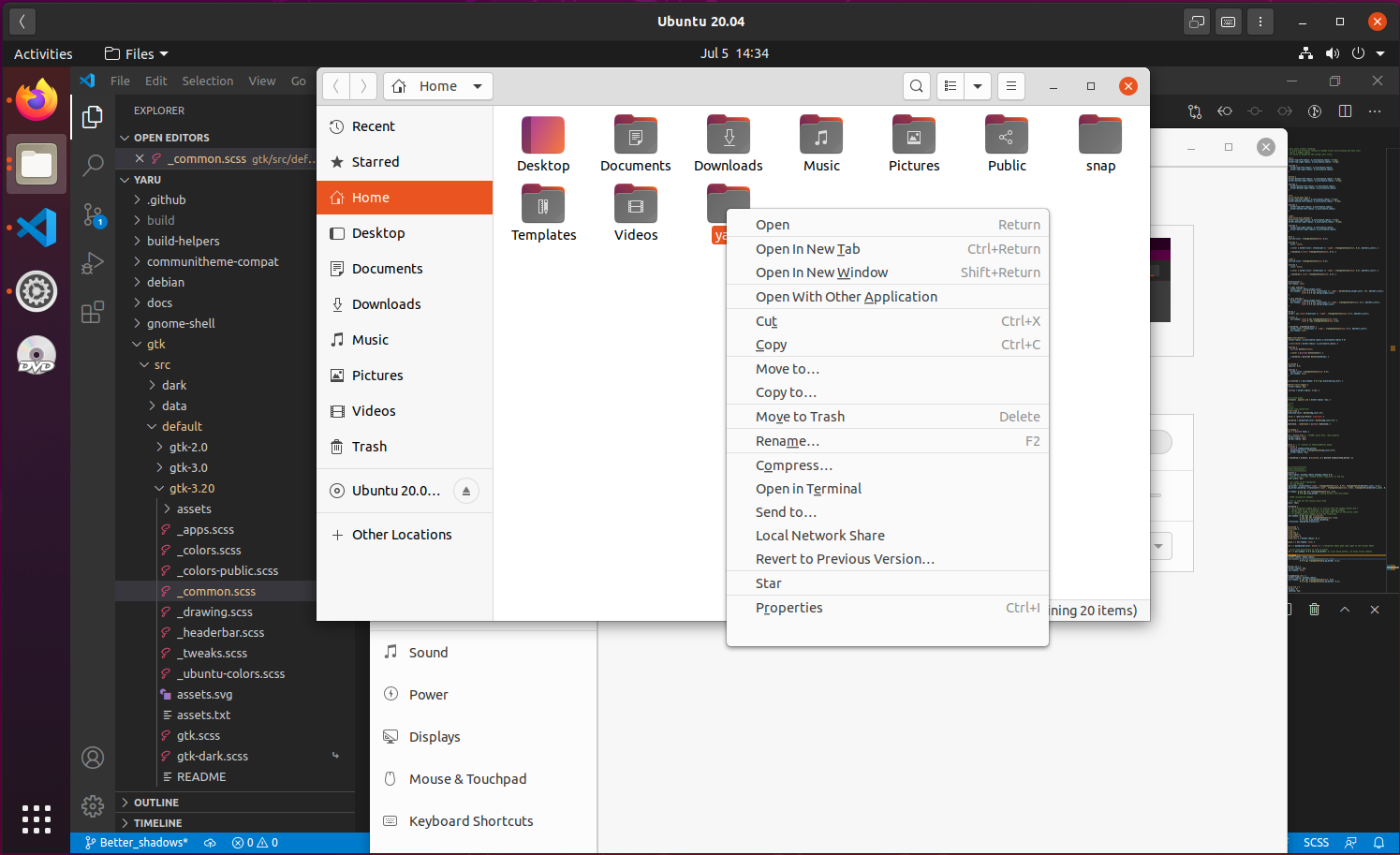
This is not enough in my opinion and it looks like it's on the same layer as the background:

All 8 comments
I'm definitely +1 for more shadow
I agree with Mads, can we try a bit more? It doesn't really look like a shadow
Do we consider this to be a contrast problem that needs to be put into focal?
The point release is quite close. I think I am ok with current, so it is ok for me to keep it this way on focal, however I prefer the shadow if it is sensible
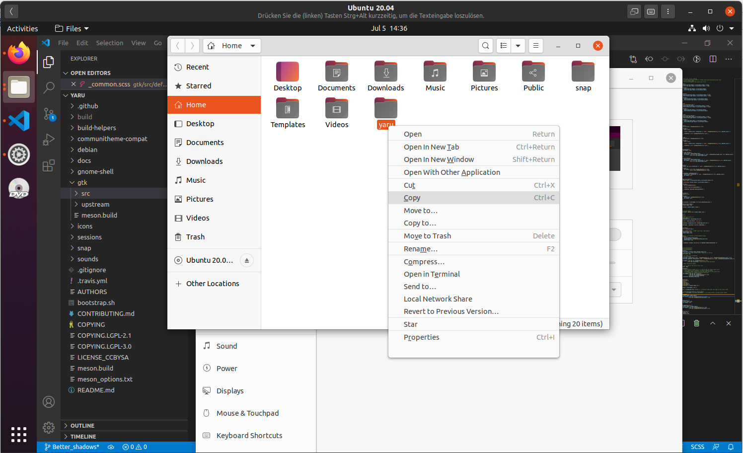
- darker shadow + more spread

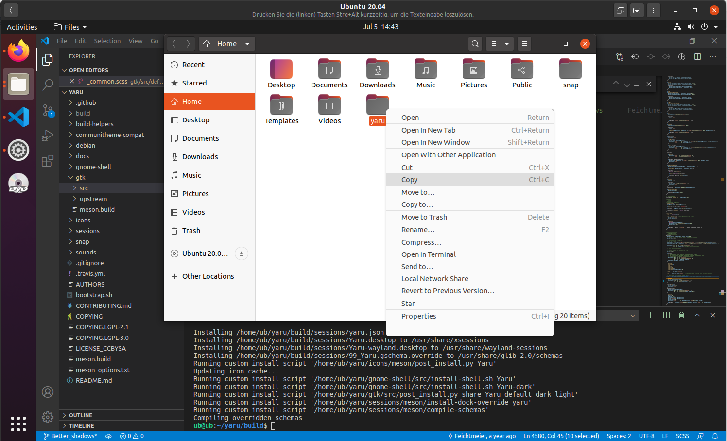
- slightly darker shadow + slightly more spread

- darker border shadow + sligthyl more spread

Any more ideas?
Why did we change the menu color from white to fafafa btw? :thinking: I think white "popped" up more in the light theme(s)
All good suggestions. I think I prefer #1 (on my phone)
I think white "popped" up more in the light theme(s)
White was better. If we changed it dillibertly, it was probably to unify all the menus/pop-over backgrounds
I also prefer the first one. Good improvement 👍
I agree on #1
Most helpful comment
Any more ideas?
Why did we change the menu color from white to fafafa btw? :thinking: I think white "popped" up more in the light theme(s)