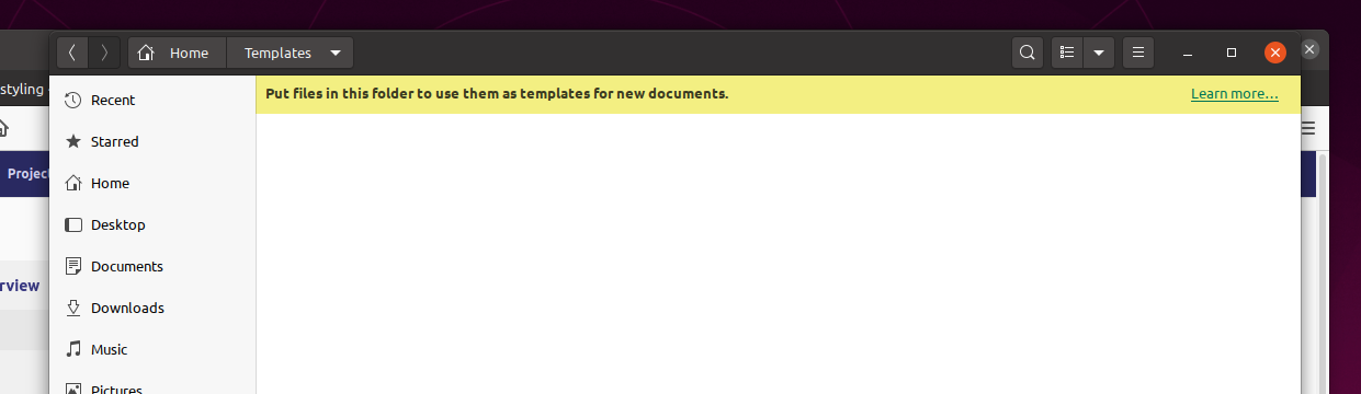
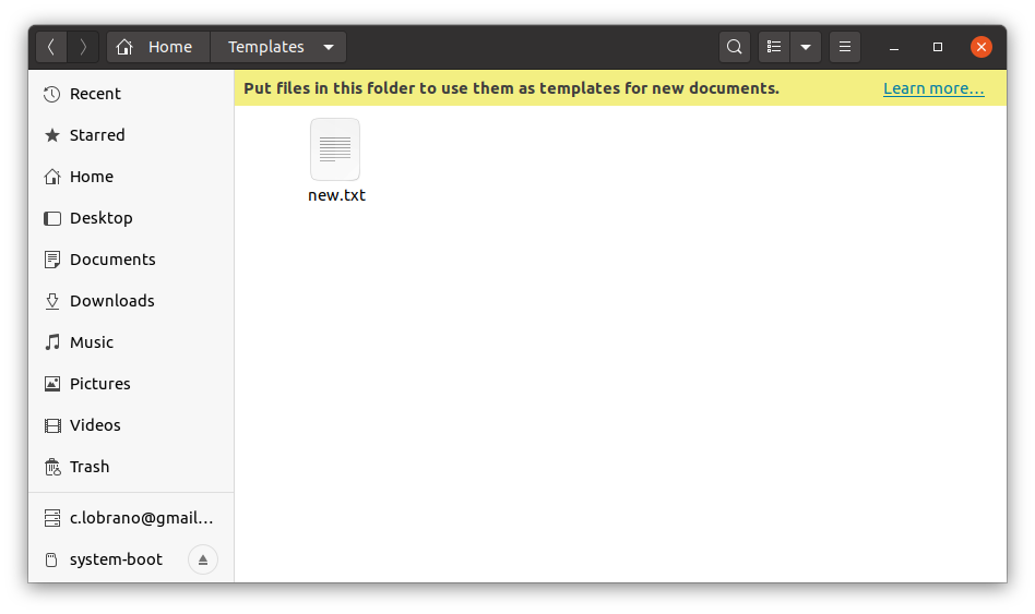
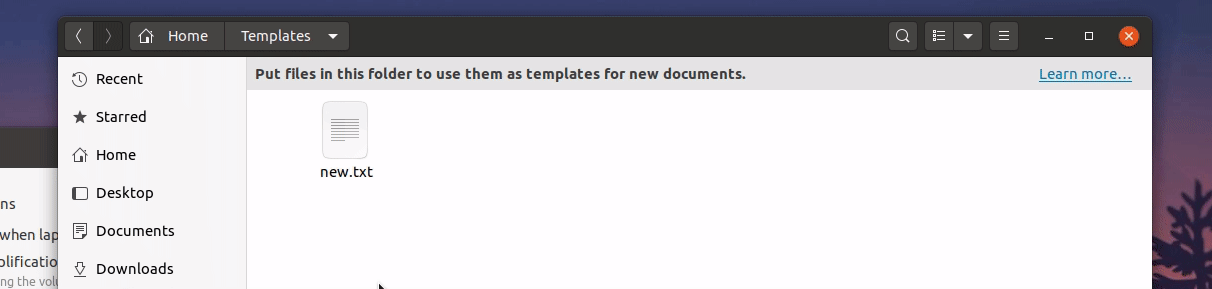
Yaru: Background in top of Templates folder
I know that per app tweaks isn't ideal, but IMHO the label in the Templates folder lacks discoverability which is key for it's usefulness. Opposed to the Trash folder, the top banner here acts as information and would benefit from a background.
WDYT?
 madsrh
All 19 comments
Okay I was pretty alone on this one 🙈
madsrh
on 27 Feb 2020
@madsrh I think it's a good idea :)
 ghost
on 28 Feb 2020
ghost
on 28 Feb 2020
👍 @friendlyapple 😁
I tried this to do this with infobar.info but couldn't make it work. Is this even possible @Feichtmeier ?
madsrh
on 28 Feb 2020
It is
Yaru's yellow is too dark btw (#f99b11) and looks too much a warning color. Shall we go with your suggestion instead (#f3ef82)?
 clobrano
on 29 Feb 2020
clobrano
on 29 Feb 2020
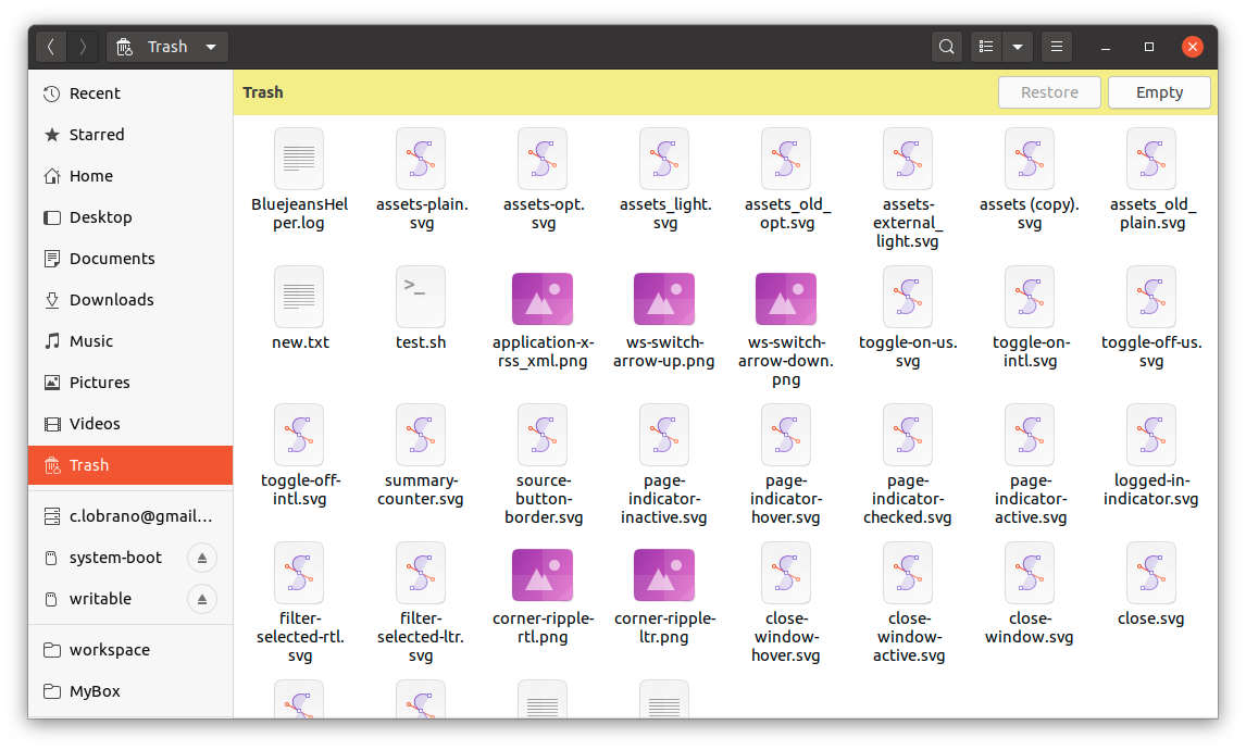
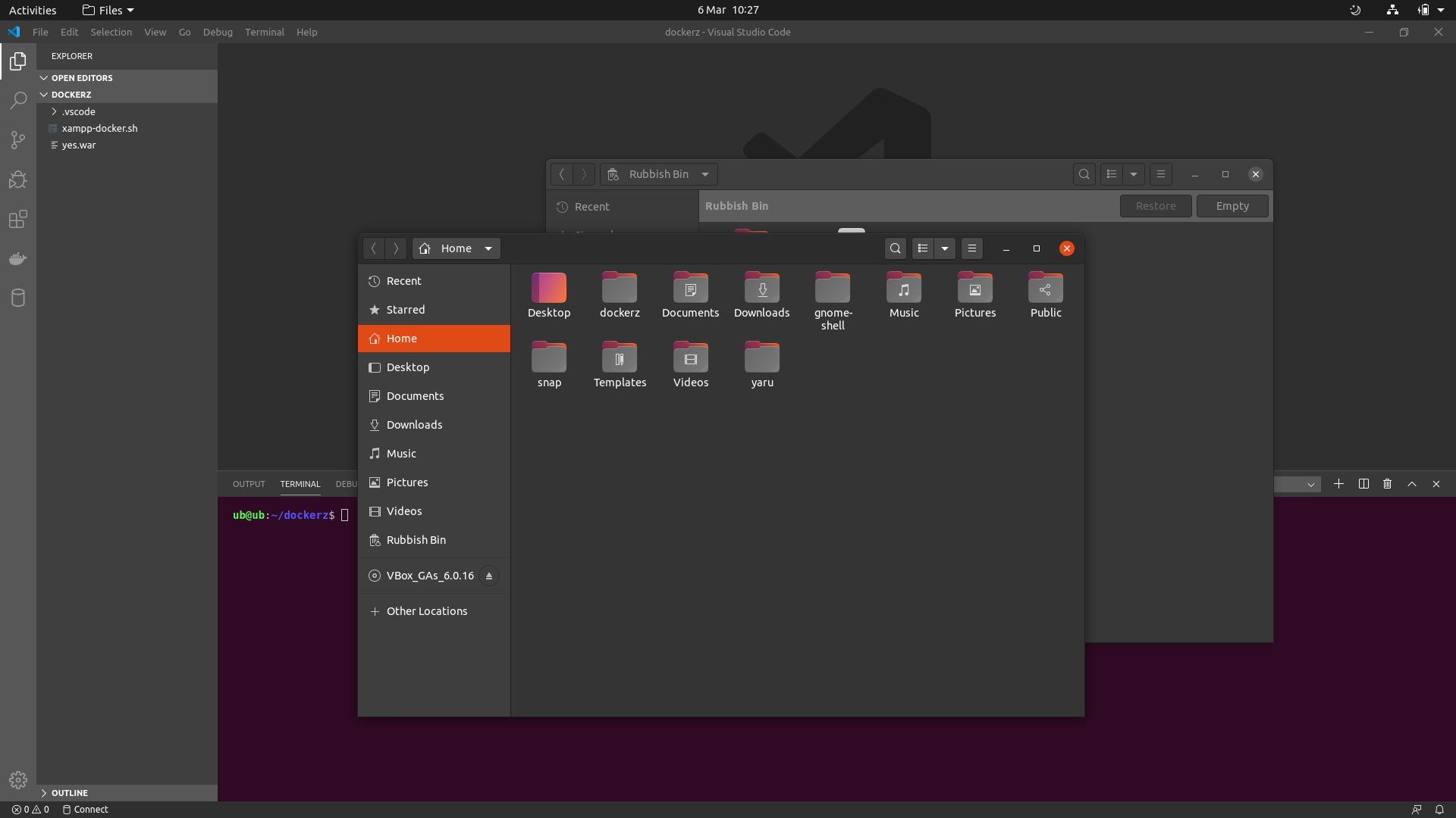
Ah, "unfortunately" also the Thrash folder has an infobar
clobrano
on 29 Feb 2020
Haha infobars again xD
I think that yellow looks like that 3M post-its so I think it looks good for a info :+1:
But what I don't like is that upstream just ignores the differences between the info bars: warning, info, error and so on
 Feichtmeier
on 29 Feb 2020
Feichtmeier
on 29 Feb 2020
"unfortunately" also the Thrash folder has an infobar
Why is unfortunately inside a " " 😂
Shall we go with your suggestion instead (#f3ef82)?
Sure or even lighter perhaps?
upstream just ignores the differences between the info bars: warning, info, error and so on
So, you're both saying that it isn't possible?
madsrh
on 29 Feb 2020
No we had it once... back in time... I think... let me see...
https://github.com/ubuntu/yaru/issues/856#issuecomment-423826338
Feichtmeier
on 29 Feb 2020
It totally makes sense. We went through a plethora of ideas :D
Right now, upstream does not make any difference, however yellow might suit better to a warning message, even more in dark variant, where the yellow should be darker.
What do you think of this?
clobrano
on 2 Mar 2020
That looks def. better for an information
I think upstream has the most lazy implementation here with inverting the selected_bg_color :man_facepalming:
If you change it would you change all three types like we had it once?
Feichtmeier
on 2 Mar 2020
I'm just changing the infobar in nautilus right now, mostly because we already saw that those bars strongly depends on the context. In Nautilus this grey can be fine, while in another app might not
clobrano
on 2 Mar 2020
Just to be clear: are you saying that we can't safely style this only for Nautilus? If so, then let's not do this
madsrh
on 2 Mar 2020
No, the other way around :smiley:. I suggest doing it only for Nautilus and it is safe to do it
clobrano
on 5 Mar 2020
For the templates folder this (https://github.com/ubuntu/yaru/issues/1989#issuecomment-593409070) looks cool
For the trash I think it is a little bit more "dangerous" and the yellow fits, imo.
Feichtmeier
on 5 Mar 2020
They are the same kind of infobar
clobrano
on 5 Mar 2020
I think the backdrop could need a little improvement in the dark theme @clobrano
Maybe just $backdrop_base_color like the rest of the window
Feichtmeier
on 6 Mar 2020
Like this?
clobrano
on 6 Mar 2020
Perfect 💪
madsrh
on 6 Mar 2020
:+1:
Feichtmeier
on 6 Mar 2020
Related issues
 Muqtxdir
·
3Comments
Muqtxdir
·
3Comments
 8none1
·
3Comments
8none1
·
3Comments
 matthewpaulthomas
·
3Comments
matthewpaulthomas
·
3Comments
 mivoligo
·
3Comments
mivoligo
·
3Comments
 YamiYukiSenpai
·
3Comments
YamiYukiSenpai
·
3Comments
Most helpful comment
It totally makes sense. We went through a plethora of ideas :D
Right now, upstream does not make any difference, however yellow might suit better to a warning message, even more in dark variant, where the yellow should be darker.
What do you think of this?
