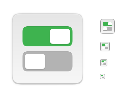
Yaru: Gnome Tweaks icon has old-style toggles
In master, the icon for Gnome Tweaks has square green toggles, which are no longer used in Yaru:
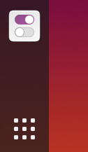
This is the replacement icon I'm working on for the spring clean:
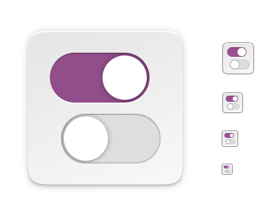
The purple is the same one used in the toggles - the compression on the image is just making it look more saturated here.
 ubuntujaggers
All 9 comments
Nice!
I think they should start at the same pixel though
Like
0-1
1-0
 Feichtmeier
on 21 Feb 2020
Feichtmeier
on 21 Feb 2020
Nice!
I think they should start at the same pixel though
Like
0-1
1-0
I tried that first but it looked a bit naff to my eye, because the proportions of the toggles are different and it looked a bit squished in horizontally :( I'll post to show what I mean when I get chance. I know there's a bit of "artistic licence" in staggering the toggles, but I hope people will like the design choice when they see the comparison. If not, c'est la vie :) EDIT: I'm not wedded to current - at least we have the elements drawn however we place them.
ubuntujaggers
on 21 Feb 2020
And this appeared to me. Giant buttons.
 Neocazen
on 21 Feb 2020
Neocazen
on 21 Feb 2020
Yes yes, gnome shell 3.36 is missing for the yaru theme. Chill
Feichtmeier
on 21 Feb 2020
@ubuntujaggers what if you would stretch the switches like in the old icon? :) Ah I just wait for your reply
Feichtmeier
on 21 Feb 2020
@ubuntujaggers what if you would stretch the switches like in the old icon? :) Ah I just wait for your reply
Yep, we can try this - when I'm on my laptop I'll do all three versions for comparison ☺️
ubuntujaggers
on 21 Feb 2020
Actually... centred looks fine :) I've done a lot of work on the elements themselves since I last tried it this way, and I don't think the problem was the alignment after all:
IMO stretched doesn't look any better and resembles the real toggles less:
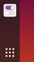
So I'm happy to go for realistic proportions and centred if everyone else is :+1:
ubuntujaggers
on 21 Feb 2020
@ubuntujaggers I think we all agreed here 🎉
Just merge it when you find time 👍
Feichtmeier
on 28 Feb 2020
Yep, it's in the "square spring clean" branch that I just have to finish ☺️
ubuntujaggers
on 28 Feb 2020
Related issues
 chrisjbillington
·
3Comments
Feichtmeier
·
3Comments
chrisjbillington
·
3Comments
Feichtmeier
·
3Comments
 pojntfx
·
3Comments
pojntfx
·
3Comments
 snydox
·
3Comments
snydox
·
3Comments
 Muqtxdir
·
3Comments
Muqtxdir
·
3Comments
Most helpful comment
Actually... centred looks fine :) I've done a lot of work on the elements themselves since I last tried it this way, and I don't think the problem was the alignment after all:
IMO stretched doesn't look any better and resembles the real toggles less:
So I'm happy to go for realistic proportions and centred if everyone else is :+1: