Could any of these ideas work @Feichtmeier @clobrano @ubuntujaggers ?
icon theme
 madsrh
👍1
All 4 comments
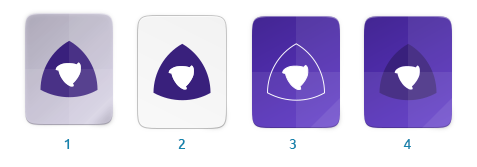
Number 2 for me, it seems more in line with the other mime types
 clobrano
on 9 Feb 2020
clobrano
on 9 Feb 2020
👍2
Maybe the icon is still a bit loud with that dark solid logo.
 real-amano
on 9 Feb 2020
real-amano
on 9 Feb 2020
...it seems more in line with the other mime types
Well, we do actually have a lot of icons with colored backgrounds, but I do agree that the white background fits better here.

the icon is still a bit loud with that dark solid logo.
This might be because I used the official meson color rather than a color from the suru color palette
I'll update the PR with white version here
madsrh
on 10 Feb 2020
👍2
All 4 are good. Not just good, looks brilliant.
 meetdilip
on 10 Feb 2020
meetdilip
on 10 Feb 2020
😄1
👍1
Was this page helpful?
0 / 5 - 0 ratings
Related issues
 Feichtmeier
·
3Comments
Feichtmeier
·
3Comments
 mivoligo
·
3Comments
mivoligo
·
3Comments
 matthewpaulthomas
·
3Comments
matthewpaulthomas
·
3Comments
 eaglersdeveloper
·
3Comments
matthewpaulthomas
·
3Comments
eaglersdeveloper
·
3Comments
matthewpaulthomas
·
3Comments
Most helpful comment
All 4 are good. Not just good, looks brilliant.