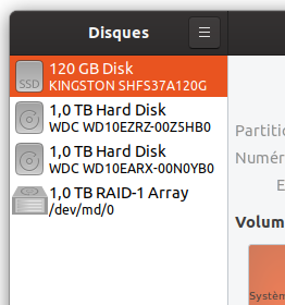
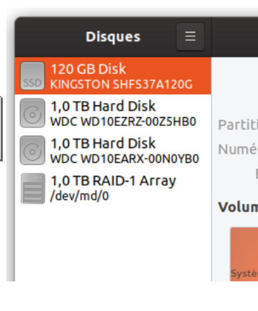
Actual Behavior

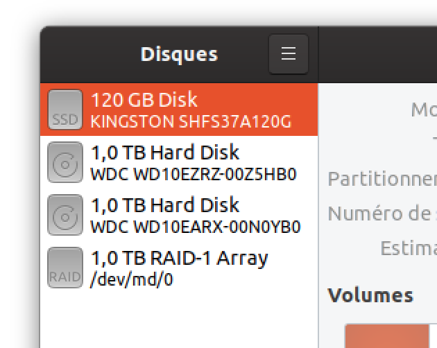
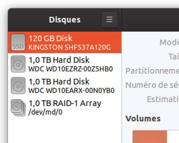
RAID icon looks inconsistent relative to others.
Software that presents the issue
- Name: gnome-disk
- Version: 3.34
- Ubuntu 19.10
I am going to look on master on my VM 20.04
 Jupiter007-43
All 39 comments
Thanks for the report
I think the full colour version is simply missing
Thus the fall back to the symbolic one
How does it look with the adwaita icon theme?
 Feichtmeier
on 26 Jan 2020
Feichtmeier
on 26 Jan 2020
Here is :

Jupiter007-43
on 26 Jan 2020
Thanks :dancer:
Feichtmeier
on 26 Jan 2020
Same issue on master.
Jupiter007-43
on 26 Jan 2020
Like this ?


 meetdilip
on 27 Jan 2020
meetdilip
on 27 Jan 2020
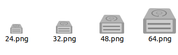
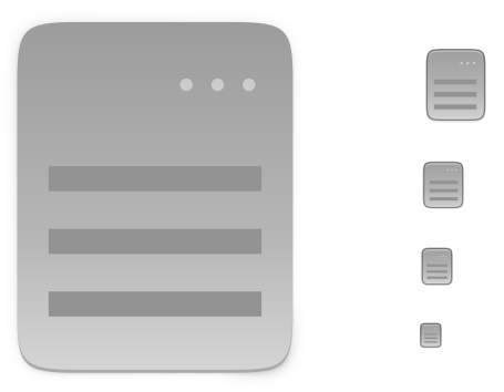
For smaller sizes, this one might be more suitable


meetdilip
on 27 Jan 2020
Details look fine on bigger sizes, but 32 px and below, we need to keep it simple and dark


I got 2 mockups, one with details and other minimal icon

meetdilip
on 27 Jan 2020
I got 2 mockups, one with details and other minimal icon
The first one looks very good 👍
Jupiter007-43
on 27 Jan 2020
@meetdilip would it be possible to change the sharp coners? It would fit the Yaru style better
 madsrh
on 29 Jan 2020
madsrh
on 29 Jan 2020
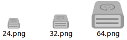
How is this one ?
meetdilip
on 29 Jan 2020
I was working on a bigger image and curves were getting vanished when made small. This one should fit your guidelines.

meetdilip
on 29 Jan 2020
Hope this fits

meetdilip
on 29 Jan 2020
Hi @meetdilip
That's a really nice icon, but we don't have any other icon with that realistic perspective (we do have some "slightly 3D" ones but they don't taper). I'm open-minded to bucking the trend :) but if we do there's edging to include that's consistent across the whole icon set. Do you mind picking an existing Yaru icon as a starting point and seeing if you can edit it to make something, or use it as a reference point and copy how the border works, highlights, etc.?
One option might be to do a slightly 3D icon in this style using this as a baseplate (moving the glyph up to make room for the detail at the bottom/front). Alternatively, just study those two and add the same edging to your existing design :+1:
 ubuntujaggers
on 29 Jan 2020
ubuntujaggers
on 29 Jan 2020
Thanks for the comment @ubuntujaggers
I am not familiar with that kind of template. I can only promise to try. :)
meetdilip
on 29 Jan 2020
I tried a non 3D ish icon concept. I hope @ubuntujaggers will have some tips for me to make it more Suru - ish.

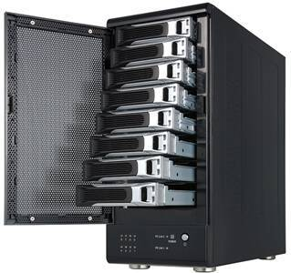
RAID is a set of hard drives. So I think something like this might fit the scene. Thanks.
meetdilip
on 29 Jan 2020
I'll post some tips about next steps tonight :)
ubuntujaggers
on 31 Jan 2020
Okay: in Yaru terms, the easiest design to try first is the flat one, because we already have some good reference points.
We've got a device icon that already has the right shape, so download this file and delete the bit at the bottom of each icon (the bit that represents the front of the drive). Then you've got a plain shape to do the flat design on.
Next, download this file and pipette the darker grey from it (the one used for the symbol). Using that colour, draw the darker details onto each of your different sized baseplates, making sure the vertical and horizontal lines are snapped to whole pixels for maximum sharpness at every size (press # in Inkscape to reveal the grid). You can copy/resize the design onto each size as long as you then edit it slightly to align it with the pixels for that size:
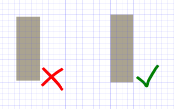
For the biggest icon, instead of aligning the design to individual pixels, work to a grid of 4px squares where possible.
If the resulting design looks good, you have an icon that's consistent with the edging, gradients and shades as the other devices :) and we can use it in the icon theme. If not, we think again!
ubuntujaggers
on 31 Jan 2020
I will keep in mind :)
meetdilip
on 1 Feb 2020
Tried a mockup
meetdilip
on 1 Feb 2020
Seems ok with small sizes as well
meetdilip
on 1 Feb 2020
Okay, so for the vertical concept, save the svg of this file:

Load it in Inkscape and delete the glyph to make the plain backplate:
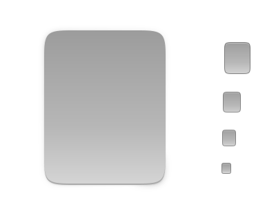
...then draw your RAID design on each of the five backplates using this colour for the darker grey:

:+1:
ubuntujaggers
on 1 Feb 2020
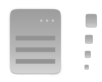
Thanks. That is how I did it. However, I had to tweak the disk background and disk colour + stroke to make it look good. Otherwise, the output will be
meetdilip
on 2 Feb 2020
Added to other back plates as well
meetdilip
on 2 Feb 2020
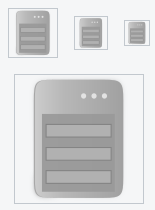
@meetdilip It looks like a server. Why not use the same style as for the SSD?
Or why not a set of hard drives?
 ghost
on 2 Feb 2020
ghost
on 2 Feb 2020
Perhaps we follow the same for HDD.
Stacked HDD looks better. But please check existing icons for devices which uses RAID.
meetdilip
on 2 Feb 2020
@meetdilip The icon you are trying to make is too complex. You are trying to show the HDD and a system/case that manages the hardware RAID (which is not necessary). I think this goes against Yaru principles which wants an icon to be simple and easily identifiable.
It would also be wise to take inspiration from the following file:
https://github.com/ubuntu/yaru/blob/master/icons/src/scalable/source-symbolic.svg
RAID: current symbolic icon:

ghost
on 2 Feb 2020
You are trying to show the HDD and a system/case that manages the hardware RAID (which is not necessary).
That is how a RAID system is. Different views are welcome.
meetdilip
on 2 Feb 2020
@meetdilip I agree with you for a hardware RAID (recognized by the system as a conventional hard drive). But here it is a software RAID. Therefore your icon is not appropriate.
ghost
on 2 Feb 2020
Please see the upstream icon. It is in post no. 3.
meetdilip
on 2 Feb 2020
Please see the upstream icon. It is in post no. 3.
It's a choice of representation, which is probably not the best for me (it's not an external device). It is a fairly complicated subject. Besides, if you look at macOS or Windows, they have the same icon as an ordinary hard drive. If we still want to display the difference between a conventional hard drive and a RAID, and since it is a software RAID, I think we have to keep it simple.
As you said, it's interesting to have several points of view 👍
ghost
on 2 Feb 2020
Hi guys,
We had a little chat about this and think the least controversial option is probably the same as SSD:

...especially because the icon will rarely be seen. This would be a great first PR for a new contributor because it's simple but you get to run the scripts to build the pngs, does either of you fancy it :) If not I can do it 👍
ubuntujaggers
on 2 Feb 2020
Not smart enough for making a PR. I give it a pass this time. :)
meetdilip
on 2 Feb 2020
Not smart enough for making a PR. I give it a pass this time. :)
I made a video 😁 Can you render the .png? I think ubuntujaggers posted a guide somewhere 🤔
Please don't be discouraged because of the disagreement!
madsrh
on 2 Feb 2020
Thanks for the video. I will check that.
I feel ok. Just that this is not my concept. So it will not be appropriate to claim the credit. :)
meetdilip
on 2 Feb 2020
Hmm, actually... I just started this PR and it turns out the icon is called drive-multidisk, would it be unwise to specify "RAID" on it? Maybe it's better to do a full colour version of the symbol :thinking:
ubuntujaggers
on 2 Feb 2020
I just started this PR and it turns out the icon is called drive-multidisk, would it be unwise to specify "RAID" on it? Maybe it's better to do a full colour version of the symbol
I agree that it might be safer. Special hardware cases like these are difficult to test.
madsrh
on 2 Feb 2020
@madsrh Your video is great! Very well explained 😃
On the other hand, I really have trouble with Inkscape and I don't have time to train on it currently. Sorry, I can't do it. :/
ghost
on 2 Feb 2020
On the other hand, I really have trouble with Inkscape and I don't have time to train on it currently. Sorry, I can't do it. :/
No problem. I think there's a How to edit and render icons video coming too 😉
madsrh
on 2 Feb 2020
Personally (and as a RAID user 😉) I think the set of disk is the most understandable icon :
But this is just my opinion...
Jupiter007-43
on 2 Feb 2020
Related issues
 matthewpaulthomas
·
3Comments
matthewpaulthomas
·
3Comments
 8none1
·
3Comments
8none1
·
3Comments
 Muqtxdir
·
3Comments
Muqtxdir
·
3Comments
 CDrummond
·
3Comments
Feichtmeier
·
3Comments
CDrummond
·
3Comments
Feichtmeier
·
3Comments
Most helpful comment
Personally (and as a RAID user 😉) I think the set of disk is the most understandable icon :
But this is just my opinion...