Expected Behavior
(What you were trying to do)
Actual Behavior
(What happened instead)
Steps to Reproduce the Problem
1.
1.
1.
Software that presents the issue
- Name: Ubuntu
- Version: 20.04
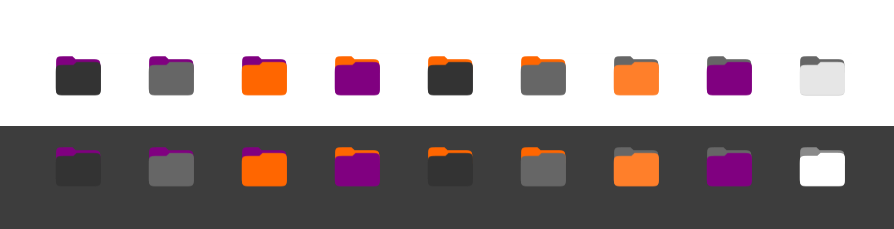
I know there would be a lot of brainstorming before the proposed folder icon was finalized. But since I heard it is experimental, I believe the gradient in it is a bit flashy on some occasions. It looks great when the image size is 64 px or higher. But for 48 px and below, there is some highlight due to the gradient.
I am not trying to say that what we have right now has to change. But if you are considering other options before finalizing, I thought I would propose something simpler. Thanks.
 meetdilip
All 16 comments
Uhm that screenshot is a mockup by one of the ubuntu designers
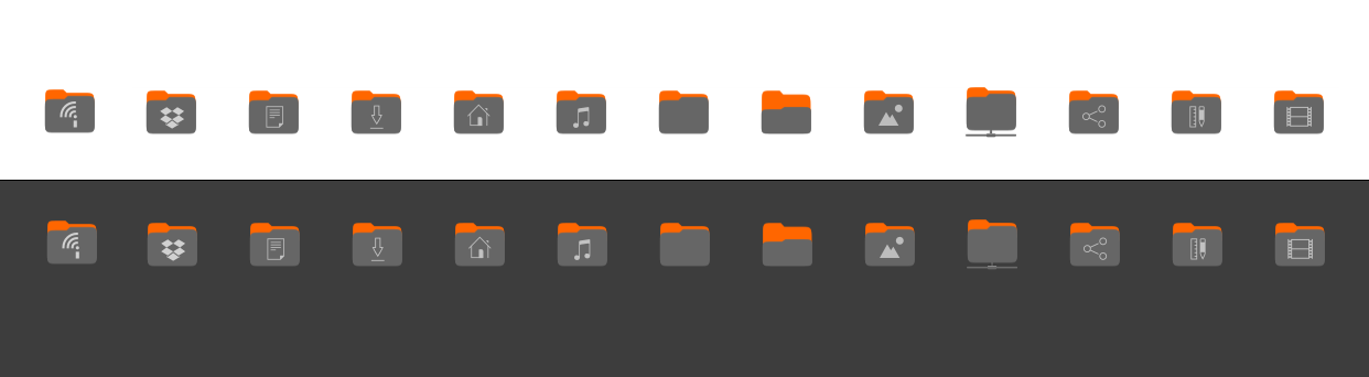
The actual real look when build from master is this (@ubuntujaggers took the mock-up and really implemented this in our src files)

On your proposal - I don't like it :/ It somehow looks like folders from a comic or something, really not fitting into the yaru icons
 Feichtmeier
on 16 Jan 2020
Feichtmeier
on 16 Jan 2020
The usage of the gradient has one more nice effect: the orange side keeps good the contrast with the dark variant, while the purple one does the same but with the light variant :D
 clobrano
on 16 Jan 2020
clobrano
on 16 Jan 2020
I read that the folder design is experimental at OMG Ubuntu. So I thought will start a discussion with possible alternatives.
On your proposal - I don't like it :/ It somehow looks like folders from a comic or something, really not fitting into the yaru icons
I don't like a couple of them. But I used the full scope of colours. From what I learned from designing for others, people have strange tastes. :)
The usage of the gradient has one more nice effect: the orange side keeps good the contrast with the dark variant, while the purple one does the same but with the light variant :D
Sure. This is the first time I have seen gradient in folder icons. Hopefully, with time, will get used to it. :)
meetdilip
on 16 Jan 2020
Please don't feel discouraged by critiques. I don't find these icons bad at all, probably the set that fits best with both light and dark variant is this

which are the current (which I personally prefer) without the gradient and hypothetically can be considered by others team members, so let's keep this ticket open (if you like) and visible
clobrano
on 16 Jan 2020
Thank you. At first, I thought 2 different sets of icons for dark and light themes. But that would be more work, I guess.
meetdilip
on 16 Jan 2020
The folder set does not change with theme variant, unfortunately
clobrano
on 16 Jan 2020
I don't know whether it fits here. But at times, I think the whole idea of a folder can have some refresh. Box icons replacing folder icons.

I think when we rework on colours and perhaps " representation ", box icon might be more appealing than a folder icon
meetdilip
on 16 Jan 2020
On topic of your initial post @meetdilip:
I hope I get this right but you say that the contrast of the folders ontop of the background is not evenly good in both gtk themes (I say both, because we have two light themes)
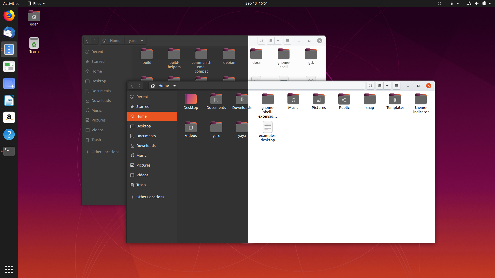
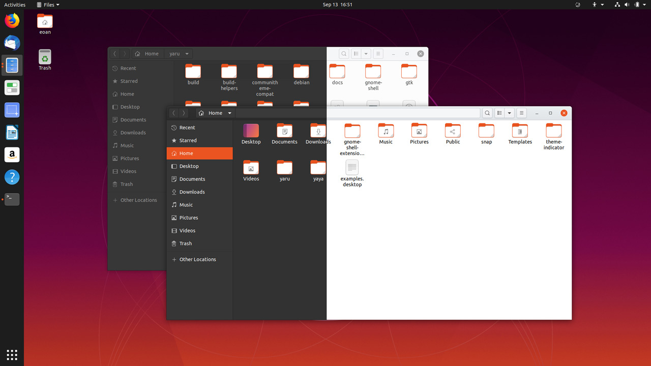
Did you try to real folders from master?
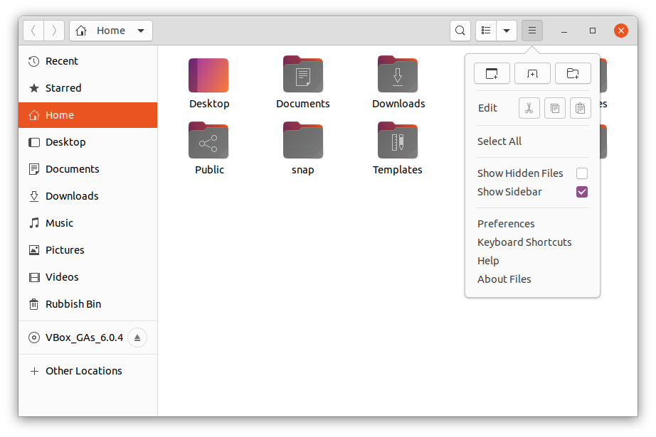
@ubuntujaggers made a really good job in getting the mockups into the real icon style with outlines, real suru gradients and so on. Have a look please and see if you still feel like a second icon set is needed. (it's also more to maintain)
If you come to the conclusion after testing master that for one of the themes the master folder icons don't cut it, how about finding a slight variation of the gray that fits good on both light and dark backgrounds instead of creating a second icon theme?
Feichtmeier
on 16 Jan 2020
@Feichtmeier I made my comments based on M Wimpress' blog which I saw on Twitter. It had pictures of folder with dark and white backgrounds. Another source I had was images from OMG Ubuntu. They were comparatively smaller than M Wimpress' blog images.
It looked a bit strange to me from those screenshots. But that is just one man's opinion which does not matter at all. I am no one when it comes to Ubuntu.
From the pictures you posted ( and my own comment from the 1 st post ), it looks great when we view it on 64px or higher. UbuntuJaggers and others have indeed done a good job from that viewpoint.
I was so used to the bright Orange folders ( which I didn't like the first time ) that this one looked different to me.
The only reason I started this discussion was that " folder design is experimental ". I thought in that case, the team wants to discuss other possible designs.
Please don't be upset about my comments on the folder design. It is just one user and that does not matter at all. :)
meetdilip
on 16 Jan 2020
I am not upset at all!
I just want to analyse the problem, maybe it's indeed a contrast problem maybe not.
Just build from master and see if you still feel that the contrast is bad in either of the themes
Feichtmeier
on 16 Jan 2020
Please don't be upset about my comments on the folder design...
It may sound like it, but I assure you that no one here is ever upset! We are all just highly passionate about making a beautiful desktop - and so are you, it seems 😃 Different opinions are welcome and especially if they bring actual suggestions 😉
 madsrh
on 16 Jan 2020
madsrh
on 16 Jan 2020
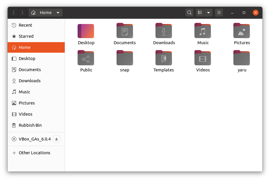
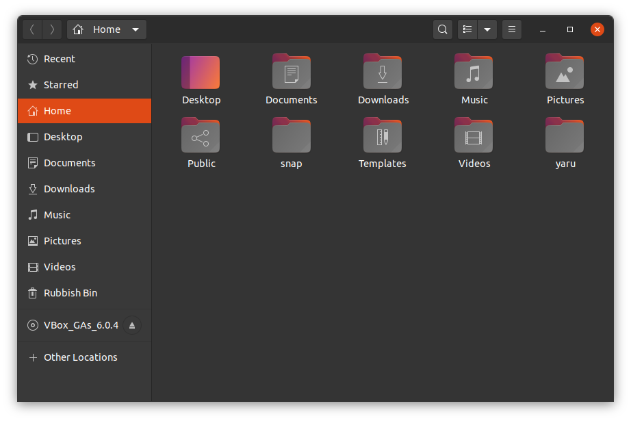
I tried those folder variants. Same icons different backgrounds
meetdilip
on 16 Jan 2020
Just for the sake of completeness: That mockup was posted by the user Templar82 in the Phoronix forums:
I am not sure if I really like it though.
 real-amano
on 16 Jan 2020
real-amano
on 16 Jan 2020
I would prefer something with more contrast with the dark theme when it comes to the folder icons. I liked orange (keeping it would be my preference, I pretty much always prefer more distinctiveness!), but lightening the grey a bit would help too.
 chrisjbillington
on 19 Jan 2020
chrisjbillington
on 19 Jan 2020
After a week of using Ubuntu with the new Yaru design, I must say that the new folder design is really beautiful. The colors are well chosen and the gradient is the most beautiful effect.
I finally do not regret losing the orange folders. The new folders give Yaru a fresh look.
Congratulations 🎉
 ghost
on 24 Jan 2020
ghost
on 24 Jan 2020
@meetdilip re-reading your issue, I think you refereed to the screenshots on OMGubuntu which were from the mockups, not the real SVGs
I think there is no contrast problem with the real folder icons on the light and dark gtk theme, so I'm closing this issue, thanks for contributing :+1:
Feichtmeier
on 26 Jan 2020
Related issues
Feichtmeier
·
3Comments
 mivoligo
·
3Comments
mivoligo
·
3Comments
 CDrummond
·
3Comments
madsrh
·
3Comments
CDrummond
·
3Comments
madsrh
·
3Comments
 snydox
·
3Comments
snydox
·
3Comments
Most helpful comment
After a week of using Ubuntu with the new Yaru design, I must say that the new folder design is really beautiful. The colors are well chosen and the gradient is the most beautiful effect.
I finally do not regret losing the orange folders. The new folders give Yaru a fresh look.
Congratulations 🎉