Yaru: Missing icons: checkmark and close-X action icons
In the Ubuntu installer (ubiquity-frontend-gtk) there are green checkmarks showing up if you filled a field successfully :heavy_check_mark:
Those are still taken from the Humanity icon theme and could use an update
It looks like two symlinks are also needed. As a bonus the X-icons could also be updated
The list could be:
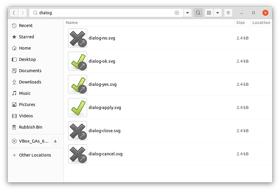
Positive checkmarks:
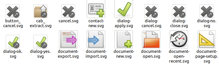
- [x] dialog-apply (THIS is the icon, the rest are "only" symlinks)
- [x] dialog-yes
- [x] dialog-ok
- [x] gtk-ok
- [x] gtk-yes
- [x] stock_calc-accept
- [x] stock_mark
- [x] stock_mail-filters-apply
- [x] stock_yes
Negative cancel X icons
- [x] window-close (THIS is the icon, the rest are "only" symlinks)
- [x] cancel
- [x] dialog-close
- [x] dialog-no
- [x] dialog-cancel
- [x] button_cancel (with _ not -)
- [x] gtk-close
- [x] stock_calc-cancel
- [x] stock_close
@ubuntujaggers and/or @madsrh please have a look in /usr/share/icons/Humanity/actions
 Feichtmeier
All 11 comments
Regarding the checkmark ✔️ there's two options:
or...
The second one is most in line with the Canonical design specs we will be discussing next week. Moving the checkmark inside the textfield isn't possible, right?

 madsrh
on 2 Jan 2020
madsrh
on 2 Jan 2020
Moving the checkmark inside the textfield isn't possible, right?
I think not, it should be a widget feature, but afaik gtk entries don't have check image inside.
 clobrano
on 2 Jan 2020
clobrano
on 2 Jan 2020
We could simply symlink to the emblem icons:
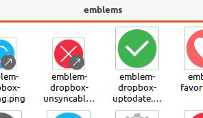
but perhaps these should also be revisited and updated with these? This green is #0e8420
https://assets.ubuntu.com/v1/5594880d-error.svg
https://assets.ubuntu.com/v1/94949185-icon-success.svg
madsrh
on 2 Jan 2020
Thinking about it: if we have a lot of green ticks and red X's that are symlinked, the origin file shouldn't be the Dropbox ones because those icons are too app-specific. As it happens the two Dropbox emblems are currently very generic so it works but we might change things later (e.g. if Dropbox develops its own widely-understood glyphs). So, IMO best practice would be:
Clone the (lovely) Dropbox emblems to make icons for dialog-apply and window-close, which will cascade through symlinks to the other use cases
Consider whether we want to make the Dropbox icons symlinks instead of having two identical icons in Yaru.
 ubuntujaggers
on 4 Jan 2020
ubuntujaggers
on 4 Jan 2020
- Clone the (lovely) Dropbox emblems to make icons for dialog-apply and window-close, which will cascade through symlinks to the other use cases
Doing a branch for this now :)
ubuntujaggers
on 4 Jan 2020
Doing a branch for this now :)
We might want to base this on the Canonical design. Which is slightly different and slightly darker. See the links above
EDIT: But it's a good point not to use Dropbox.
madsrh
on 4 Jan 2020
Should we wait till after design fest then?
ubuntujaggers
on 4 Jan 2020
Should we wait till after design fest then?
Well, it's just the two icons so we can always change this later
madsrh
on 4 Jan 2020
Well, it's just the two icons so we can always change this later
:+1: And all the folders/symlinks will still be made and work :)
ubuntujaggers
on 4 Jan 2020
Also missing is the view-refresh.svg and it's symlinks
madsrh
on 11 Jan 2020
It looks like we've missed one symlink
Feichtmeier
on 13 Feb 2020
Related issues
 eaglersdeveloper
·
3Comments
eaglersdeveloper
·
3Comments
 8none1
·
3Comments
madsrh
·
3Comments
8none1
·
3Comments
madsrh
·
3Comments
 mivoligo
·
3Comments
Feichtmeier
·
3Comments
mivoligo
·
3Comments
Feichtmeier
·
3Comments
Most helpful comment
Thinking about it: if we have a lot of green ticks and red X's that are symlinked, the origin file shouldn't be the Dropbox ones because those icons are too app-specific. As it happens the two Dropbox emblems are currently very generic so it works but we might change things later (e.g. if Dropbox develops its own widely-understood glyphs). So, IMO best practice would be:
Clone the (lovely) Dropbox emblems to make icons for dialog-apply and window-close, which will cascade through symlinks to the other use cases
Consider whether we want to make the Dropbox icons symlinks instead of having two identical icons in Yaru.