Yaru: Printer still isn't the same style as other icons
I've had numerous passes at printer and I think it's a nice set of icons, but it doesn't quite have the same style as the rest of the Suru icon sets. When you compare it to other physical objects like the camera and the keyboard it's a bit out of place.
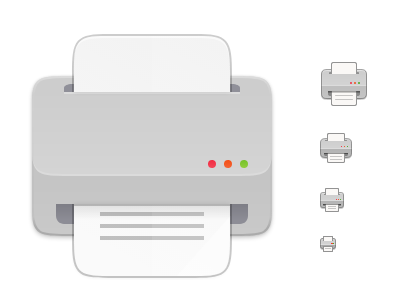
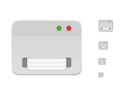
I've been working on a printer in a more abstract style - I wonder if we could use something like this:
 ubuntujaggers
All 7 comments
I can't tell if this one fits better but I understand what you're trying to do here - I do prefer the current icon.
 madsrh
on 26 Dec 2019
madsrh
on 26 Dec 2019
I think the devices icons are not bound to the 4 sizes we use (or 3? :smile: )
 Feichtmeier
on 27 Dec 2019
Feichtmeier
on 27 Dec 2019
@ubuntujaggers if you remake drive-removable-media.png to a printer icon, it will live amongst similar toned icons. Possibly those colourful buttons and lighter grey tone is making printer icon standout.
 meetdilip
on 27 Dec 2019
meetdilip
on 27 Dec 2019
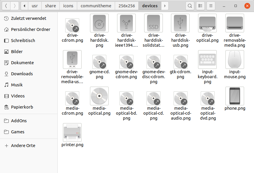
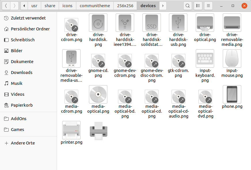
I did a mock-up 64px size

meetdilip
on 27 Dec 2019
Added it to the list
meetdilip
on 27 Dec 2019
I did a mock-up 64px size
I certainly like these proportions better than the current full size icon!
ubuntujaggers
on 27 Dec 2019
Closing for now because I can live with the printer now the larger icon has better proportions.
ubuntujaggers
on 4 Jan 2020
Related issues
Feichtmeier
·
3Comments
 YamiYukiSenpai
·
3Comments
YamiYukiSenpai
·
3Comments
 eaglersdeveloper
·
3Comments
eaglersdeveloper
·
3Comments
 8none1
·
3Comments
Feichtmeier
·
3Comments
8none1
·
3Comments
Feichtmeier
·
3Comments
Most helpful comment
I can't tell if this one fits better but I understand what you're trying to do here - I do prefer the current icon.