Yaru: :hover / :active bg_colors are hardly distinguishable in the dark shell theme
I know this is nothing serious, but it adds flavour to the UX. The below code was given to me by @Feichtmeier . I used #E95420 Ubuntu orange in the active in gnome-shell.css in gnome-shell/theme/yaru
I know I should have used it in .scss file, but when I opened gnome-shell.scss in the gnome-shell folder of the cloned folder, there was only 3 lines beginning @import
If you find this request worthy, we can have some more colours. Thanks.
.system-menu-action {
    -st-icon-style: symbolic;
    color: $fg_color;
    border-radius: 32px; /* wish we could do 50% */
    padding: 13px;
    border: 1px solid $_bubble_borders_color;

    &:hover, &:focus {
      background-color: $_hover_bg_color;
      color: $fg_color;
      border: none;
      padding: 14px;
    }
    &:active {
      background-color: $_active_bg_color;
      color: $fg_color;
    }

    & > StIcon { icon-size: 16px; }
  }
------ ISSUE TEMPLATE starts HERE ------
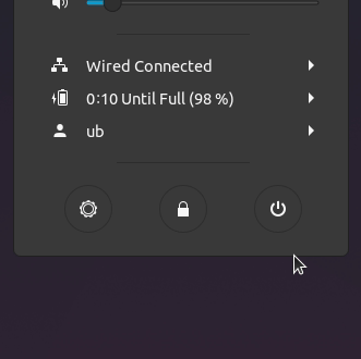
Expected Behavior

Different highlight than hover
(What you were trying to do)
Actual Behavior
hover and active has almost the same colour
(What happened instead)
Steps to Reproduce the Problem
- Try one of the actions through system menu 1. Shutdown, 2. Lock, 3. Settings
- You will see that hover and active colours are the same
1.
Software that presents the issue
- Name: Ubuntu
- Version: 18.04
Yaru version Built from Bionic day before yesterday
Please report the Yaru version in your system using one of the following commands
If you installed Yaru from PPA
$ apt show communithemeIf you installed Yaru via Snap
$ snap info communithemeI you installed from the sources, go the Yaru folder and copy the output of the following terminal command instead
$ git describe
> ~/yaru$ git describe
> r29-163-g6e63b5aa
 meetdilip
All 17 comments
Hey @meetdilip,
thanks for the idea, my point of view is the following
- why accent color only on those buttons? Menu action has other buttons whose
:activestate is the same. - we are trying first to propose changes upstream whenever possible, and I think this is one of those possible cases.
 clobrano
on 29 Nov 2019
clobrano
on 29 Nov 2019
I suggested that because 2 of them are damaging functions to some end. There needs to be some basic warning or alarm before going on. In that case, one can say that warning should come on hover than active.
Upstream means, Gnome Gitlab, right ? Let me know if you want me to do it. But I have not tired the latest Gnome ( 3.34 ? ). So I don't know what is the condition on it now.
meetdilip
on 29 Nov 2019
I suggested that because 2 of them are damaging functions to some end. There needs to be some basic warning or alarm before going on. In that case, one can say that warning should come on
hoverthanactive.Upstream means, Gnome Gitlab, right ? Let me know if you want me to do it. But I have not tired the latest Gnome ( 3.34 ? ). So I don't know what is the condition on it now.
Indeed, but when you click on switch off, there's already a popup that prevents you to do the wrong thing
Upstream means, Gnome Gitlab, right ? Let me know if you want me to do it. But I have not tired the latest Gnome ( 3.34 ? ). So I don't know what is the condition on it now.
It would be good to propose it in Gitlab yes.
clobrano
on 29 Nov 2019
If we agree that we do not want orange :active again, we can def. darken the :active gray a bit for the dark shell theme
 Feichtmeier
on 29 Nov 2019
Feichtmeier
on 29 Nov 2019
Feichtmeier
on 29 Nov 2019
Feichtmeier
on 29 Nov 2019
If we agree that we do not want orange :active again, we can def. darken the :active gray a bit for the dark shell theme
Not sure if darkening is the right direction. Isn't active > hover? Btw, I'm good with current colors
clobrano
on 29 Nov 2019
Just to get this right: this is a global color set for all :active stuff. It is not specific for the system menu icons (which will vanish with the next gnome shell version by the way =) )
https://gitlab.gnome.org/GNOME/gnome-shell/merge_requests/764/diffs
Or brightening yeah the difference is low this might be a valid issue. Prbly it's better to make the color change more visible
Edit: but this is valid for all buttons in the dark shell
Feichtmeier
on 29 Nov 2019
I guess it's again a question of the screen contrast because I can see the difference very clearly

Do you have also a problem to see the difference @clobrano @madsrh @ubuntujaggers ?
Feichtmeier
on 29 Nov 2019
If we agree that we do not want orange :active again, we can def. darken the :active gray a bit for the dark shell theme
Definitely not orange 😨There is nothing destructive about hibernating your PC IMO.
Not sure if darkening is the right direction. Isn't active > hover? Btw, I'm good with current colors
If anything I think less contrast on hover (aka a lighter color) would be a better solution, but like Carlo, I'm happy with the current.
 madsrh
on 29 Nov 2019
madsrh
on 29 Nov 2019
Aha that's a good idea - so you mean instead of changing :active, we should rather tone down :hover for the dark theme?
Feichtmeier
on 29 Nov 2019
@Feichtmeier yes and OFC lighter for the light theme
madsrh
on 29 Nov 2019
I am ok with keeping whatever we have now. What we have works great. But of all people, we cannot call Orange a destructive colour. Ubuntu is orange :)
meetdilip
on 29 Nov 2019
But of all people, we cannot call Orange a destructive colour.
Sorry, I was referring to your comment about a _damaging_ action.
I suggested that because 2 of them are damaging functions to some end.
I am ok with keeping whatever we have now.
Are you saying that we can close this issue or did @Feichtmeier want to try changing the hover?
madsrh
on 29 Nov 2019
:man_shrugging:
I can't say it's not valid. I think it's more valid for the dark theme though.
I'd say let's keep it open until the next big upstream shell sync happens and then we can see what we need to change. There is some big refactoring incoming by SNWH who wants to split the shell theme files into the amount of widgets as files
Feichtmeier
on 29 Nov 2019
@madsrh It is quite ok. I was not blaming you :)
As for closing this issue, you guys can decide. To be honest, I found the orange highlight active attractive. Probably that is the only reason I made this suggestion. But yes, everyone has their own taste. And there is brand and design principles. So, I am not worrying much about this now. :)
meetdilip
on 29 Nov 2019
Yesterday I updated to Fedora 31 and those buttons now use the selection color (blue)
clobrano
on 10 Dec 2019
Yes that's how it's in gnome shell master for all things in shell popups
Yet we decided to go back to gray/dark gray for hover/active for gtk popovers and shell popups for 19.10 like in Yaru 1.0
It's a less invasive change for gtk as there are colours in _colors.scss for this
For 20.04: those buttons don't exist anymore in gnome shell master :)
But for all other things we could discuss if we want to keep gray/light gray or get back to gray/orange
Feichtmeier
on 10 Dec 2019
Related issues
 pojntfx
·
3Comments
pojntfx
·
3Comments
 chrisjbillington
·
3Comments
chrisjbillington
·
3Comments
 matthewpaulthomas
·
3Comments
Feichtmeier
·
3Comments
madsrh
·
3Comments
matthewpaulthomas
·
3Comments
Feichtmeier
·
3Comments
madsrh
·
3Comments
Most helpful comment
Aha that's a good idea - so you mean instead of changing :active, we should rather tone down :hover for the dark theme?