First of all, you guys are doing a fantastic job on the theme! I think it is great that you are simplifying things by sticking closer to Adwaita, and I like the new light/dark split that results from the change.
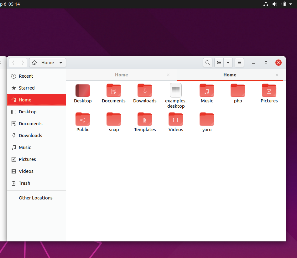
However, the silver look to the new light theme seems cold, and while it looks good with the black shell theme, it kind of clashes with the colorful orange. Maybe I'm wrong about that, but what if you used the warm grey colors from the Ubuntu palette? Like so:
Warm:

Cold (original):
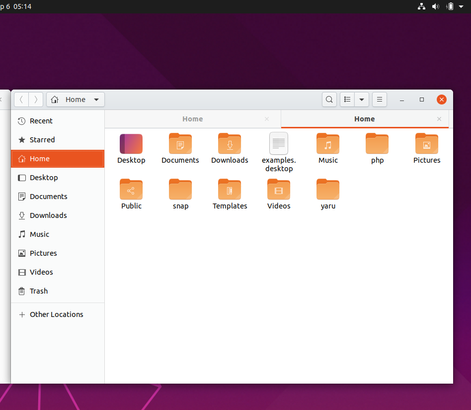
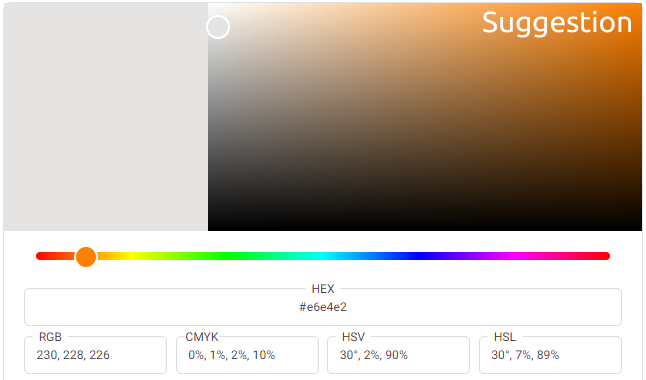
The changes bring back some of the old Radiance (but not too much!) and all it took was to change the headerbar color to Warm Grey 30% (#E6E4E2) and the sidebar/tabs to Warm Grey 10% (#F6F6F5). I left the silver on the buttons alone because it actually provides a really good contrast to the warmer grey.
It is a subtle change, and perhaps not worth making, but I thought I would throw it out there and see what you think. In my opinion, it even improves the contrast a bit because now the sidebar is further removed from the white background. Or maybe I am wrong and silver is more modern and clean and I am just reaching back for nostalgia reasons. Perhaps I should "let the past die", as Kylo says lol. I am undecided about it actually, but I thought it would be interesting to bring up and see what others thought.
I don't mention the dark theme because it is actually quite warm already imo.
All 4 comments
As a follow up, I realized that maybe part of the reason it seems so off to me is that red and silver/white are often paired together, and my subconscious is rebelling against the orange being there haha. I tested the theory, and... maybe that's indeed part of it. It seems like the red is better paired with the colder colors. (now I want to read some color theory) If the difference between the two oranges is subtle, try comparing the red/silver to the orange/warm grey. Even the buttons look warmer, though that is an illusion since they are precisely the same silver color in all three images.
Hi, thanks for the kind words and participation!
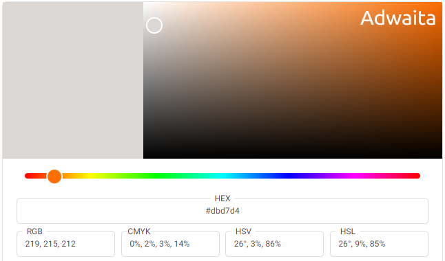
If you are referring to the big orange bars.... Upstream plans to make them all look like when you use nautilus with adwaita
https://gitlab.gnome.org/Teams/Design/os-mockups/issues/16
(A soft gray)
Also there isn't always a sidebar by the way. But yeah it's a very common pattern in most of the modern gnome apps.
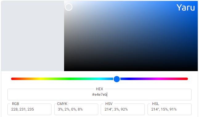
The brownish headerbar may fit better to the orange but it looks a little bit old school to me. The blueish headerbar gives the whole desktop a rather fresh look.
I recommend to try it live, referring only to the screenshots has its limits.
Thanks for doing this work @ElectricGestalt 👍
The brownish headerbar may fit better to the orange but it looks a little bit old school to me. The blueish headerbar gives the whole desktop a rather fresh look.
I have to agree with Frederik for now, that the current color gives it a more modern look. It's the #1 feedback we've gotten and we know it's a bold choice. The blue color is not something new in Yaru because we already use bright blue for scales/progressbars.
We are in UI freeze atm so we have the whole next cycle to do experiments with the colors 😃
The brownish headerbar may fit better to the orange but it looks a little bit old school to me. The blueish headerbar gives the whole desktop a rather fresh look.
Oh yes I thought you might be going for that. Carry on then! :)
I have to agree with Frederik for now, that the current color gives it a more modern look. It's the #1 feedback we've gotten and we know it's a bold choice. The blue color is not something new in Yaru because we already use bright blue for scales/progressbars.
Yes, bold new change is scary haha. I figured you guys might be going for modern/clean, and I respect that. I look forward to the new themes, and thank you again for your work!
Most helpful comment
Oh yes I thought you might be going for that. Carry on then! :)
Yes, bold new change is scary haha. I figured you guys might be going for modern/clean, and I respect that. I look forward to the new themes, and thank you again for your work!