Yaru: The orange folder icon in Yaru is too intense to watch, it should be toned down a bit
The nice short title is taken from the hub.
That intense orange is mostly suitable for small things (like selections, underlines).
It’s very flashy and it’s OK for kids, but for an employee who works 8 hours with Nautilus in full screen (and with many folders) it is the predominant color on the entire screen and it is really hard to look at for a long time.
As much as I agree with this, I think we should keep the orange folders (unless someone has a good alternative), BUT tone down the color _slightly_.
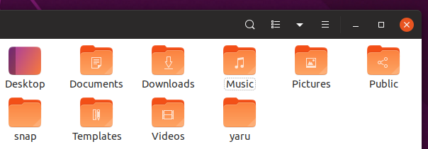
Current:
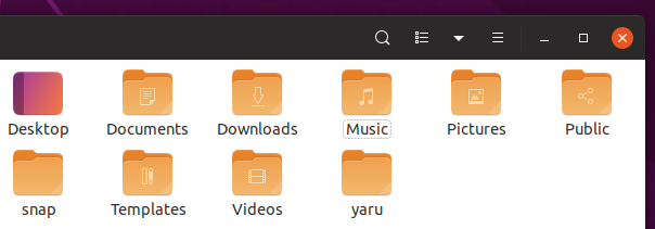
Suggestion:

Alternative suggestion:
_Note:_ These are quick mockups, so I've simply added a color overlay which means that the white symbolic icon is colored too. These would ofc be crystal clear in the final version.
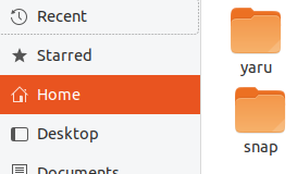
EDIT: I forgot to add the "orange stab" sidebar for comparison
 madsrh
All 7 comments
@madsrh

?
EDIT: And one of the glyph ones:

 ubuntujaggers
on 25 Apr 2019
ubuntujaggers
on 25 Apr 2019
Looks great @ubuntujaggers :tada:
There's a ton of different folder icons - do you have time to create a PR with this color change (if @clobrano also approves)?
You are targeting the "suggestion" mockup, right? Would you say that the "Alternative suggestion" is too much? I think that it might be better because it's more neutral 🤷♂️IDK, perhaps too yellowish
madsrh
on 25 Apr 2019
Yep, I pipetted colours from the first mockup for starters - we could try that in a test PR and then try the second one too?
ubuntujaggers
on 25 Apr 2019
Yes! +1 Let's do that
madsrh
on 25 Apr 2019
I don't agree. Suggested colors looks faded and ugly to look at. Current color is so much better and I've never had problem with It's intensity so I downvote for this one change.
 tomkra
on 28 Apr 2019
tomkra
on 28 Apr 2019
Suggested colors looks faded and ugly to look at
I think that "faded" was the goal of the change, I don't agree about the "ugliness", which is an unnecessary word other than rather subjective.
 clobrano
on 28 Apr 2019
clobrano
on 28 Apr 2019
Closed by https://github.com/ubuntu/yaru/pull/1316
madsrh
on 29 Apr 2019
Related issues
 Feichtmeier
·
3Comments
Feichtmeier
·
3Comments
Feichtmeier
·
3Comments
Feichtmeier
·
3Comments
Feichtmeier
·
3Comments
Feichtmeier
·
3Comments
 sicklylife-jp
·
3Comments
sicklylife-jp
·
3Comments
 pojntfx
·
3Comments
pojntfx
·
3Comments
Most helpful comment
@madsrh
?
EDIT: And one of the glyph ones: