Expected Behavior
Resized naultilus window, and expected the "Home" button to stay far left, and the search button far right.
Actual Behavior
When you resize nautilus, it looks like it has a max width for the pathbar+search icon and so tries to center these if the window is too wide. This looks OK with Adwaita, but horrible with Yaru.
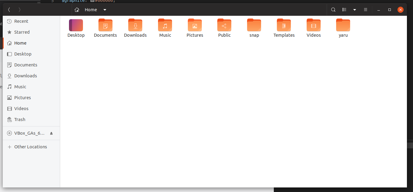
Yaru:

Adwaita:

With adwaita, when the path bar is centered the background of the whole widget is drawn. With Yaru, it appears as if the "Home" and "search" icons are just placed randomly. There should at least be a border drawn to connect the two.
Steps to Reproduce the Problem
- Open nautilus
- Resize to sufficient width/
Specifications
Yaru, and Ubuntu session, are from an upgraded 18.10 -> 19.04 install.
 CDrummond
All 10 comments
Hi @CDrummond, you're right, we probably need to bring back pathbar background to fix this
 clobrano
on 20 Apr 2019
clobrano
on 20 Apr 2019
There is a style class for the expanded mode... Or a state. Need to ninja the code from adwaita :)
 Feichtmeier
on 20 Apr 2019
Feichtmeier
on 20 Apr 2019
it's .width-maxized
Tried different stylings with bg and borders but ended up with this solution :man_shrugging:
Adwaita has a different padding/margin of buttons so there is still space left
Any other ideas very welcome
Feichtmeier
on 21 Apr 2019
Not sure about this solution. This new vertical line looks like the usual separator (like in gedit or settings) but isn't aligned (and it can't be aligned). Il propose something in the next days
clobrano
on 21 Apr 2019
The problem with a background is that the pathbar is much bigger than the buttons. Resulting in a big surface being highlighted, which completely ruins the minimalistic and clean look we have now.
The style class .width-maxmized is attached to the pathbar, not the buttons inside the pathbar. : /
Feichtmeier
on 22 Apr 2019
What about this?
This means to go back to pathbar in buttonbox style, because otherwise the underline effect will clash with the path-bar-box border, but it doesn't seem too bad to me
clobrano
on 22 Apr 2019
This would also bring 100% consistency to the headerbar buttons no matter where they are in. It looks just as good as the stackswitcher. It's sad to see the underline go but this makes just sense
Feichtmeier
on 22 Apr 2019
But the double layered BG looks strange. I think a border should be enough for the expanded pathbar
Edit: the :last-child button should also have it's border radius axed :) (like in adwaita)
Feichtmeier
on 22 Apr 2019
Update: (sorry for auto-closing)
Thanks to @clobrano we now have the same look of buttonbox linked buttons and stackswitcher .linked buttons for the pathbar .linked buttons!
Sadly the border around the pathbar produces some bug so we've cut this part
I am not 100% sure but I think adwaitas latest release also removed the border around the whole pathbar
Feichtmeier
on 10 Jun 2019
Closing this as it is not happening anymore with new master branch (refreshed from upstream)
In bionic this can't happened with that old nautilus version (except someone installs a flatpak)
Feichtmeier
on 6 Aug 2019
Related issues
 chrisjbillington
·
3Comments
Feichtmeier
·
3Comments
chrisjbillington
·
3Comments
Feichtmeier
·
3Comments
 snydox
·
3Comments
Feichtmeier
·
3Comments
snydox
·
3Comments
Feichtmeier
·
3Comments
 eaglersdeveloper
·
3Comments
eaglersdeveloper
·
3Comments
Most helpful comment
This would also bring 100% consistency to the headerbar buttons no matter where they are in. It looks just as good as the stackswitcher. It's sad to see the underline go but this makes just sense