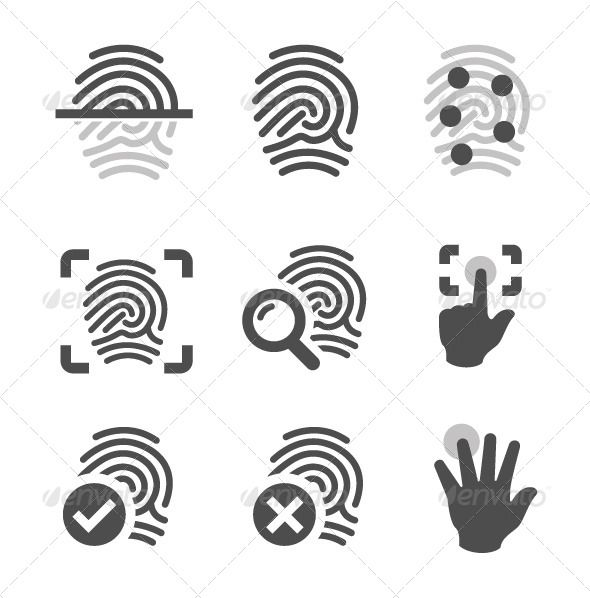
In Adwaita:

All 10 comments
@eaglersdeveloper Why change this? Does it look out of style in Yaru? Perhaps post a screenshot for reference.
IMO the Adwaita icon look fine because I have no idea how a suru style fingerprint icon look.
We could make it less thick. Adwaita symbolic icons are always very thick, no idea why
no idea why
This is the corporate GNOME's style
no idea why
adwaita has been focused much more on the most functional implementations rather than ones with stylistic flair for a while (until the new upcoming revamp). as such, through their experimentation and research, they found that thick symbolics were important for low resolution screens or other places where thin line weights would be more unreadable.
Yeah but it doesn't really fit into the other thin Suru styled symbolic icons
Which come from Ubuntu touch as a little reminder and work pretty well on the Ubuntu phone ;)
I don't really understand why thick icons are good for LOW resolution screens but it doesn't really matter after all since this issue is about the missing icon and yes it's missing.
So feel free to provide it @eaglersdeveloper or @ubuntujaggers
(General disclaimer that will be a sticky on the hub soon: if you want a pure gnome experience install gnome-session which includes unmodified gtk, shell and icon themes)
@ubuntujaggers do you think that these many lines actually work with 1px strokes?
If not please close this
I had a go at drawing a fingerprint in the Yaru style in case I could beat the feature freeze but no luck yet. Doesn't mean it's impossible, just haven't succeeded so far :) I wondered if a hand like this 👆 with something emphasising the finger would do?
I wondered if a hand like this 👆 with something emphasising the finger would do?
Perhaps something like this:

I also like the first one below similar to our scanner icon:

We could make it less thick. Adwaita symbolic icons are always very thick
Did you already do this @Feichtmeier ?
I did it some days ago, but I can't find the icon anymore. Let me try again
Most helpful comment
Yeah but it doesn't really fit into the other thin Suru styled symbolic icons
Which come from Ubuntu touch as a little reminder and work pretty well on the Ubuntu phone ;)
I don't really understand why thick icons are good for LOW resolution screens but it doesn't really matter after all since this issue is about the missing icon and yes it's missing.
So feel free to provide it @eaglersdeveloper or @ubuntujaggers
(General disclaimer that will be a sticky on the hub soon: if you want a pure gnome experience install gnome-session which includes unmodified gtk, shell and icon themes)