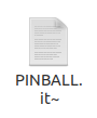
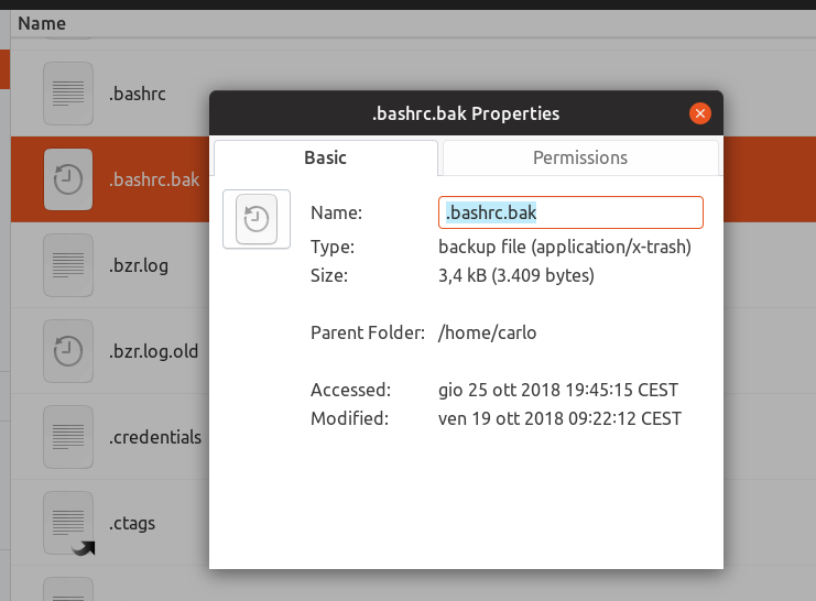
MIME Type: application/x-trash
$ git describe && lsb_release -rci
18.10.7-180-g038e0c1a
Distributor ID: Ubuntu
Release:    18.04
Codename:   bionic
 vitalkanev
All 35 comments
@ubuntujaggers @eaglersdeveloper :D
 Feichtmeier
on 7 Dec 2018
Feichtmeier
on 7 Dec 2018
This is Awdaita

 clobrano
on 8 Dec 2018
clobrano
on 8 Dec 2018
 eaglersdeveloper
on 8 Dec 2018
eaglersdeveloper
on 8 Dec 2018
Yeah I know - activity on suru is pretty low currently. We could push it here first, and make a PR after on Suru - instead of doing it the other way around like you did with the last 10 pull requests @eaglersdeveloper ? ;) What do you say?
When changes are applied upstream to icons we already pushed here, we can always decide if we overwrite our stuff with the upstream changes but currently - targeting 19.4 - I think we should go for PR-here->thenupstream
Feichtmeier
on 8 Dec 2018
Do you guys like something like this instead of a plain text icon ?
 meetdilip
on 8 Dec 2018
meetdilip
on 8 Dec 2018
Is the answer just to clone the normal (Suru) icon to this position, like Adwaita does? I'm not sure I understand the symbolic logic of the one on Filefinder...?
 ubuntujaggers
on 8 Dec 2018
ubuntujaggers
on 8 Dec 2018
Hmmm maybe the same icon but with @meetdilip 's glyph
Feichtmeier
on 9 Dec 2018
Sorry @meetdilip, but I don't think that icon would be nice in suru. Is there any example from most used icons set?
clobrano
on 9 Dec 2018
Consider that this files are usually hidden. I'd say that we can even keep it as it is
clobrano
on 9 Dec 2018
I think he means only the shape as a glyph
Like this icon but instead of the (C) that backup icon but in "suru" style (thinner)

Feichtmeier
on 9 Dec 2018
I meant the above. The file background and a time indicator glyph instead of the copyright symbol in the icon by @Feichtmeier
@clobrano Attached what Papirus does
meetdilip
on 9 Dec 2018
I thought the icon should say that it is a document, from an older time. Here is a mockup

meetdilip
on 9 Dec 2018
If you like it white

meetdilip
on 9 Dec 2018
Maybe we can "steal" design from Breeze icons
vitalkanev
on 9 Dec 2018
I think putting a "turn back the clock" glyph on the mimetype for a normal document would be really easy, happy to do that in the coming week?
ubuntujaggers
on 9 Dec 2018
Easy to confuse with the thumbnail loading icon.
eaglersdeveloper
on 10 Dec 2018
Maybe we can use the recycle icon? See my comment above
понедельник, 10 декабря 2018г., 12:58 +03:00 от Eaglers [email protected] :
Easy to confuse with the thumbnail loading icon.
—
You are receiving this because you authored the thread.
Reply to this email directly, view it on GitHub , or mute the thread .
vitalkanev
on 10 Dec 2018
We could also make a glyph out of one of these icons:
https://github.com/ubuntu/yaru/blob/master/icons/src/scalable/source-symbolic.svg
For example the floppy symbolic is pretty common for "saved" or "safe" (even if the kids don't even know what that floppy is ;D )
Feichtmeier
on 10 Dec 2018
...a "turn back the clock" glyph on the mimetype...
+1 for the "turn back the clock" idea. A quick Google search also implies that it's the most common used one.
 madsrh
on 11 Dec 2018
madsrh
on 11 Dec 2018
The mimetypes seem mostly very simple - just a glyph on a white "rectircle":

So maybe it should be as simple as:

?
ubuntujaggers
on 12 Dec 2018
the latter looks better to me
On Wed, 12 Dec 2018 at 13:19, ubuntujaggers notifications@github.com
wrote:
The mimetypes seem mostly very simple - just a glyph on a white
"rectircle":[image: copying]
https://user-images.githubusercontent.com/38893390/49869353-14629a80-fe08-11e8-8fd1-4bd1e4e4e0f6.pngSo maybe it should be as simple as:
[image: backup]
https://user-images.githubusercontent.com/38893390/49869367-1d536c00-fe08-11e8-8d4c-457225eaf63b.png?
—
You are receiving this because you were mentioned.
Reply to this email directly, view it on GitHub
https://github.com/ubuntu/yaru/issues/1025#issuecomment-446568484, or mute
the thread
https://github.com/notifications/unsubscribe-auth/ACwAHhe8ZwgWonOrA7fsBkig__2ljiFIks5u4PRUgaJpZM4ZI3iR
.
clobrano
on 12 Dec 2018
Okay, I'll do a PR today :)
ubuntujaggers
on 12 Dec 2018
Is the circle a bit asymmetric ? The bottom part seems to be stretched and long. Or is it just an illusion ?
meetdilip
on 13 Dec 2018
I prefer make as in Humanity: make the file icon translucent.
eaglersdeveloper
on 14 Dec 2018
@meetdillip It is long - I thought it best to copy exactly the dimensions of the circle from the existing Copying icon shown above - what does everyone think?
ubuntujaggers
on 14 Dec 2018
Oh, maybe the hands of the clock could be lower, is that what you mean?
ubuntujaggers
on 14 Dec 2018
@ubuntujaggers I meant the partial circle with arrow. It looks a bit stretched at the bottom. Oval than a circle.

meetdilip
on 14 Dec 2018
Oh yeah, it's definitely an oval, happy to redraw that if people don't like it. I literally took/edited the "circle" (really an oval) from the existing icon.
ubuntujaggers
on 15 Dec 2018
Hi guys,
Do we want a PR for this one or more mockups?
ubuntujaggers
on 19 Dec 2018
To show mockups I prefer a PR :) the bug is more for describing the problem
clobrano
on 19 Dec 2018
Ah, okay, I've been doing it wrong lol. I'll make a PR as soon as I get chance, having a bit of drama today with a leaky roof!
ubuntujaggers
on 19 Dec 2018
Fixed with #1061
Feichtmeier
on 27 Dec 2018
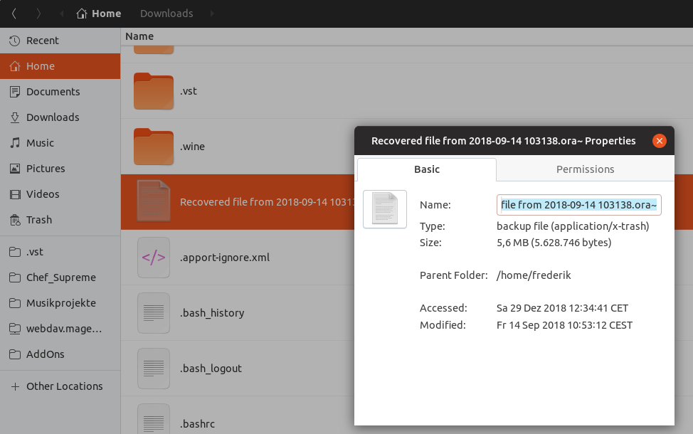
Hmmm... @clobrano with which icon did you test it? Does not work for the mypaint backup files here
Feichtmeier
on 1 Jan 2019
EDIT: let me double check, I might have an old series of file application-x-trash in my system
clobrano
on 2 Jan 2019
My bad, I had old application-x-trash.png images that where the one working. I'll propose a patch right away
clobrano
on 2 Jan 2019
Related issues
eaglersdeveloper
·
3Comments
Feichtmeier
·
3Comments
Feichtmeier
·
3Comments
 chrisjbillington
·
3Comments
chrisjbillington
·
3Comments
 CDrummond
·
3Comments
CDrummond
·
3Comments
Most helpful comment
I think putting a "turn back the clock" glyph on the mimetype for a normal document would be really easy, happy to do that in the coming week?