GtkButtons currently have the following styling:
Normal - 1 level above main layer
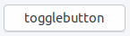
Active - 1 level below main layer
So we press the button 2 layers/levels down
Do we really need that black top border?
Since the normal buttons are already "1 level above" the window layer, meaning 1 bit closer to the user if there would be a z-axis, wouldn't a press effect, that simply presses the button down TO THE layer of the rest enough?
Which would look like this:
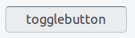
Normal - 1 level above main layer
Active - on the main layer
Now we would press the button 1 layer/level down
@madsrh @clobrano ?
Post 18.10 discussion ofc :)
 Feichtmeier
All 10 comments
Feichtmeier
on 4 Oct 2018
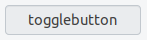
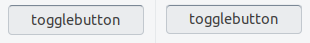
Current effect looks a bit too much in my opinion, for example near other borders:
Feichtmeier
on 4 Oct 2018
I'll appreciate it to be left as is. it helps me when I get that extra feedback for pressed btn.
 Paz-it
on 4 Oct 2018
Paz-it
on 4 Oct 2018
I'm in doubt here 🤔 It looks better for sure, but with the current design I really like the extra usability - it's just obvious. We could (as we do with everything else) test it and see how it feels 🤷♂️
 madsrh
on 5 Oct 2018
madsrh
on 5 Oct 2018
I agree with Mads, I like the 3d effect for usability
 clobrano
on 5 Oct 2018
clobrano
on 5 Oct 2018
How about lightening the top border a bit? When in clashes with the left and right borders it looks like there is a pixel missing
It looks not as sharp as it could look
Feichtmeier
on 5 Oct 2018
I think it helps when there are disabled buttons around, but we can try to tweak it
clobrano
on 11 Oct 2018
I think it's perfect as is, it's very obvious and for some reason, really satisfying to look at for me.
To help with the sharpness, maybe a box-shadow on top might help refine the top corners? I can't test it right now but just an idea.
 godlyranchdressing
on 12 Oct 2018
godlyranchdressing
on 12 Oct 2018
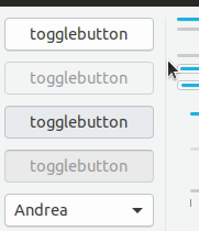
No luck. It looks about the same (slightly making the blur even more noticeable if you look closely) . The box-shadow attempt is on the right, and I had to do border-top-color: transparent or else the dark border on top would be 2px tall.
Edit: So I think we'll just have to live with it. :man_shrugging:
godlyranchdressing
on 13 Oct 2018
We could try to lower the darkness of the top border so the difference between the border and the top border is less leveling. Otherwise just close it. I think everyone beside me is liking it no use from my point of view to stress this any further =)
Feichtmeier
on 14 Oct 2018
Related issues
 matthewpaulthomas
·
3Comments
Feichtmeier
·
3Comments
matthewpaulthomas
·
3Comments
Feichtmeier
·
3Comments
 mivoligo
·
3Comments
mivoligo
·
3Comments
mivoligo
·
3Comments
mivoligo
·
3Comments
 snydox
·
3Comments
snydox
·
3Comments
Most helpful comment
I'm in doubt here 🤔 It looks better for sure, but with the current design I really like the extra usability - it's just obvious. We could (as we do with everything else) test it and see how it feels 🤷♂️