Yaru: Current Nautilus new-tabs - some thoutghs
After taking some time to get used to the recent tabs change, I must say that all notebooks looks fantastic but one. Maybe it's only me but something bothers me in Nautilus appearance.
Some examples :
I have a radical idea - What if we change the path-bar to look like text-buttons color-wise and behaviour-wise as well? 
 Paz-it
All 11 comments
Could you explain better what's the issue?
 clobrano
on 6 Sep 2018
clobrano
on 6 Sep 2018
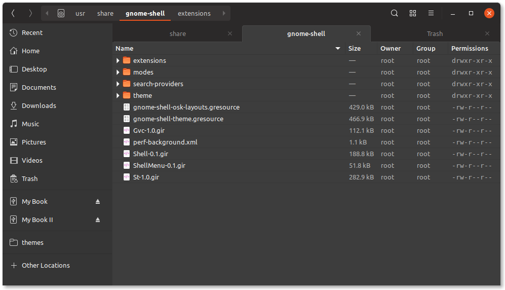
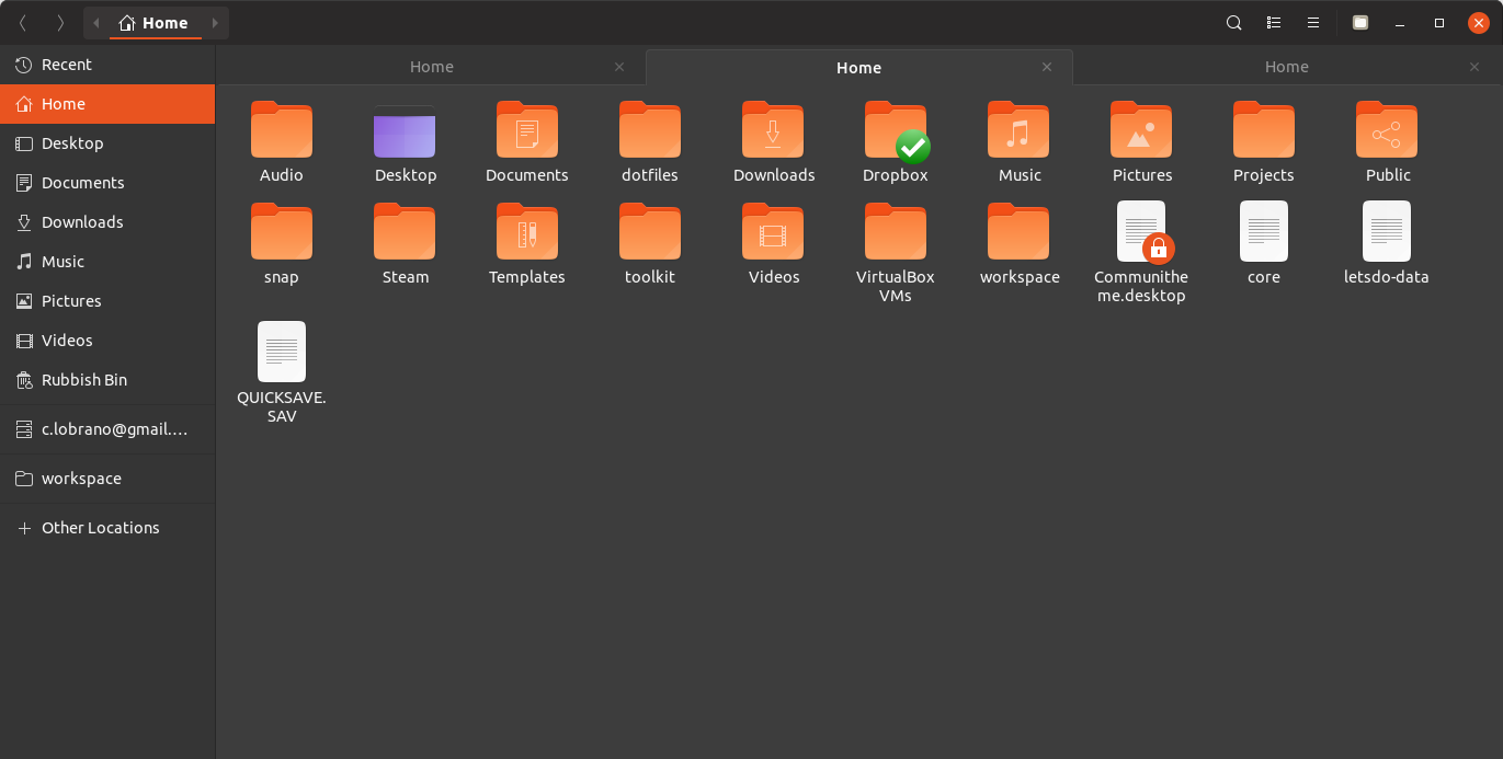
I think pazit is talking about this picture:

Where the overall color composition COULD look a bit weird. If you look from top to bottom you have several color layers which MIGHT let you question which elements belongs to which layer/container. I don't have this feeling but I can understand where she is coming from
 Feichtmeier
on 6 Sep 2018
Feichtmeier
on 6 Sep 2018
I don't think that recoloring the pathbar would have a positive impact.
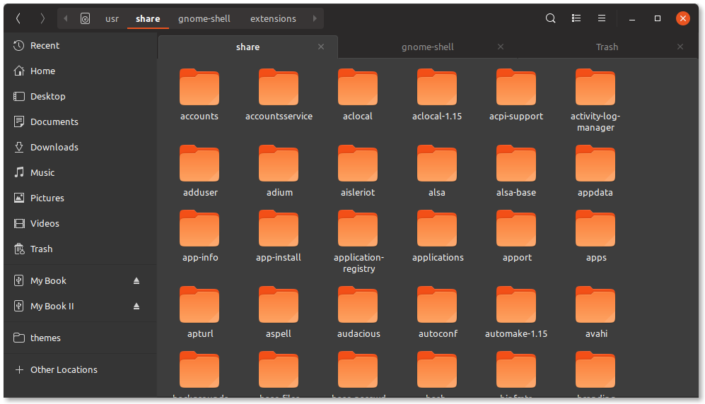
This is only a "problem" in the dark theme by the way. The light theme does not have it, because the headerbar is colored completely different than the rest of the window:
Hm, but we could color the background of not selected tabs like the dark sidebar color. This COULD work
Feichtmeier
on 6 Sep 2018
In the light theme the layers are pretty clear. I think now my brain nailed what pazit wanted to say, am I correct, @Paz-it ?
Feichtmeier
on 6 Sep 2018
Right to the point @Feichtmeier !
Thanks!
Hm, but we could color the background of not selected tabs like the dark sidebar color. This COULD work.
Worth trying!
Paz-it
on 6 Sep 2018
I would leave this open for @clobrano to decide and to implement. I can live with the current solution and the complexity of the apps styling makes me fear I could introduce more mistakes before UI freeze.
I'll focus on things I am sure it works without mistakes until then
Feichtmeier
on 6 Sep 2018
I'll try
clobrano
on 6 Sep 2018
I made some tests. Considering that this is current state

I think we can't have a good solution that would be the same for all the notebooks.
While for Nautilus and Gedit, this could be a good change (I made some more changes in gedit to make the sidebar exactly the same as nautilus and the same as its status bar)...
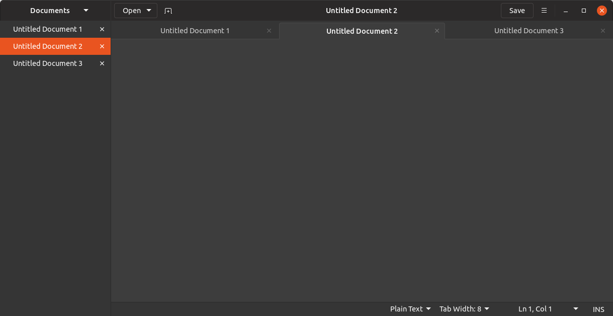
... this wouldn't work for terminal
that will stay as it is now
Here is widget factory for reference

To me, the effect is less pleasant in notebooks like the ones in widget factory, however it might be actually tidier on Nautilus and Gedit (which are among the most used applications)
what are your thoughts?
clobrano
on 7 Sep 2018
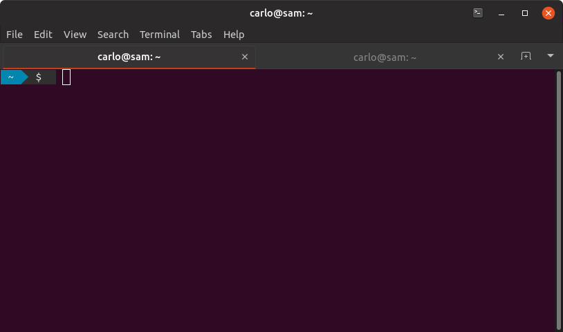
I like it (https://user-images.githubusercontent.com/2883614/45234307-9ad18280-b2d5-11e8-93d0-ac023198c7df.png)
I noticed one minor issue:

The border is ending 1 or 2 pixels too early.
Could this be fixed by using an inset box-shadow for tabs inset of a border?
Feichtmeier
on 7 Sep 2018
I think it's just round. It's the same on the other side
clobrano
on 7 Sep 2018
+1 for changing only Nautilus and Gedit. All other notebooks and Treminal looks perfectly good as is.
Well done @clobrano ! :dancer:
Paz-it
on 8 Sep 2018
Related issues
Feichtmeier
·
3Comments
 madsrh
·
3Comments
madsrh
·
3Comments
 eaglersdeveloper
·
3Comments
eaglersdeveloper
·
3Comments
 chrisjbillington
·
3Comments
chrisjbillington
·
3Comments
 matthewpaulthomas
·
3Comments
matthewpaulthomas
·
3Comments
Most helpful comment
I would leave this open for @clobrano to decide and to implement. I can live with the current solution and the complexity of the apps styling makes me fear I could introduce more mistakes before UI freeze.
I'll focus on things I am sure it works without mistakes until then