Yaru: Button hover effect too strong in dark theme? [Discussion]
Again, not an issue. I tend to find the 3d hover effect for gtk buttons a bit too harsh (too black) in the dark variant of Yaru. It looks more subtle and "natural" in the regular light theme.
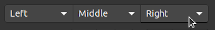
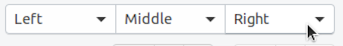
Not really apparent in pictures and I'm not the giffy guy. Look at it in person... 😝
 ya-d
ya-d
All 5 comments
I think you should consider that the background in dark variant is... Dark :D so a lighter effect won't be visible enough.
 clobrano
on 28 Aug 2018
clobrano
on 28 Aug 2018
Sure, it just feels like pure black instead of a drop shadow to me (even if its not). In the regular theme it looks more balanced IMHO which is why I would opt for a slightly less dark grey/black hue.
ya-d
on 28 Aug 2018
just a general note: could we please chill a bit with the colors. I assign some of the new dark issues to me, but the colors are used in the strangest places. Let's not rush colors or anything only because UI freeze is soon. Atm we got a pretty solid composition, but I look into this button hover in drawing
 Feichtmeier
on 29 Aug 2018
Feichtmeier
on 29 Aug 2018
can we close this? I think that colors are fine now
clobrano
on 15 Sep 2018
Thanks for being open to this ❤️
ya-d
on 17 Sep 2018
Related issues
 mivoligo
·
3Comments
mivoligo
·
3Comments
 eaglersdeveloper
·
3Comments
eaglersdeveloper
·
3Comments
 sicklylife-jp
·
3Comments
sicklylife-jp
·
3Comments
 CDrummond
·
3Comments
CDrummond
·
3Comments
 snydox
·
3Comments
snydox
·
3Comments
Most helpful comment
just a general note: could we please chill a bit with the colors. I assign some of the new dark issues to me, but the colors are used in the strangest places. Let's not rush colors or anything only because UI freeze is soon. Atm we got a pretty solid composition, but I look into this button hover in drawing