Yaru: Tab implementation slightly differs for regular and dark theme
Just an observation, I'm not sure if this is an oversight or if there is good reason to it.
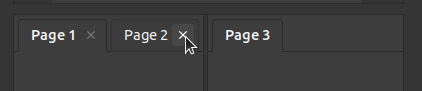
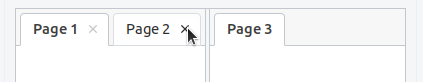
- The "close tab" button has a different hover effect for dark (lighter text color + grey background) and regular (only different text color) theme variant.
- Tab bars in dark theme share the background with their "content"/widget part while in the regular theme they use the background color of the window.
 ya-d
ya-d
All 4 comments
We can't replicate all the effects in both variants because of the difference in colors.
Here for instance it is impossible to make light background brighter (light variant), but that doesn't mean that the effect is bad and should be removed from the dark variant IMO.
 clobrano
on 28 Aug 2018
clobrano
on 28 Aug 2018
👍2
The equivalent hover effect for the light theme would be grey of of course (like it is in menus for example).
ya-d
on 28 Aug 2018
Of course, but grey doesn't look as good as the brighter color in dark variant I think
clobrano
on 29 Aug 2018
👍2
Closing this
clobrano
on 1 Sep 2018
Was this page helpful?
0 / 5 - 0 ratings
Related issues
 eaglersdeveloper
·
3Comments
eaglersdeveloper
·
3Comments
 madsrh
·
3Comments
madsrh
·
3Comments
 Feichtmeier
·
3Comments
Feichtmeier
·
3Comments
 Muqtxdir
·
3Comments
Feichtmeier
·
3Comments
Muqtxdir
·
3Comments
Feichtmeier
·
3Comments
Most helpful comment
Of course, but grey doesn't look as good as the brighter color in dark variant I think