Yaru: Improvements to (new) button box styling (or: consolidate toggled buttons)
While its a pitty that Software lost its (fake) stack switcher you came up with a universal, pragmatic and good looking solution for button boxes. 👍 I think it could be further improved by making the toggled state either weaker or stronger.
Currently there are three different styles for toggled header bar buttons which should be consolidated IMHO.
Regular buttons:
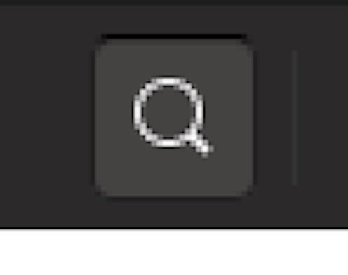
Text Buttons:
Button box:
1. Since regular buttons give the clearest and most visible indication of a toggled state I would go that route and make text und box buttons the same: strong dark shadow plus dark border. That means removing the grey border for both text buttons and button boxes while toggled. Darkening all four sites would especially improve separation to the left and right element for button boxes.
2. If there is some intention behind the more subtle toggled text button style that could be another option for button boxes as I think the current grey plus dark border looks weird. I prefer option 1 though.
 ya-d
ya-d
All 4 comments
@clobrano MIGHT come up with a global solution for all things in the headerbar (except stackswitchers) soon :D ( flat ... )
 Feichtmeier
on 28 Aug 2018
Feichtmeier
on 28 Aug 2018
Hey @ya-d, you're right, we were discussing this a couple of weeks ago. The difference comes from the button border, which was already present (and for valid a reason IMHO) in text-buttons and now it is present in buttonbox to link the group together (happy that you like it as well :wink:)
Removing this border only in pressed state would create an optic effect so that the button looks smaller (since the context of headerbar is already dark), so we thought that the best solution would have been to go completely flat and just signal the pressed state with the background color change. However, since the flatness of headerbar buttons has been discussed a lot (and in the opposite direction), I waited before proposing this change.
I'll do it however in a coming PR
 clobrano
on 28 Aug 2018
clobrano
on 28 Aug 2018
I was investigating that too lately, but because I just cannot get totally used to the inner-shadow effect in the buttons - seems to jump out of the all flat style.
The point for me is just to not have two ways to show the state if one is enough and fits better the rest of the system.
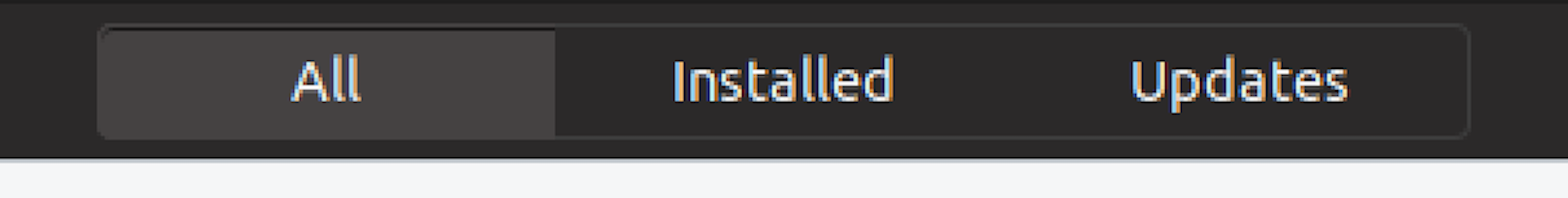
I like the grey border an the bright click/hover background, but especially in the button-box (like in software "All | Installed | Updates" the inner shadow just is not fitting well.
I would try to keep everything flat and keep a simple state/switch status without inner-shadow and than bring that style also to places like the background-choose-window, ToDo app, text buttons. Maybe the orange line we did choose months ago isn't that fitting anymore ;-P
Question is: Is the active state enough visible without the inner-shadow? But could be enough, because of the difference between the button with grey boarder only and the bright background...
You thoughts?
 Luxamman
on 28 Aug 2018
Luxamman
on 28 Aug 2018
Yes I would love to try the full flat headerbar, too.
We have the border for the buttonbox and certain text buttons and this should not change.
Neither should the stack switcher change.
In my opinion the only solution for everything is just
Transparent for not pressed, base_hover_color for hover and base_active_color for active. This should work everywhere (but let's just wait for carlo, I bet he comes up with a nice solution)
Feichtmeier
on 28 Aug 2018
Related issues
 Muqtxdir
·
3Comments
Muqtxdir
·
3Comments
 madsrh
·
3Comments
Feichtmeier
·
3Comments
madsrh
·
3Comments
Feichtmeier
·
3Comments
 snydox
·
3Comments
Feichtmeier
·
3Comments
snydox
·
3Comments
Feichtmeier
·
3Comments
Most helpful comment
I was investigating that too lately, but because I just cannot get totally used to the inner-shadow effect in the buttons - seems to jump out of the all flat style.
The point for me is just to not have two ways to show the state if one is enough and fits better the rest of the system.
I like the grey border an the bright click/hover background, but especially in the button-box (like in software "All | Installed | Updates" the inner shadow just is not fitting well.
I would try to keep everything flat and keep a simple state/switch status without inner-shadow and than bring that style also to places like the background-choose-window, ToDo app, text buttons. Maybe the orange line we did choose months ago isn't that fitting anymore ;-P
Question is: Is the active state enough visible without the inner-shadow? But could be enough, because of the difference between the button with grey boarder only and the bright background...
You thoughts?