Yaru: Insensitive borders does not look insensitive
It's a bit odd that the insensitive spinbutton border is darker than the active one - IMO it makes it look active.
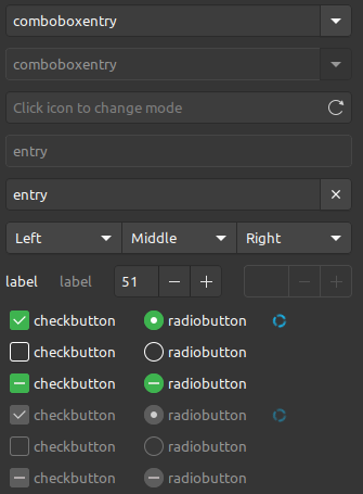
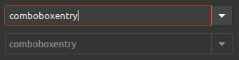
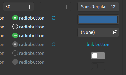
Current:
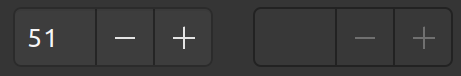
If I switch the borders (dark border on active and gray border on insensitive)
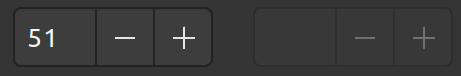
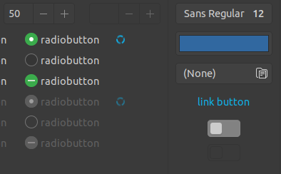
Here's the current (for reference):

Perhaps doing something like this?
This is just extending the already used border color from the dropdown arrow:
I also tried a brighter border, but that didn't work: 🗑
@Feichtmeier ?
Also shouldn't the background be transparent like with the switches? Or is it fine because radios have a lighter background too 🤷♂️

EDIT: sorry if I tweaked the main post, but let's keep a list of the changes here ;)
Todo
spinbutton insensitive
- [ ] border be the same color as insensitive button
- [ ] (vertical) number box border be the same color as insensitive button
entries insensitive
- [ ] border be the same color as insensitive button (see comboboxes)
~## radio/check and switch insensitive~ see #763
~- [ ] (unchecked) background be a lighter version of normal radio/check and not transparent~
 madsrh
All 26 comments
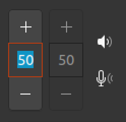
I have this on my list too. Vertical insensitive spin buttons currently even have a mixed style for their borders.
I would vote for Mads suggestion of more subtle border color which would also match insensitive buttons.
Also shouldn't the background be transparent like with the switches? Or is it fine because radios have a lighter background too 🤷♂️
Thats consistent with the regular theme at least. And with combo boxes where the entry field is lighter than the button.
--
Update 28.8.: Please ignore; opened separate issues.
Am I ok to add some more (very, very) minor dark theme glitches/observations here? I'm happy to open separate issues if you prefer... I don't include screenshots for now, but can be checked with widget factory easily.
The button hover effect looks a little bit too harsh (too black) to me. (discussion)(see #755)The "close tab" button has a different hover effect for dark (darker text color + grey background) and regular (only different text color) theme variant.(see #754)To match the styling of the non-dark theme, the background of tab bars should be darker (like window background).(see #754)
 ya-d
on 27 Aug 2018
ya-d
on 27 Aug 2018
I don't think that we should make the switches bg transparent. I fear they might get lost in the UI then. There should be a desire to toggle them.
The insensitive border is indeed to dark! I'll fix this
 Feichtmeier
on 28 Aug 2018
Feichtmeier
on 28 Aug 2018
The point was that insensitive switches and buttons are "transparent" (bg color) while spin buttons and entry fields are a bit lighter than that. That's the same for the regular theme though.
ya-d
on 28 Aug 2018
I just noticed that the regular theme also uses two different colors for the insensitive states. They are used for the exact same places but the difference is much more subtle than in the dark variant.
ya-d
on 28 Aug 2018
Yes would be great if we could put 1 change request in 1 issue <.<
I already lost everything beside the border color for insensitive elements which is really too dark
Feichtmeier
on 28 Aug 2018
I don't think that we should make the switches bg transparent. I fear they might get lost in the UI then. There should be a desire to toggle them.
I fear we're lost in translations (again) 😄
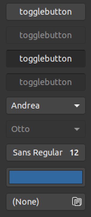
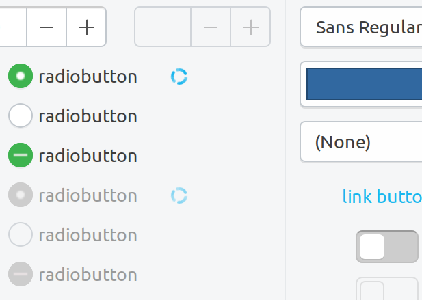
Here is the current light theme:
madsrh
on 28 Aug 2018
I am in favor of current insensitive radio/check. It comes from a specific design and it's the only widget which is pure white when active. I would suggest to do the insensitive spinbuttons the same as radio/check
 clobrano
on 29 Aug 2018
clobrano
on 29 Aug 2018
I am in favor of current insensitive radio/check.
+1
Alright, so that means the spinbutton will look like the example I trashed above 😄
Should I create another issue for the insensitive border for combobox and entry @Feichtmeier or are color tweaking on pause ?
madsrh
on 30 Aug 2018
No that's fine here the tilte fits :)
Don't get me wrong it was just my experience that when you tweak the main colours that there pop up issues elsewhere because many colours depend on each other. For example border colours depend on BG colour and so on
Feichtmeier
on 30 Aug 2018
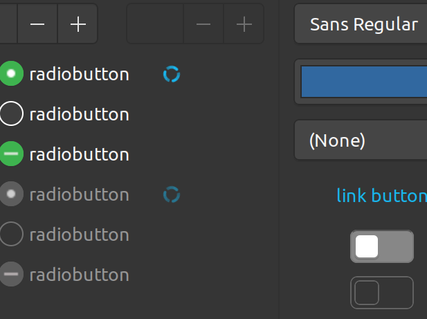
Okay, so following @clobrano's suggestion of using a lighter border, here are some "real world" mockup:
I'm surprised, but I actually really like this 😊 Especially comparing to the current.
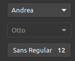
NOTE: Insensitive elements have transparent background
EDIT: To be consistent, I guess the "Otto" combo here should be light too 🤔 But I'll have to admit that I really like the current 🤷♂️
madsrh
on 1 Sep 2018
To understand you correctly: additionally to tabs you also want disabled elements to have the bright border?
Feichtmeier
on 1 Sep 2018
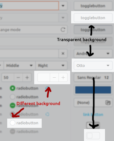
What about comboboxes with button and entries? Button would have dark border and entries light one
clobrano
on 1 Sep 2018
What about comboboxes with button and entries?
Button would have dark border and entries light one
Buttons would/should, like "Otto" below/above also use light borders:

@Feichtmeier might be right that we should revisit this after FF, but I sense your scepticism 😉 I hope you can at least agree with me, that what we currently have is a bit confusing 😕
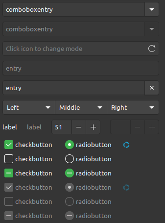
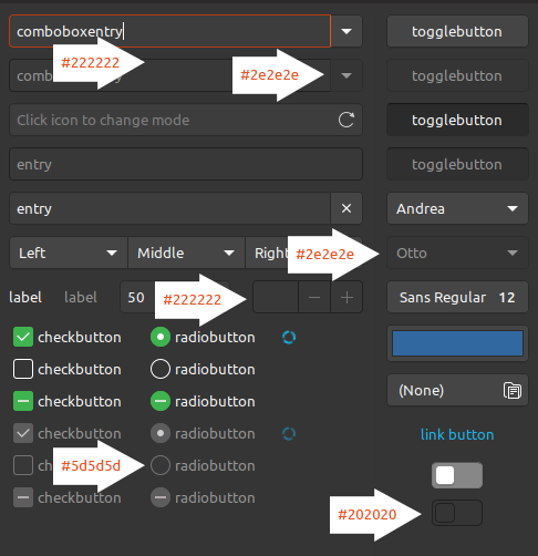
Bordercolors for insensitive elements:
madsrh
on 1 Sep 2018
Just to clarify: Initially I created this issue to remove #202020 and #222222 (see above). Any change would definitely require a lot of testing.
IMO there's two options:
- Light border (as seen above)
- Semi dark borders like #2e2e2e
The mockup below looks a bit odd with the light border, but again, it's hard to know how this feels in the real
madsrh
on 1 Sep 2018
Press effect sure doesn't work with bright borders buttons. This is why I am working on notebook tabs borders in order to keep buttons and entries as they are now
clobrano
on 1 Sep 2018
Why don't we just use #2e2e2e for insensitive borders in buttons and entries? Radio and check are already different in normal state, so it doesn't feel wrong if they differ in insensitive and backdrop too
clobrano
on 1 Sep 2018
Alright, I updated todos, let's keep this bug for fixes, and eventually we'll work on improvement in another bug/discussion
clobrano
on 1 Sep 2018
Reopening this issue because insensitive toggle switches borders weren't changed (still too dark / should match spinbutton)

madsrh
on 9 Sep 2018
I forgot, sorry
clobrano
on 9 Sep 2018
(still too dark / should match spinbutton)
like spinbutton or like radio/check?
clobrano
on 10 Sep 2018
Doesn't it make most sense with the spinbutton? I was looking at your PR here https://github.com/ubuntu/yaru/pull/764
madsrh
on 10 Sep 2018
I asked because initially we talked about radio/check. I just wonder if it
gets too invisible. I'll try
On Mon, 10 Sep 2018 at 09:05, MadsRH notifications@github.com wrote:
Doesn't it make most sense with the spinbutton? I was looking at your PR
here #764 https://github.com/ubuntu/yaru/pull/764—
You are receiving this because you modified the open/close state.
Reply to this email directly, view it on GitHub
https://github.com/ubuntu/yaru/issues/746#issuecomment-419809790, or mute
the thread
https://github.com/notifications/unsubscribe-auth/ACwAHmUEbNd_WXDWUAuL0W7sUF8wEuMjks5uZg8dgaJpZM4WOYMV
.
clobrano
on 10 Sep 2018
Normal
Backdrop
clobrano
on 10 Sep 2018
😄 I just finished some mockups.
Seems dark, but it's hard to say without trying it. IMO the light one seems too bright 🤷♂️
It's funny the with the light theme, we style the toggle very subtle and radio and spinbuttons the same.
madsrh
on 10 Sep 2018
I still agree on the initial issue - this dark border is too dark.
But... could you double check where that insensitive border is being used in common? Or wasn't it somehow connected to borders edge? I have some bad memory about this border's strange using places but I could be wrong :thinking:
Feichtmeier
on 10 Sep 2018
I am not changing the value of insensitive_border, I only changed the color
of switch borders
On Mon, 10 Sep 2018 at 10:18, Feichtmeier notifications@github.com wrote:
I still agree on the initial issue - this dark border is too dark.
But... could you double check where that insensitive border is being used
in common? Or wasn't it somehow connected to borders edge? I have some bad
memory about this border's strange using places but I could be wrong 🤔—
You are receiving this because you modified the open/close state.
Reply to this email directly, view it on GitHub
https://github.com/ubuntu/yaru/issues/746#issuecomment-419827772, or mute
the thread
https://github.com/notifications/unsubscribe-auth/ACwAHpVs_lqqAnLKkpI29S7HVQ9Y9xXrks5uZiBxgaJpZM4WOYMV
.
clobrano
on 10 Sep 2018
Related issues
 mivoligo
·
3Comments
mivoligo
·
3Comments
 matthewpaulthomas
·
3Comments
matthewpaulthomas
·
3Comments
 eaglersdeveloper
·
3Comments
eaglersdeveloper
·
3Comments
 8none1
·
3Comments
matthewpaulthomas
·
3Comments
8none1
·
3Comments
matthewpaulthomas
·
3Comments
Most helpful comment
I forgot, sorry