Yaru: Revert dialogues back to the upstream design
The current dialogues are styled like "classic" dialogues or to look more "generic".
While we had a big discussion about this already (and even a poll) I want to be annoying again and propose that we should revert this styling back to look more like the upstream dialogues.
Pros:
- upstream designers had big discussions about this and it is definitely a design decision to reduce the dialogues on simply the buttons, we want to be as close to upstream as possible anywhere else (I don't want to count the upstream adaptions but they should be quiet numerous) so we could do this here, too
- LibreOffice was pretty proud about having native dialogues finally implemented and with styling them back to the generic look, we somehow "ruin" this milestone
- beside upstream decisions when you look to the dialogues as if you never seen a dialogue before (to reduce the bias) then it is pretty clear what you want to do: press this button OR press that button so there shouldn't be a dire need for a titlebar since you should answer to the questions the dialogue asks you and not drag him around (EDIT: dragin is still possible with CSD dialogues)
- opinion: the upstream dialogues look more "modern"/minimal designed
- the upstream design looks like the GNOME shell dialogues - and we use the light dialogues now in the shell - having a white gtk dialogue and a white shell dialogue could be more usable for the average user who doesn't care if it is GNOME Shell or a gtk window wanting him to proceed/click
Cons:
- Some people want to drag the dialogue around (EDIT: dragin is still possible with CSD dialogues)
- Yaru could like to be on par with the rest of dialogues outside of GNOME
@godlyranchdressing @madsrh @clobrano @luxamman
Sorry for opening this barrel again, but I think if we have the possibility to stick to upstream we should do this.
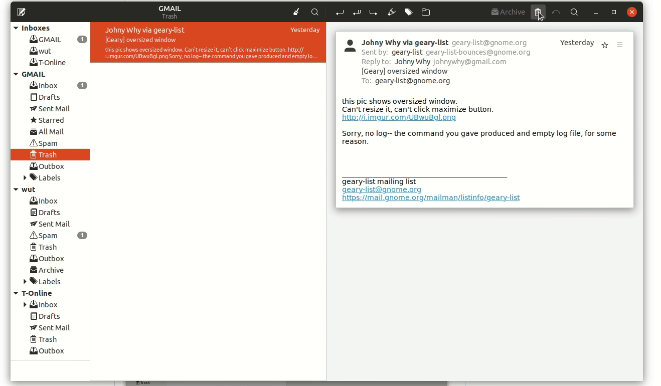
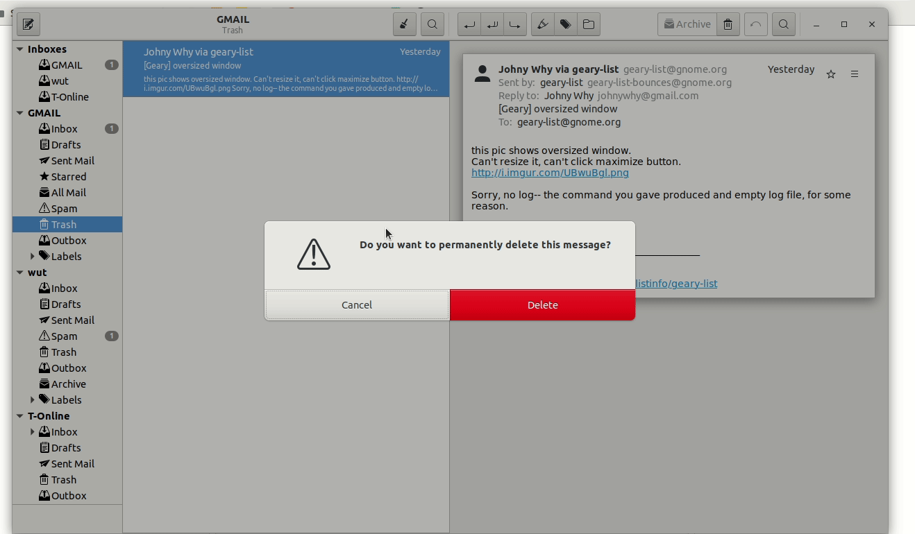
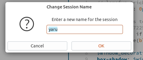
Current yaru gtk dialogues:
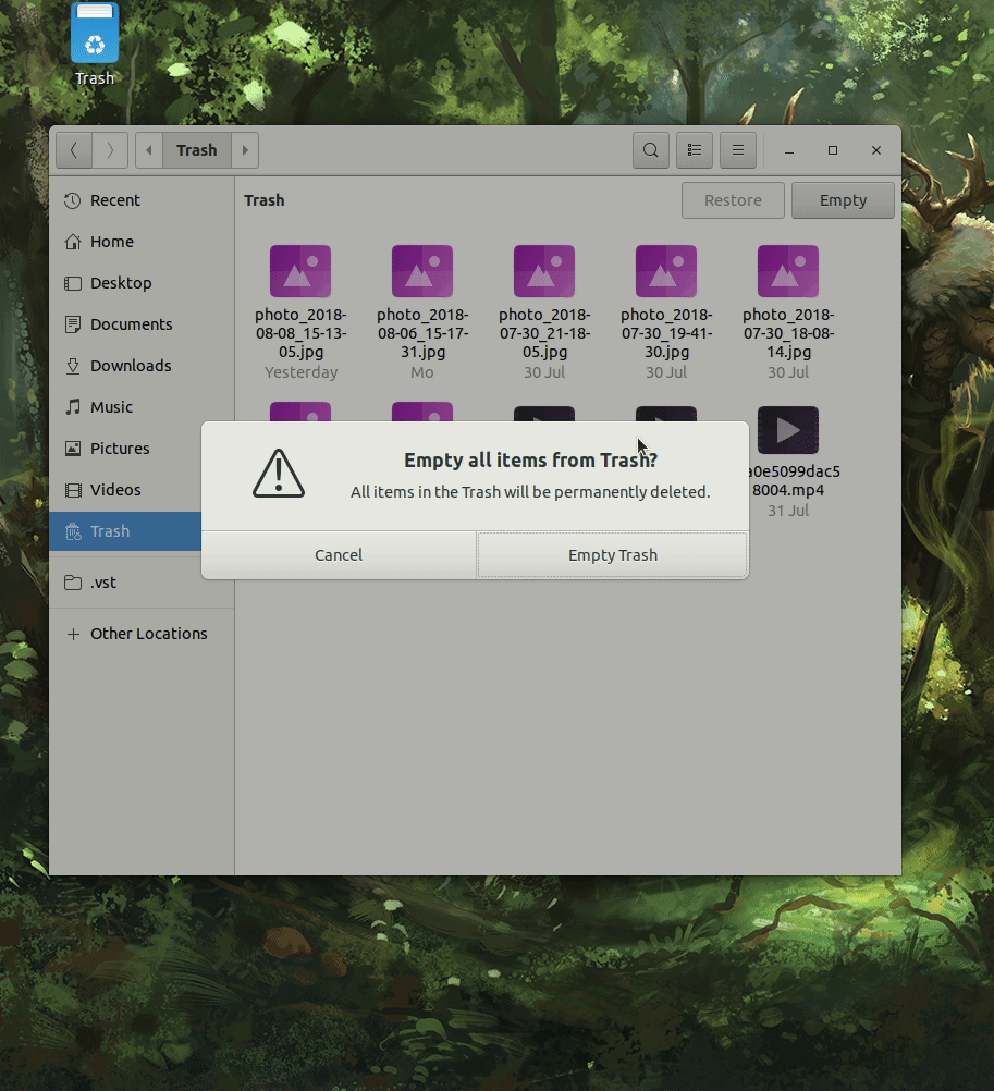
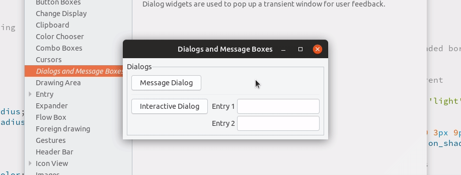
Adwaita gtk dialogues:
Yaru Shell dialogues:
 Feichtmeier
All 21 comments
Some people want to drag the dialogue around
this might be the only showstopper, to me. Was really not possible to drag the upstream dialog, or was it just a lack of our implementation (e.g. we removed the titlebar at all)?
 clobrano
on 9 Aug 2018
clobrano
on 9 Aug 2018
Edit: you can still drag it, so without the titlebar it is maybe not that obvious that you can drag it
Feichtmeier
on 9 Aug 2018
Yes, I remembered there was something due to an option to unlink the dialog from the window below plus we removing the titlebar.
clobrano
on 9 Aug 2018
I would prefer to keep the current. Can't believe you are going back to this loooong discussion again...

 Paz-it
on 9 Aug 2018
Paz-it
on 9 Aug 2018
Yes I am almost a necromancer - the reasons are listed above :) No need to repeat myself
Feichtmeier
on 9 Aug 2018
Upstream dialogues really look more modern than current! I like they!
 eaglersdeveloper
on 10 Aug 2018
eaglersdeveloper
on 10 Aug 2018
@clobrano the titlebar is still there in adwaita. They simply colored it like the BG and made it very thin. That's why you can still drag it
Feichtmeier
on 11 Aug 2018
I guess we need a mockup here "UI freeze is coming" :snowman:
clobrano
on 14 Aug 2018
We could start with the headerbar color. I am short on time this week would be great if you could tackle this :[
Feichtmeier
on 14 Aug 2018
I guess we need a mockup here
Yeah, but what are we aiming for?
In random order here is:
- Shell style (Very consistent, but Didier had some issue with this)
- Shell style but white #fff like notifications
- Regular buttons with white background (old PR here)
- Adwaita (for reference)
- Yaru shell (for reference)

Other ideas? @clobrano @Feichtmeier @godlyranchdressing
 madsrh
on 14 Aug 2018
madsrh
on 14 Aug 2018
Shell style but white #fff like notifications
I actually like this a lot (maybe because I don't like the other big buttons). What was the problem with shell style?
clobrano
on 14 Aug 2018
I don't consider this an issue, but the problem was:
I think that having them differentiated actually help: "is it something from the system or is it something specific to the app?"
https://github.com/ubuntu/yaru/issues/130#issuecomment-365586932
madsrh
on 14 Aug 2018
Now I remember. I agree with the point, even if, from a user perspective, maybe is not so distinctive
clobrano
on 14 Aug 2018
Thanks for the mock-ups.
I don't consider this an issue, but the problem was: I think that having them differentiated actually help: "is it something from the system or is it something specific to the app?"
I think this design is on purpose. Upstream wants the user not to care for if the "shell" or the applications wants his interaction.
This could also be a question of the target audience :) Sure, the classic linux user knows he is running gnome shell. But consider all the "new users" ubuntu recruits every day. Do they really know or want to know if it is GNOME Shell or a GTK application? :)
Focusing on the visuals, the mixed one, without a headerbar but with our button style, is already an improvement to the current one, in my opinion. A headerbar without a close button looks a little bit weird.
Feichtmeier
on 14 Aug 2018
I think this design is on purpose. Upstream wants the user not to care for if the "shell" or the applications wants his interaction.
to remember that there's actually a modal dialog and a interaction dialog (at least on gtk3-demo). The first is similar to shell dialog, while the latter is similar to a normal gtk window
clobrano
on 14 Aug 2018
clobrano
on 14 Aug 2018
Looks good @clobrano 💪
Are you sure you don't want to keep the shell buttons?
madsrh
on 14 Aug 2018
1) Maybe we need some days to think about this, I really like both full upstream and this
2) I see that those modal dialogues all miss padding at the bottom :) We could maybe fix this globally and remove it out of the ubiquity code in apps
Feichtmeier
on 14 Aug 2018
I made the PR so we can try it. I like it white, but don't want to mess up current balance :)
clobrano
on 14 Aug 2018
This might even be a good situation to propose on the HUB, making it clear that we are just experimenting and that nothing is decided yet :)
clobrano
on 15 Aug 2018
OK. I like it white and asking the same question @madsrh asked :
Are you sure you don't want to keep the shell buttons? :smiley: ...
So let's see how it evolve .. :curious:
Paz-it
on 16 Aug 2018
Related issues
 8none1
·
3Comments
Feichtmeier
·
3Comments
8none1
·
3Comments
Feichtmeier
·
3Comments
 pojntfx
·
3Comments
pojntfx
·
3Comments
 matthewpaulthomas
·
3Comments
matthewpaulthomas
·
3Comments
 YamiYukiSenpai
·
3Comments
YamiYukiSenpai
·
3Comments
Most helpful comment
Looks good @clobrano 💪
Are you sure you don't want to keep the shell buttons?