This is the continuation of this Issue on the shell's old repo https://github.com/ubuntu/gnome-shell-communitheme/issues/183 about how we can improve the GNOME Shell's login/lock screen - knowing that it might get replaced in the future.
Solutions discussed so far:
- no gradient
- dark box
- light box
 Feichtmeier
All 27 comments
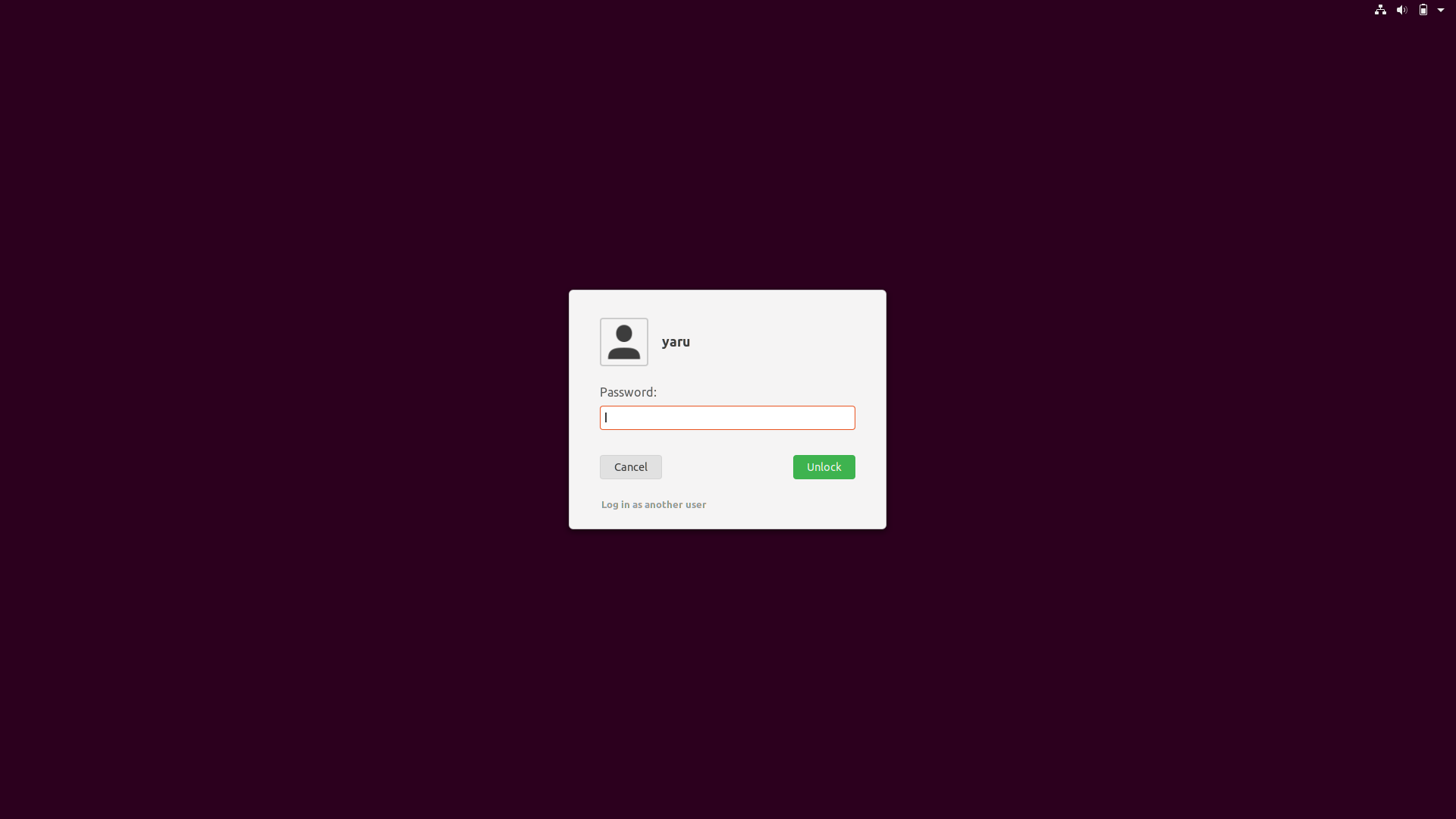
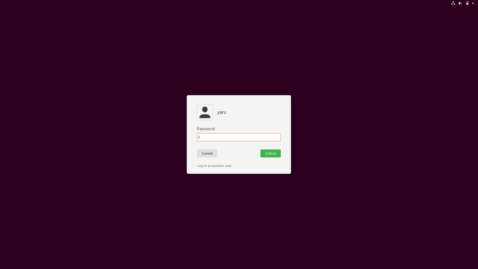
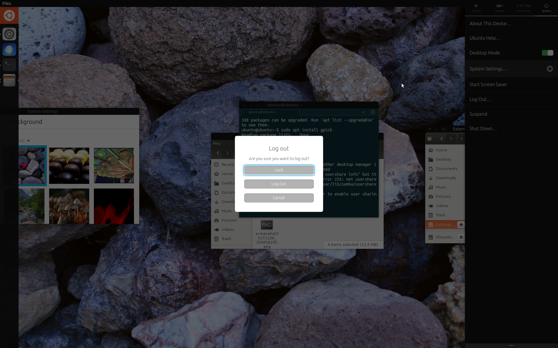
Does everyone feel comfortable with that new login/lookscreen ?
Shamelessly tagging
@didrocks @luxamman @madsrh @clobrano @godlyranchdressing @galgalesh
If yes we could close this issue :)
Feichtmeier
on 18 Jul 2018
TBH, I'm not a big fan of it compared to the previous one. Unsure if I'll get used to it or not.
 didrocks
on 18 Jul 2018
didrocks
on 18 Jul 2018
Although not tagged , I'll be happy to go back to previous one. TBH, I was already digging @didrocks blog for how to change the background if the one is in use remain. :rofl:
 Paz-it
on 19 Jul 2018
Paz-it
on 19 Jul 2018
Alright let's wait a bit for the missing thumbs down or up for some weeks and then roll back eventually.
Feichtmeier
on 21 Jul 2018
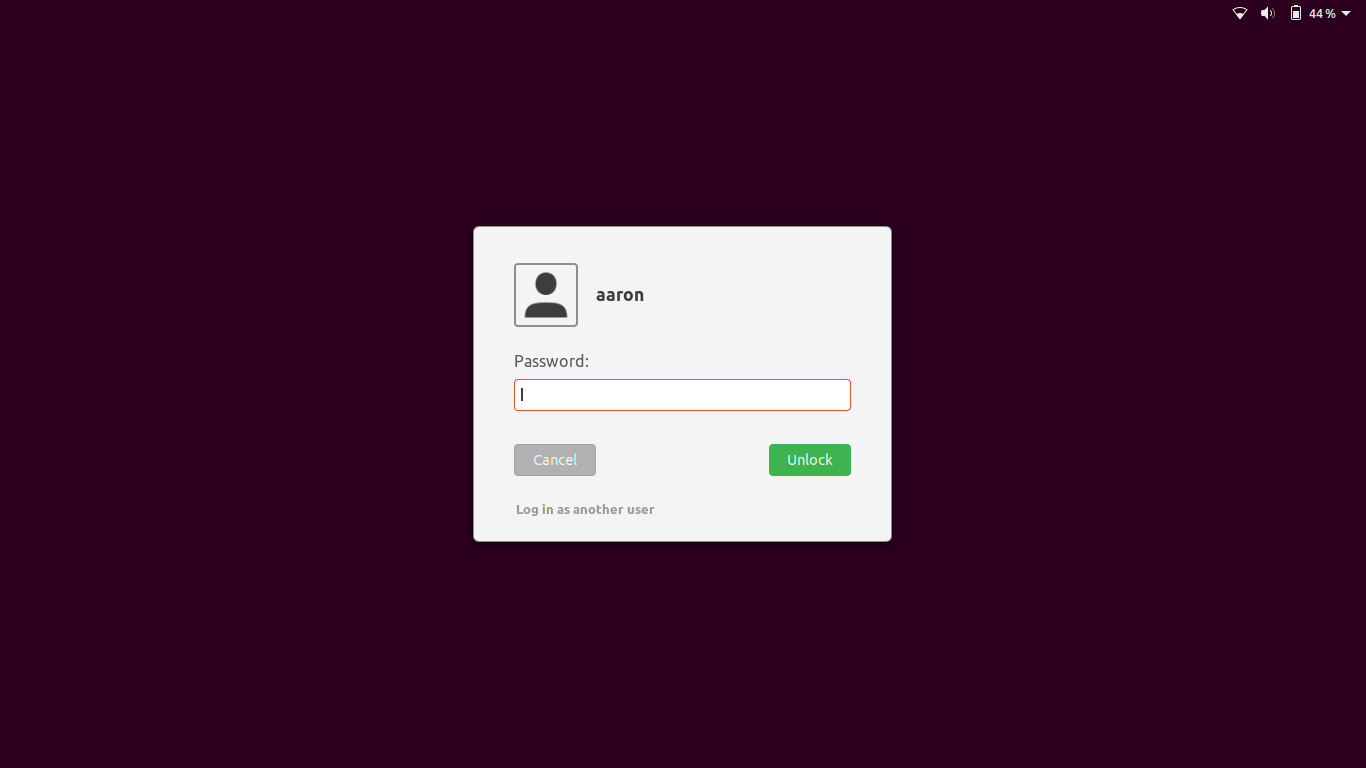
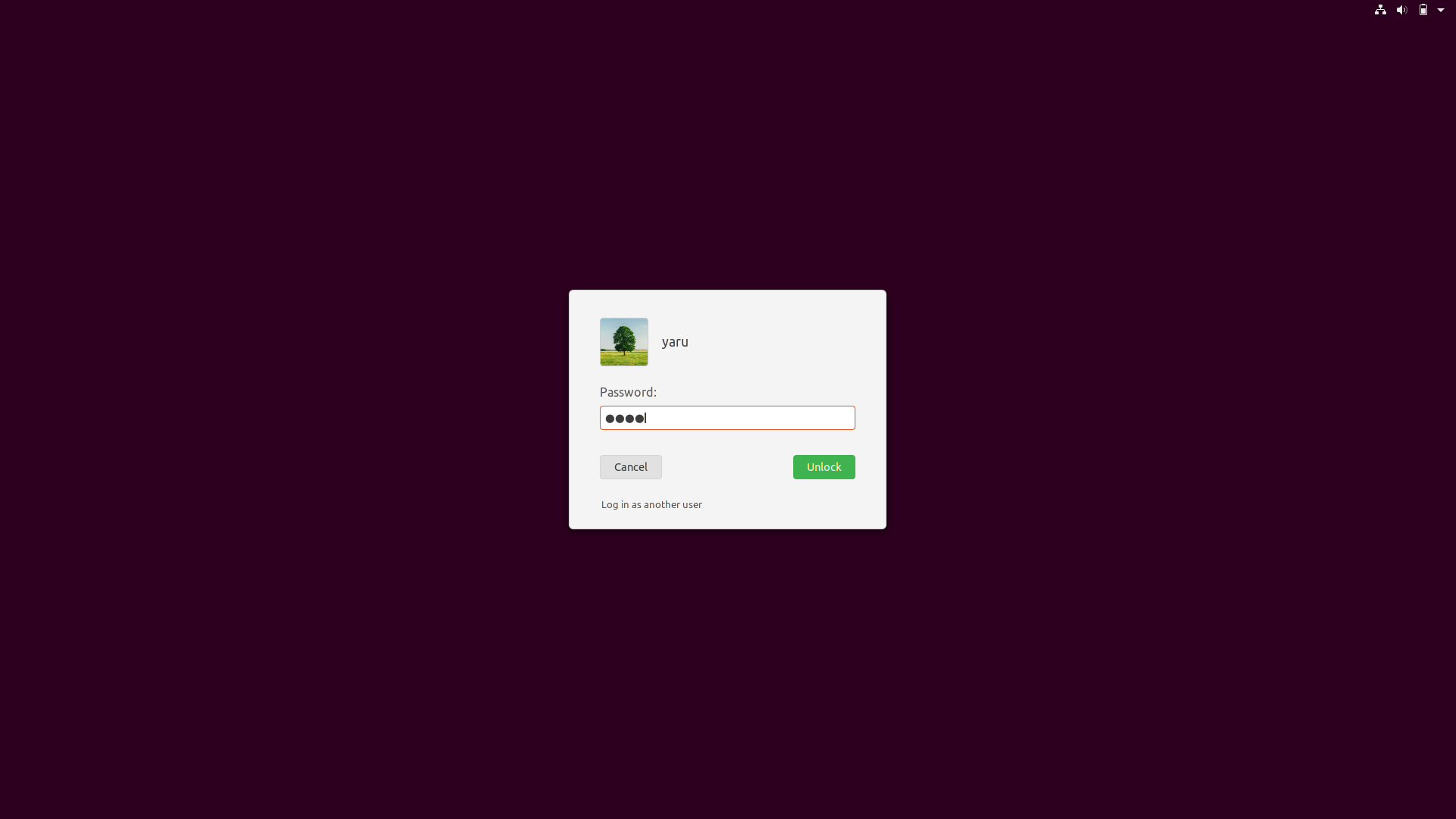
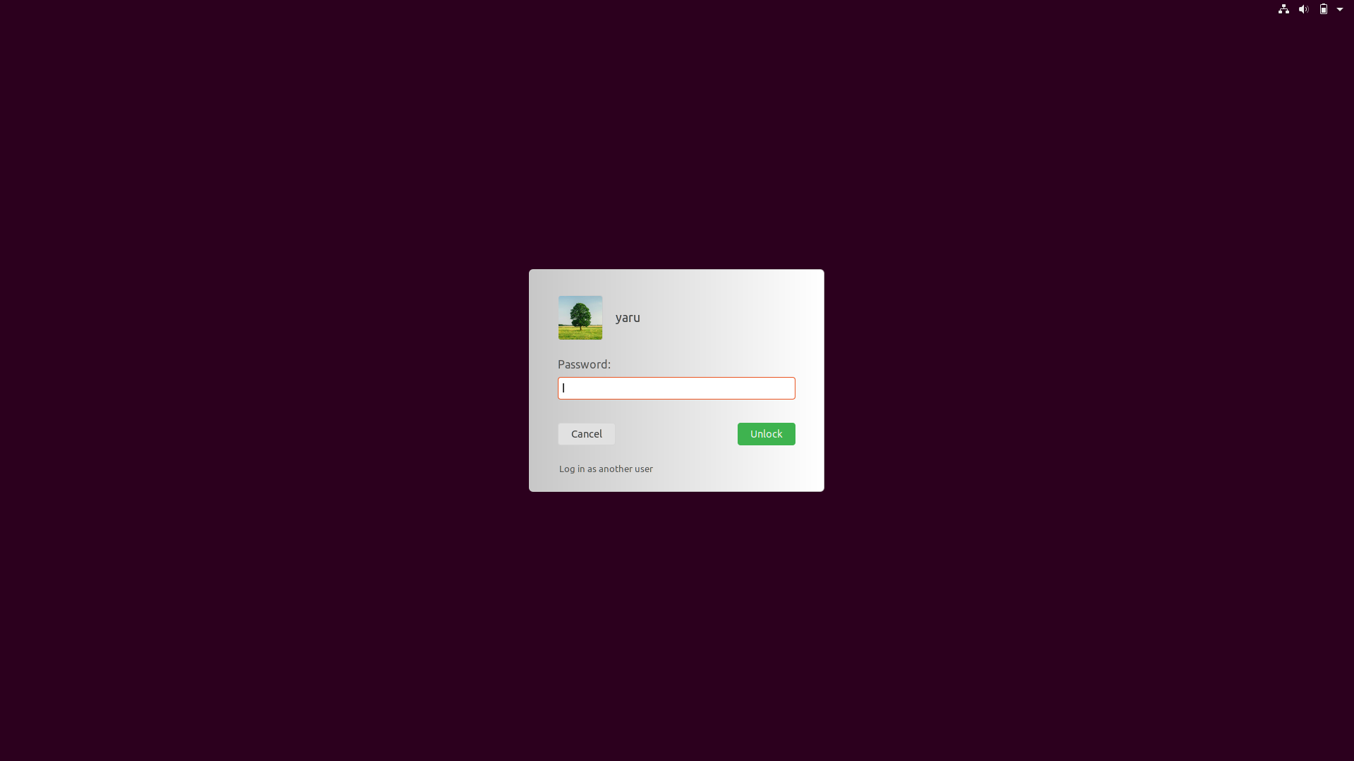
The "Cancel" button is less noticeable.
Make the outline darker or add a shadow.
 eaglersdeveloper
on 21 Jul 2018
eaglersdeveloper
on 21 Jul 2018
Is it possible to use the current wallpaper as a login background?
I would like to return to the previous one, but with wallpaper.
As in Windows 10 or macOS.
eaglersdeveloper
on 25 Jul 2018
Nope, not supported now
 clobrano
on 25 Jul 2018
clobrano
on 25 Jul 2018
The cancel button needs some love indeed :)
Feichtmeier
on 25 Jul 2018
Like this, @eaglersdeveloper ?
Feichtmeier
on 25 Jul 2018
@Feichtmeier, yes!
But font-weight of user name need set to normal.
And avatar. In Ubuntu Touch it was in Suru style, but with a 1:1 aspect ratio.
eaglersdeveloper
on 25 Jul 2018
- normal font weight
- 1px less for the user picture border
Feichtmeier
on 25 Jul 2018
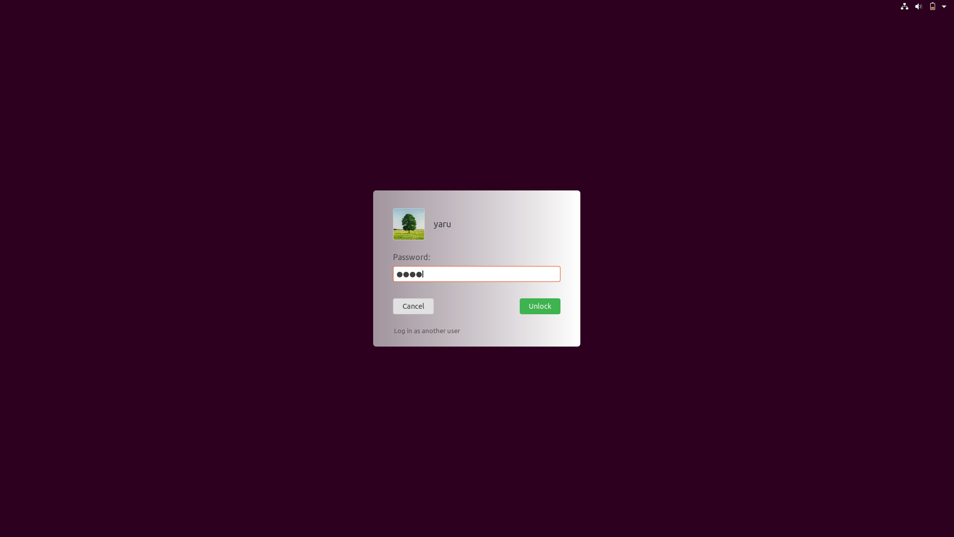
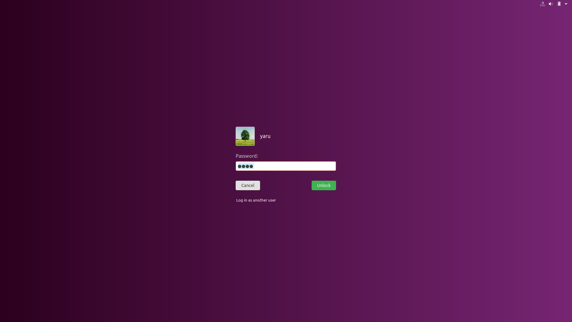
Generally speaking, dialog is needed to distinguish content from the background for easy understanding. I do not understand why the dialog is here. White text is easy to read on a simple purple background.
eaglersdeveloper
on 25 Jul 2018
Well if you scroll up that's the topic of discussion ;) if we should keep the white background or not
Feichtmeier
on 25 Jul 2018
@Feichtmeier
How about this?
Got it from here:
But I'd get if that were too drastic.
$light_borders_color: #8E8E8E;
$light_button_bg_color: #B1B1B1;
 godlyranchdressing
on 27 Jul 2018
godlyranchdressing
on 27 Jul 2018
I'd prefer current + this for login
clobrano
on 27 Jul 2018
If keeping the current I'm +1 with @clobrano .
Paz-it
on 27 Jul 2018
Is the current one without dialog?
eaglersdeveloper
on 27 Jul 2018
Updated the "login with another user" label to have a normal font-weight, too.
:thinking: this looks very unity8ish and very "modern" :dancer:
@godlyranchdressing I think this could work if we would go full flat for the light dialogs. Grey + 3d effect looks too much imho
Feichtmeier
on 27 Jul 2018
It woule be great if we could mimic some glass effect with gradient :angel:
clobrano
on 27 Jul 2018
Gradient is possible, but we don't use gradients anywhere else :thinking:
  > StBoxLayout {
    // this is the main window that the widgets are drawn on
    background:none;
    background-color:none;
    background-gradient-direction: horizontal;
    background-gradient-start: darken($light_bg_color,20%);
    background-gradient-end: white;
    border: 1px solid $light_borders_color;
    border-radius: $medium_radius;
    padding: 12px 40px 24px 40px;
  }
Or with a little transparency
 > StBoxLayout {
    // this is the main window that the widgets are drawn on
    background:none;
    background-color:none;
    background-gradient-direction: horizontal;
    background-gradient-start: transparentize(darken($light_bg_color,15%),0.3);
    background-gradient-end: white;
    border-radius: $medium_radius;
    padding: 12px 40px 24px 40px;
  }

With that gradients, the previously reported rendering problem with the SVG is basically gone. :man_shrugging:
Feichtmeier
on 28 Jul 2018
Awesome! Can we try some different gradients and tones? Someone suggested that previous gradient starting from the upper left corner make the eyes look on the wrong part of the screen, so I wonder if a radial gradient from the center might look better
clobrano
on 28 Jul 2018
Tones - yes!
But with that undocumented gradients, only vertical and horizontal seems to work :(
(That's horizontal)
Feichtmeier
on 28 Jul 2018
only vertical and horizontal seems to work :(
pity, ok let's try with tones
clobrano
on 28 Jul 2018
Hi! (This is my first post in any forum, sorry if I say something wrong). What do you think about the "Cancel" button with a red color?
 ahayasic
on 30 Jul 2018
ahayasic
on 30 Jul 2018
Hi @a-hayasi
Red is recommended for negative and irreversible action buttons, errors and alerts. The cancel button isn't that.
But thanks for taking the time to contribute 👍 Good first post!
 madsrh
on 30 Jul 2018
madsrh
on 30 Jul 2018
closed by #661
clobrano
on 30 Jul 2018
Related issues
 Muqtxdir
·
3Comments
Muqtxdir
·
3Comments
 CDrummond
·
3Comments
CDrummond
·
3Comments
 mivoligo
·
3Comments
mivoligo
·
3Comments
 matthewpaulthomas
·
3Comments
Feichtmeier
·
3Comments
matthewpaulthomas
·
3Comments
Feichtmeier
·
3Comments
Most helpful comment
With that gradients, the previously reported rendering problem with the SVG is basically gone. :man_shrugging: