Yaru: GNOME Software visibility issue on label and stars
Self-explanatory:) :
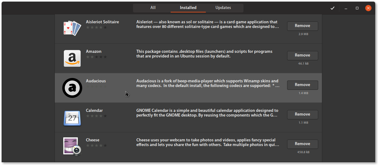
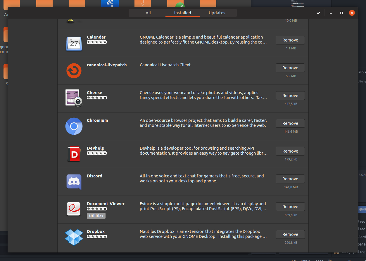
Stars hardly recognizable and when hovered they are invisible :
 Paz-it
All 8 comments
Hi @Paz-it, I edited the title, otherwise anyone that would contribute would be forced to open the ticket to understand what the problem is.
 clobrano
on 20 Jun 2018
clobrano
on 20 Jun 2018
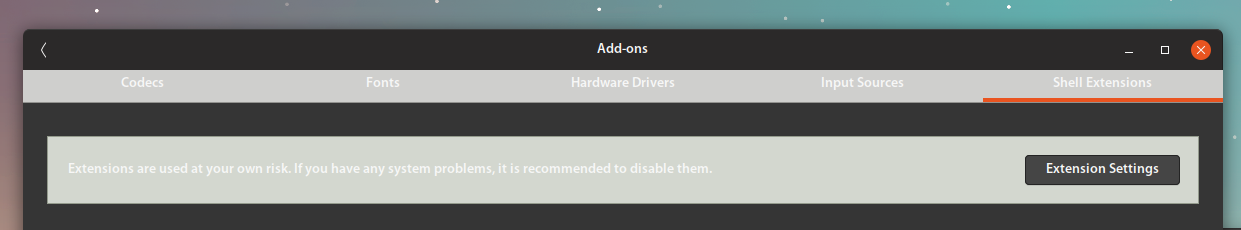
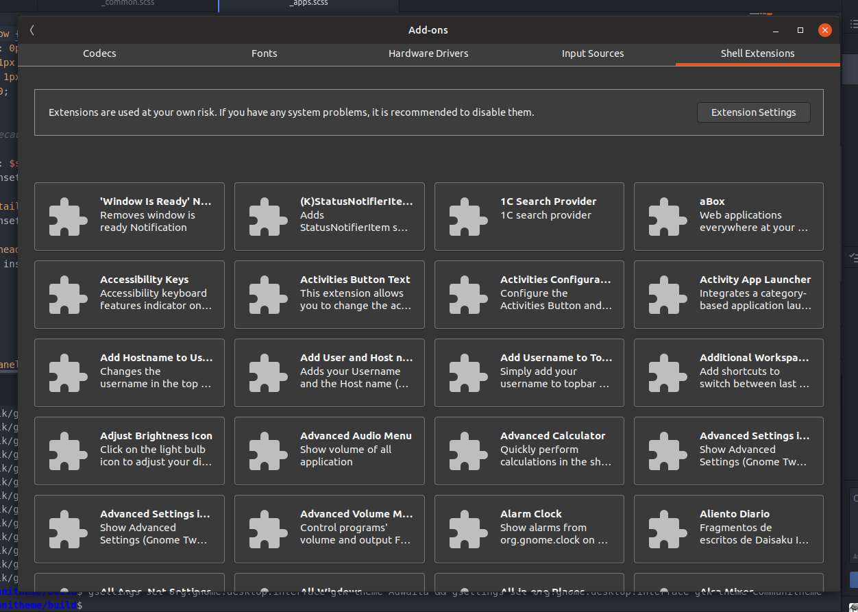
The stars are also very hard to read in the white version in the "all" stacks. Sadly there are several elements in software without a style class. I already tried to change the orange check marks to green without success. Let's see if we can style the stars for both black and white. The infobar is also some custom infobar which can not be targeted by infobar. Yet I've seen ambiance somehow managed to change its look. Do you have any idea who to tag in here from the ambiance team to help us with the infobar? @clobrano
 Feichtmeier
on 20 Jun 2018
Feichtmeier
on 20 Jun 2018
I believe there is work being done up stream to fix this.
Can I tag @dylanmccall here?
 madsrh
on 20 Jun 2018
madsrh
on 20 Jun 2018
Really? That would be great. To fix the lack of style classes or to fix the wrong colours somehow in their code directly?
Feichtmeier
on 20 Jun 2018
@Feichtmeier we can have a look inside Ambiance code itself, since it's normal css, otherwise I can ask on IRC
clobrano
on 20 Jun 2018
In ambiance under apps/software-center.css :
.action-bar {
background-color: @bg_color;
}
but this is probably only will solve the top. The yellowish frame was fixed in the light theme. one of you already fixed it there. If I remember well, the warning frame is inheriting the colors from warning/info/ect..bar. (not on my commuter now) - I'll check it later in the .css file.
Paz-it
on 20 Jun 2018
no it's called .application-details-infobar
gnome-software is really the nightmare for every scss coder. There are several style classes which can only be styled by inset box-shadow cheats and get overriden by some fallback colors. It's a horror. This is really the best we can get. We could discuss the color of the infobars though.
The stars color (haha) are also somehow hardcoded. So the only way to give them more contrast is to change the background color for the light variant. :cry:
It's really a horror show.
Feichtmeier
on 26 Jun 2018
Well, well, not that bad though
clobrano
on 26 Jun 2018
Related issues
 8none1
·
3Comments
Feichtmeier
·
3Comments
8none1
·
3Comments
Feichtmeier
·
3Comments
 chrisjbillington
·
3Comments
chrisjbillington
·
3Comments
 snydox
·
3Comments
snydox
·
3Comments
 Muqtxdir
·
3Comments
Muqtxdir
·
3Comments