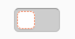
Yaru: Keyboard focus for switches should span whole widget
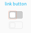
Currently only the "knob" is surrounded by the dotted orange line which is hardly visible and differs from other widgets. The selection ring should span the whole widget with some padding.
 ya-d
ya-d
All 13 comments
If the ring is around the knob, it means it's the selected widget. Not sure we can "transfer" the selection to the whole switch. I need to investigate a bit more
 clobrano
on 28 May 2018
clobrano
on 28 May 2018
I double check and focus state is actually and correctly on the switch widget and not on the knob/slider.
Adwaita however does the same thing, so I think this is how this kind of widget show selection (actually the part on which you can act on when selected is the slider, so it is not so wrong as a meaning).
clobrano
on 29 May 2018
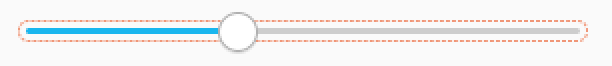
Would it be possible to add an asymmetrical padding to achieve something like this?
ya-d
on 29 May 2018
:thinking: I'll try!
clobrano
on 29 May 2018
Argh. I just figured that the selection ring probably moves with the knob so this hack won't work for both on and off states. But even the one with symmetrical padding looks better to me and is more visible in any case.
ya-d
on 29 May 2018
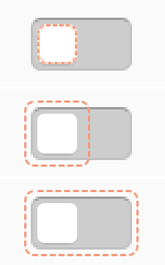
Uhm, right I didn't think at all myself. Theoretically we know in which state the knob is, but it's getting a bit complex. What about the same as the buttons and treeview row, selection ring slightly inside the knob?
clobrano
on 29 May 2018
I would say its better than the selection ring being the border itself but might get a bit small. I tend to prefer the outer ring even if it crosses the switch. But thats only a personal preference.
ya-d
on 29 May 2018
Just a stupid question - Why do we need this ring anyway??!!??
 Paz-it
on 2 Jun 2018
Paz-it
on 2 Jun 2018
It is the focus ring. Some people use the tab key to travel through the UI elements. The focus ring indicates were the focus is
 Feichtmeier
on 2 Jun 2018
Feichtmeier
on 2 Jun 2018
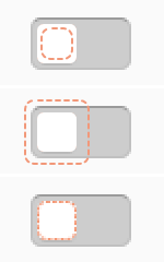
Unfortunately outline-offset property cannot be asymmetric, so the best we can have is this one
the thin line does not help, but bigger would be even worse
clobrano
on 10 Jun 2018
I'd prefer the current solution then which looks pretty logical to me. This one ∆ looks like something went wrong in my opinion
Feichtmeier
on 10 Jun 2018
Agreed. What about a very minor inset?
ya-d
on 10 Jun 2018
Current 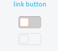
Changed 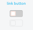
clobrano
on 11 Jun 2018
Related issues
 mivoligo
·
3Comments
Feichtmeier
·
3Comments
mivoligo
·
3Comments
Feichtmeier
·
3Comments
 chrisjbillington
·
3Comments
chrisjbillington
·
3Comments
 8none1
·
3Comments
8none1
·
3Comments
 madsrh
·
3Comments
madsrh
·
3Comments