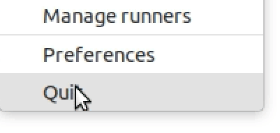
Yaru: .context-menu border in light, bradius of last-child in dark & sub-menu placement
For the first-child in the light theme (which is the last-child in nautilus? =D) there is a tiny border-bleed:

The border-radius of the last-child for the dark theme (at least in EOG) seems to be small_radius on all edges:

The sub-menu seems to popup like 2 or 3px too early (meaning the "frame" of the submenu could be placed exactly at the edge of the context-menu, they overlap atm):
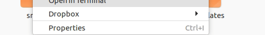
Edit: also in non CSD menus we have the wrong border-radius for both first and last child:
 Feichtmeier
All 12 comments
Not sure if this is wanted? @godlyranchdressing
(The separators are almost invisible - I was never a fan of them, but this looks like it is not wanted - either remove it or bring back the old color? :D no idea really)
Maybe I've merged the PR once again ... - I didn't realize that the context-menu might also be affected
Feichtmeier
on 21 May 2018
@Feichtmeier
I wish they will not be visible, just the way it is in your SS. so much cleaner and elegant this way.
 Paz-it
on 21 May 2018
Paz-it
on 21 May 2018
The separators are almost invisible - I was never a fan of them, but this looks like it is not wanted - either remove it or bring back the old color?
We should take into account developer desire :) if he/she put the separators, we should try to find a nice way to style them
 clobrano
on 22 May 2018
clobrano
on 22 May 2018
I agree. @godlyranchdressing styled them the best way :))
Paz-it
on 22 May 2018
I like it too! Just wondering if this was wanted :dancer:
Feichtmeier
on 22 May 2018
 madsrh
on 28 May 2018
madsrh
on 28 May 2018
@madsrh @godlyranchdressing @vinceliuice @clobrano
Cant' we just remove the border radius for hovering menu entries completely and add a padding to the context-menus? This would make everything hell lot of easier and why ship something broken if the solution is so easy yet does not look weird (quiet the opposite).
As proposed in the closed PR: (but with more padding like in this gif)

And that's also very similar to the shell:

And basically every other context-menu out there on the web with round corner :)
Feichtmeier
on 28 May 2018
Padding looks good to me too, maybe I just use the same (small) padding in shell as well
clobrano
on 28 May 2018
I say +1 for this because it solves the headache, BUT I've said this before _(in an issue I can't find it atm_):
IMHO the padding looks broken, and the current doesn't (_except for where it's actually broken_ 🤡 )
Beautiful and clean IMO:
IF there should be top / bottom padding IMO overdoing it - like the shell above - would make it more obvious that this isn't an issue.
EDIT:
maybe I just use the same (small) padding in shell as well
Ahhh, I missed that +1
madsrh
on 28 May 2018
The idea is beautiful idd.
Sadly we also still have a border bleed for the first and last child hover. You can even see that in the pic you posted mads :D it's just tiny but it's there

Feichtmeier
on 28 May 2018
If @vinceliuice does not suceced there would be a third option (after the padding top/bottom):
@madsrh @luxamman @clobrano
I tried @Paz-it 's idea to have a padding everywhere and continue to use border radius on menu items and I love it:

- solves all problems
- looks like the popovers currently in master:
What do you think?
Feichtmeier
on 4 Jun 2018
Perfect! The other suggestion looked like a compromise - this one doesn't 👍 Please merge 😀
madsrh
on 4 Jun 2018
Related issues
 pojntfx
·
3Comments
madsrh
·
3Comments
Feichtmeier
·
3Comments
pojntfx
·
3Comments
madsrh
·
3Comments
Feichtmeier
·
3Comments
 mivoligo
·
3Comments
Feichtmeier
·
3Comments
mivoligo
·
3Comments
Feichtmeier
·
3Comments
Most helpful comment
If @vinceliuice does not suceced there would be a third option (after the padding top/bottom):
@madsrh @luxamman @clobrano


I tried @Paz-it 's idea to have a padding everywhere and continue to use border radius on menu items and I love it:
What do you think?