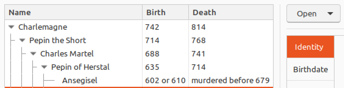
Page 3 of gtk3-widget-factory contains a tree view. The arrows used to expand/collapse a branch seem blurry. This can also be seen in Geary.
 CDrummond
All 4 comments
 madsrh
on 10 May 2018
madsrh
on 10 May 2018
This is probably because we use Adwaita/GNOME's default assets, but in effect on Ambiance triangles look sharper
 clobrano
on 10 May 2018
clobrano
on 10 May 2018
@clobrano
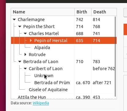
I think the sharp arrow is in the assets as well. when you hover it it turns sharp. it means in the code the link to the sharp arrow is used under the hover section.
Not sure it's needed be if you think so you just have to switch the links to the correct image.
Edit :
- Expanders *
***/
expander arrow {
min-width: 16px;
min-height: 16px;
-gtk-icon-source: -gtk-icontheme("pan-end-symbolic"); }
expander arrow:dir(rtl) {
-gtk-icon-source: -gtk-icontheme("pan-end-symbolic-rtl"); }
expander arrow:hover {
color: #8a8a8a; }
expander arrow:checked {
-gtk-icon-source: -gtk-icontheme("pan-down-symbolic"); }
If you disable the symbolic gtk-icon-source and give only color it will appear sharp in all the way .
Again, not sure it's needed though... :smiley_cat:
 Paz-it
on 3 Jun 2018
Paz-it
on 3 Jun 2018
Thanks @Paz-it, so this means that it is just a matter of color that makes it blur. I'd take this chance to propose this change instead: recently we changed check and radio button in menus in order to have the same color as their correspondant label. Here the situation is similar, since by default arrows are different than their text. What about this instead?
clobrano
on 4 Jun 2018
Related issues
 Feichtmeier
·
3Comments
Feichtmeier
·
3Comments
 pojntfx
·
3Comments
Feichtmeier
·
3Comments
CDrummond
·
3Comments
pojntfx
·
3Comments
Feichtmeier
·
3Comments
CDrummond
·
3Comments
 eaglersdeveloper
·
3Comments
eaglersdeveloper
·
3Comments
Most helpful comment
Thanks @Paz-it, so this means that it is just a matter of color that makes it blur. I'd take this chance to propose this change instead: recently we changed check and radio button in menus in order to have the same color as their correspondant label. Here the situation is similar, since by default arrows are different than their text. What about this instead?