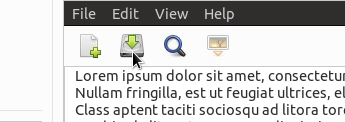
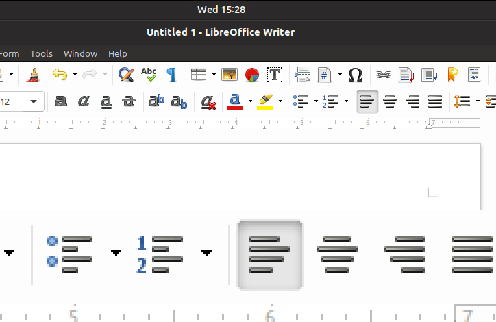
Some buttons (toolbar only?) do not have a border on hover/mouse-over or when pressed. For example see LibreOffice's toolbars, or the hamburger menu in Geary's message view (screen shot below). This makes the pressed/selected buttons look slightly blurry.

This also affects other buttons - such as the Reset to Default in nautilus' preferences dialog (in the List Columns tab)
In Qt speak these buttons would be called Auto Raise - i.e. buttons that initially have no border, background, etc, until hovered or pressed.
 CDrummond
All 22 comments
I am not that sure, but I think this is wanted. @madsrh ? :)
 Feichtmeier
on 20 Mar 2018
Feichtmeier
on 20 Mar 2018
Are you stating that the effect of not having a border is wanted? Why would that be? Every other widget has a border, so why should this not?
CDrummond
on 20 Mar 2018
Some buttons (toolbar only?) do not have a border on hover/mouse-over or when pressed.
Flat buttons do not have borders. It happens that most of flat buttons are in toolbar and headerbar.
When pressed, the border is given by box-shadow, when hovered there should be a color change. Now, since most of flat buttons are in dark headerbar and toolbar those have been tested, while the ones on bright backgrounds might need some more refinements
 clobrano
on 21 Mar 2018
clobrano
on 21 Mar 2018
Why do flat buttons have no border? I can understand whilst they are flat, but once they are pressed, or mouse-over, then why not just draw as per non-flat buttons.
The button in the screenshot above looks awful (IMHO), and would look nicer with a border.
CDrummond
on 21 Mar 2018
The border might ruin the pressed effect, but let me double check with some tests. (of course, if you can develop something, an help is welcome)
clobrano
on 21 Mar 2018
I wish I could - if it was coding then I'd gladly help. Unfortunately, I'm next to useless with CSS :-(
How would a border ruin the pressed effect? It'd just look the same as a non-flat pressed button, no?
CDrummond
on 21 Mar 2018
I'm also looking into this at the moment
 madsrh
on 21 Mar 2018
madsrh
on 21 Mar 2018
Maybe this is a bit too much? I just made:
@if $flat {
      border-color: if($c == $headerbar_bg_color,$_pressed, $_bg);
    }
@if $flat {
      border-color: $_pressed;
    }
 godlyranchdressing
on 22 Mar 2018
godlyranchdressing
on 22 Mar 2018
Looks good to me! Does it also have a border on hover?
CDrummond
on 22 Mar 2018
@CDrummond, no it doesn't, but _there should be a background-color change on hover_ to show that it's being focused on. I'm not sure what's up with that.
godlyranchdressing
on 22 Mar 2018
But why not? If there is going to be a border on pressed, then why not on hover? As in, why not just draw it as a regular button on hover, and pressed? (Just curious, you guys are better at design than me :-) )
CDrummond
on 22 Mar 2018
@CDrummond that's how it used to be earlier on, but I remember we changed it to the way it is now (no borders) because headerbar buttons looked better without a border, so then we changed all flat buttons to have no border when hovered over for consistency's sake.
I think the border when a button is pressed is different as it "aids" the shadow and looks like how a flat button would look if pressed in real life (with the border being the cut out around the button).
I'm not against reconsidering the decision if there's a push for it though.
godlyranchdressing
on 22 Mar 2018
The background on hover - I'm guessing this might be 'missing' as its white (or almost) on white? If I go to nautilus's preferences, 'List Columns' tab - the 'Reset to Default' is a flat button, that has a white hover. So, seeing as #259 is because background have become very light - perhaps this is why the hover cannot be seen? If so, surely just having a light hover background is a bad idea - because if an app places a flat button on a widget that deliberately has a light background, then the hover will not be noticeable. For this reason, perhaps have the light hover background, and a slight border? It need not be as dark as a regular button border, but (IMHO) there needs to be at least something - to cater for the light hover on light background issue.
CDrummond
on 22 Mar 2018
@CDrummond: The 'Reset to Default' should look like a button IMO, as it does in Adwaita.
We ( mostly @clobrano :stuck_out_tongue_winking_eye: ) have been hard on revamping the buttons. If we, like @godlyranchdressing says, earlier decided to not use a hover background, I can't remember why (can anyone find the thread?). There might be different cases to investigate, but in I'm +1 for a background on hover.
For me, the hover effect should be similar to the search, list, grid and pathbar hover in Nautilus.
I would suggest using a solid light gray background on hover and the inner shadow with border on pressed (sorry for the rude mockup)
madsrh
on 22 Mar 2018
That looks good, but only if it darkens its background, and is not a solid colour. As then, if the background was the same colour you have the same issue - hover background is same as background and can't be seen.
CDrummond
on 22 Mar 2018
What about giving a border on hover (and a bottom shadow if possible)? We just replaced the background color change on hover with new button style.
EDIT:
So, seeing as #259 is because background have become very light - perhaps this is why the hover cannot be seen?
259 changed only sidebar color, but you're right, now hover does not change button's background color, which is bright as the base background is
earlier decided to not use a hover background, I can't remember why
I think that when hover is brighter than background, border isn't necessary, but this case is different of course
clobrano
on 22 Mar 2018
I think the black border is too much now. The previous version was more subtile and really did a god job in telling what is going on.
Feichtmeier
on 25 Mar 2018
@Feichtmeier Really? It's not as if (on a dark header bar) that the border is all that noticeable! But it really helps when used with a lighter background.
CDrummond
on 25 Mar 2018
I agree, borders shouldn't appear on headerbars
clobrano
on 25 Mar 2018
But without the border, they don't look as sharp. To me, with the border they appear to shrink a little when clicked - giving a more obvious change. In the previous version, where hover changed shade, just adding a shadow to clicked/pressed was very hard to distinguish. At least on my laptop (unless I turned the brightness to almost 100%)
Every (?) other widget has a border - so why not here?
CDrummond
on 25 Mar 2018
Maybe not so dark
clobrano
on 26 Mar 2018
As far as I'm concerned this can now be closed - the latest commit for the new pressed look as drastically reduced the shadow, and borderless buttons are now no longer blurry.
CDrummond
on 26 Apr 2018
Related issues
 Muqtxdir
·
3Comments
Feichtmeier
·
3Comments
Feichtmeier
·
3Comments
Muqtxdir
·
3Comments
Feichtmeier
·
3Comments
Feichtmeier
·
3Comments
 sicklylife-jp
·
3Comments
Feichtmeier
·
3Comments
sicklylife-jp
·
3Comments
Feichtmeier
·
3Comments
Most helpful comment
I think the black border is too much now. The previous version was more subtile and really did a god job in telling what is going on.