I'm sorry but can someone point me to a discussion about this change? Because I'm kinda confused. Previous version was better for me.
Before:
After:
 yawzub
All 10 comments
Change was intended to affect only sidebars to look like Nautilus. I'll look into the other applications
 clobrano
on 13 Mar 2018
clobrano
on 13 Mar 2018
I agree; it seems to me that sidebars should be clearer than the application’s main background, even if it’s inconsistent with Nautilus. This change has made LibreOffice’s toolbars unusable, as there is no discernible distinction between a hovered toolbar button and the toolbar’s background.
 fitojb
on 17 Mar 2018
fitojb
on 17 Mar 2018
@fitojb could you post an example of how the libreoffice's toolbar is unusable?
clobrano
on 18 Mar 2018
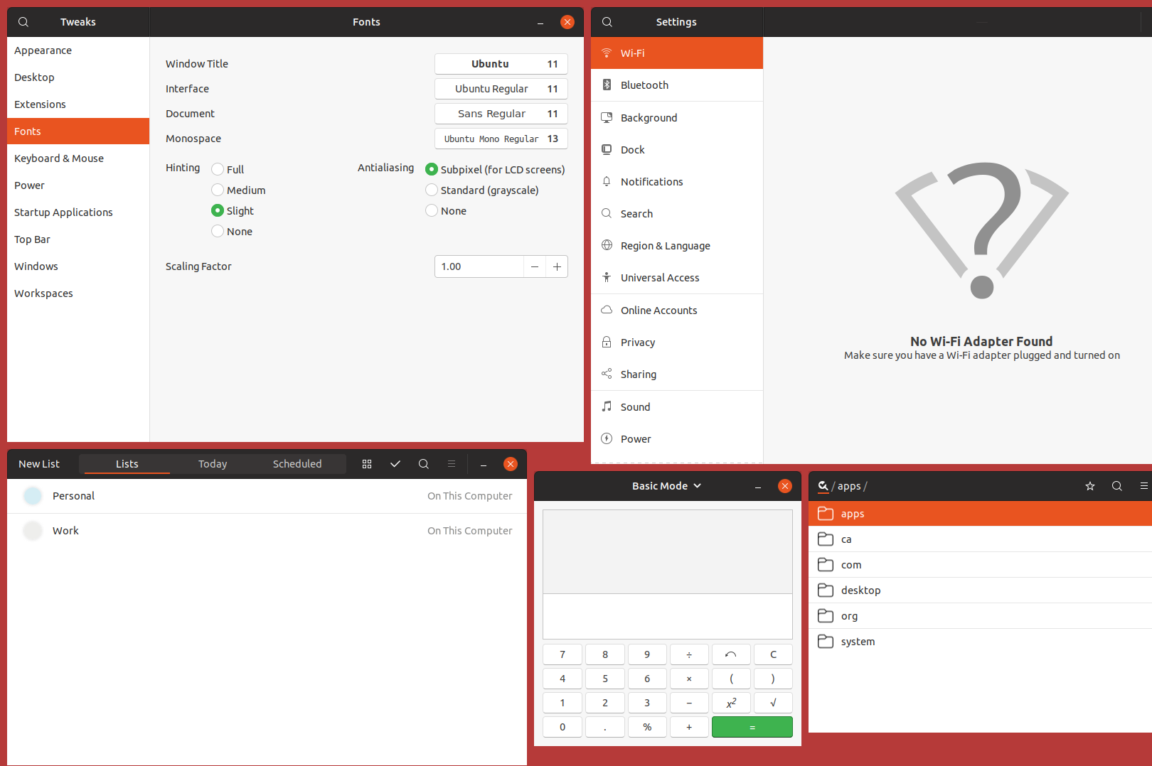
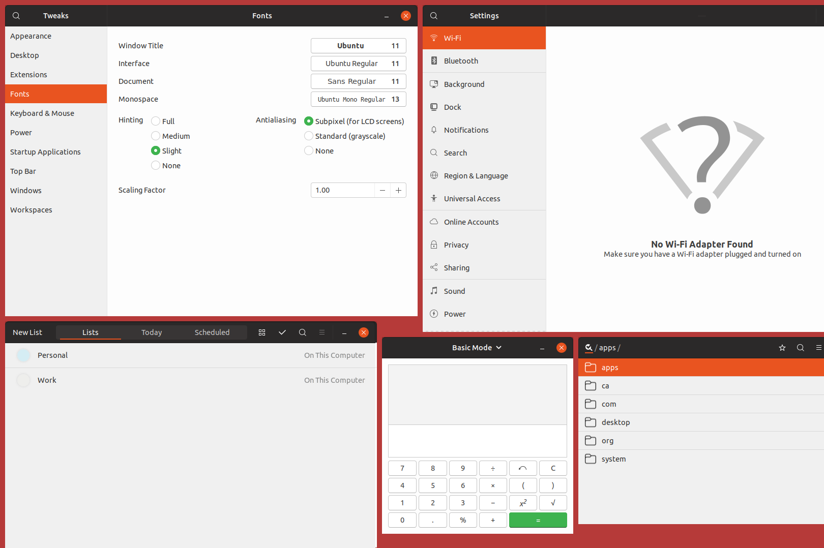
Can you tell which icon am I hovering in this screenshot?
We’ve made previously gray buttons stand out from the similarly gray background, but now we’re back again with a contrast problem as the background was also brightened up. Both surfaces are supposed to have contrast! Look at the expander in Gnome Software, which I’m also hovering in this screenshot:

In both cases, the hovered button is pure white (#ffffff) and the background is #fdfdfd (!!!).
fitojb
on 18 Mar 2018
@fitojb I understand, but this has nothing to do with the color change, it's a side effect of button restyling. I'm going to open a new bug for this
However, to me that the main window has a brighter color than sidebar, which is less important, makes sense.
We’ve made previously gray buttons stand out from the similarly gray background, but now we’re back again with a contrast problem as the background was also brightened up. Both surfaces are supposed to have contrast!
We will probably make the background a little bit darker in the future for another issue I've just found, so do not worry.
No need for exclamation marks, though :smile:
clobrano
on 18 Mar 2018
@fitojb I understand, but this has nothing to do with the color change, it's a side effect of button restyling. I'm going to open a new bug for this
Um, nope, it has to do with this color change. The button restyling was perfectly fine before this color change.
fitojb
on 18 Mar 2018
If you look at the change it has nothing to do with toolbars, moreover I double checked taking the last commit before the sidebars and the problem you reported it's already there (in bionic).
I said it's a side effect of button changes because it's there that we used the same color for background and buttons, moreover buttons in toolbar are flat, that brought the absense of the borders. This is the first flat button I saw in a bright background, while usually are in the headerbar.
Anyway, this is not really important, it's a bug and will be fixed, thank you for reporting it :wink:
clobrano
on 18 Mar 2018
By now I have stopped using this theme because it’s too bright.
fitojb
on 12 Apr 2018
I'm sorry to hear that, but maybe discussing it on the forum would be more useful
clobrano
on 12 Apr 2018
I'm closing this issue. If anyone disagrees, let me know and I'll reopen it 👍
 madsrh
on 7 May 2018
madsrh
on 7 May 2018
Related issues
 Feichtmeier
·
3Comments
Feichtmeier
·
3Comments
 eaglersdeveloper
·
3Comments
eaglersdeveloper
·
3Comments
 matthewpaulthomas
·
3Comments
matthewpaulthomas
·
3Comments
 8none1
·
3Comments
8none1
·
3Comments
 pojntfx
·
3Comments
pojntfx
·
3Comments
Most helpful comment
I'm sorry to hear that, but maybe discussing it on the forum would be more useful