Yaru: Change hover on stackswitcher / pathbar
Use the same kind of background hover for stackswitcher / pathbar as we do for other buttons in the headerbar.

 madsrh
All 21 comments
Maybe with a soft transition too?
 ghost
on 5 Mar 2018
ghost
on 5 Mar 2018
At first I thought @madsrh's mockup looks good. But when I actually tested it, I felt it doesn't look so good than I expected. What do you think? (See also the referenced issue above.)
EDIT: Please bear in mind that the corners of middle buttons in stackswitcher / pathbar cannot be rounded because the buttons are connected.
 nana-4
on 8 Mar 2018
nana-4
on 8 Mar 2018
Here it looks a bit "softer". I think because of the transition/fade in.
(Your Material-Ubuntu-Theme)
EDIT: Okay, maybe because of the gif you cant see the fade in good enough... :(
But i like the material-ubuntu-version way more.
ghost
on 8 Mar 2018
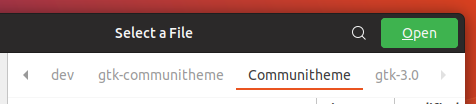
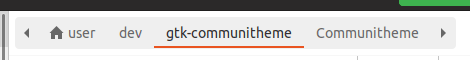
@nana-4 would you double check stackswitcher on an open file window? It uses the same style of headerbar, but in a light version
 clobrano
on 8 Mar 2018
clobrano
on 8 Mar 2018
maybe because of the gif you cant see the fade in good enough... :(
Exactly. My GIF doesn't show real (enough) transition. :(
I think that my strange feeling is due to the square corners of the buttons (that cannot be rounded).
nana-4
on 8 Mar 2018
@clobrano Are you talking about the invisible background of .path-bar? If so, I'll fix that to make the background color visible again. :)
nana-4
on 8 Mar 2018
if so, I'll fix that to make the background color visible again
I'd like to see whether the background highlight on hover would affect also that pathbar. The now-invisible background is probably a side effect of my button restyle :dagger:
clobrano
on 8 Mar 2018
I'd like to see whether the background highlight on hover would affect also that pathbar.
We can choose whether to affect or not to the pathbar, but if we adapt the highlight, it should be like this:
nana-4
on 8 Mar 2018
Awesome!
clobrano
on 8 Mar 2018
Personally, I like the current behavior (gray line on hover > orange line when active)
It feels very natural to me. Is it possible to have both at the same time? Like in firefox:

 yawzub
on 8 Mar 2018
yawzub
on 8 Mar 2018
I agree that this one might be the best fit 👍
Should the animation then be the exact same as in Firefox? To me it looks like a overline from center and on click everything changes instantly (without any animation).
madsrh
on 24 Mar 2018
Sorry, but whats wrong with the current style?
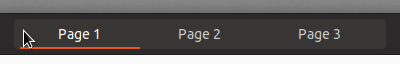
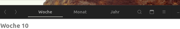
Judging from the mockups/gifs I tend to prefer how things are. Status is indicated by the the underline: orange if selected/active, grey on hover. This seems logical to me and is consistent with other elements. Why change the background on hover (…and than change it back if selected and add an underline instead)?
 ya-d
on 11 May 2018
ya-d
on 11 May 2018
There's only the animation left, current style it's good for me
clobrano
on 11 May 2018
Is this still up-to-date?
@madsrh @clobrano
 Feichtmeier
on 5 Jul 2018
Feichtmeier
on 5 Jul 2018
It is, I just haven't found a way to implement it :(
clobrano
on 5 Jul 2018
What I don't understand is why would we change this for the white underline? The underline makes perfect sense since when you press it it becomes an orange underline. :/
Feichtmeier
on 7 Aug 2018
I believe the underline will still be orange
clobrano
on 7 Aug 2018
I would prefer the current hover with only a grey line instead of the whole background.
@madsrh don't you agree? I know it has been some months but why should we exchange the cool
no line / white line / orange line ? I think that fits perfectly with the shell's top panel.
The stackswitcher is something more than just an array of buttons since you change the whole stack/layer in the main window.
Feichtmeier
on 7 Aug 2018
@Feichtmeier it's been FIVE months (I need to get our more LOL) so, +1 for keeping the current.
Does the gray line have a subtle/fast fadein on hover? Like we did for the buttons. I don't remember and I'm on the road atm
madsrh
on 7 Aug 2018
@madsrh I try to look how @nana-4 does it with his materia and all the many forks of it (canta, pop)
Edit: Hm the stackswitchers don't have that animation. Only the buttons. :man_shrugging:
Feichtmeier
on 7 Aug 2018
There's a quick fadein/out (in Yaru) and I think that's fine, so I'll close this issue for now.
madsrh
on 8 Aug 2018
Related issues
Feichtmeier
·
3Comments
Feichtmeier
·
3Comments
 CDrummond
·
3Comments
CDrummond
·
3Comments
 YamiYukiSenpai
·
3Comments
YamiYukiSenpai
·
3Comments
 Muqtxdir
·
3Comments
Muqtxdir
·
3Comments
Most helpful comment
Personally, I like the current behavior (gray line on hover > orange line when active)

It feels very natural to me. Is it possible to have both at the same time? Like in firefox: