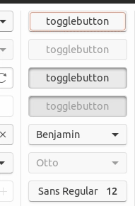
I simply can’t bear the flat gray chosen for the buttons. Can it be brightened up a little bit? It’ll help with #115.
 fitojb
All 28 comments
+1 @fitojb We know they look a bit old-school and we're investigating other possibilities. The current design uses Ubuntu Touch as inspiration.
I would love to hear/see if you have a suggestion! I'll give the above a try.
 madsrh
on 27 Feb 2018
madsrh
on 27 Feb 2018
I don't think they're exactly depressing but I thought about that too. Two quick inspirations for mockups could be:
- The linked screenshot uses rgb-values of 253 for background and 245 for buttons while Communitheme uses 250 and 237. (Could be about color reproduction through image compression/rendering though.)
- I really like the new design for the check and radio buttons. Maybe analogously try white buttons? (I will propose something similar for slider switches soon, too.)
- Maybe scaling back the drop shadow a little (less dark) helps too. (Another issue to be filed: drop shadow for round buttons looks really weird.)
 ya-d
on 27 Feb 2018
ya-d
on 27 Feb 2018
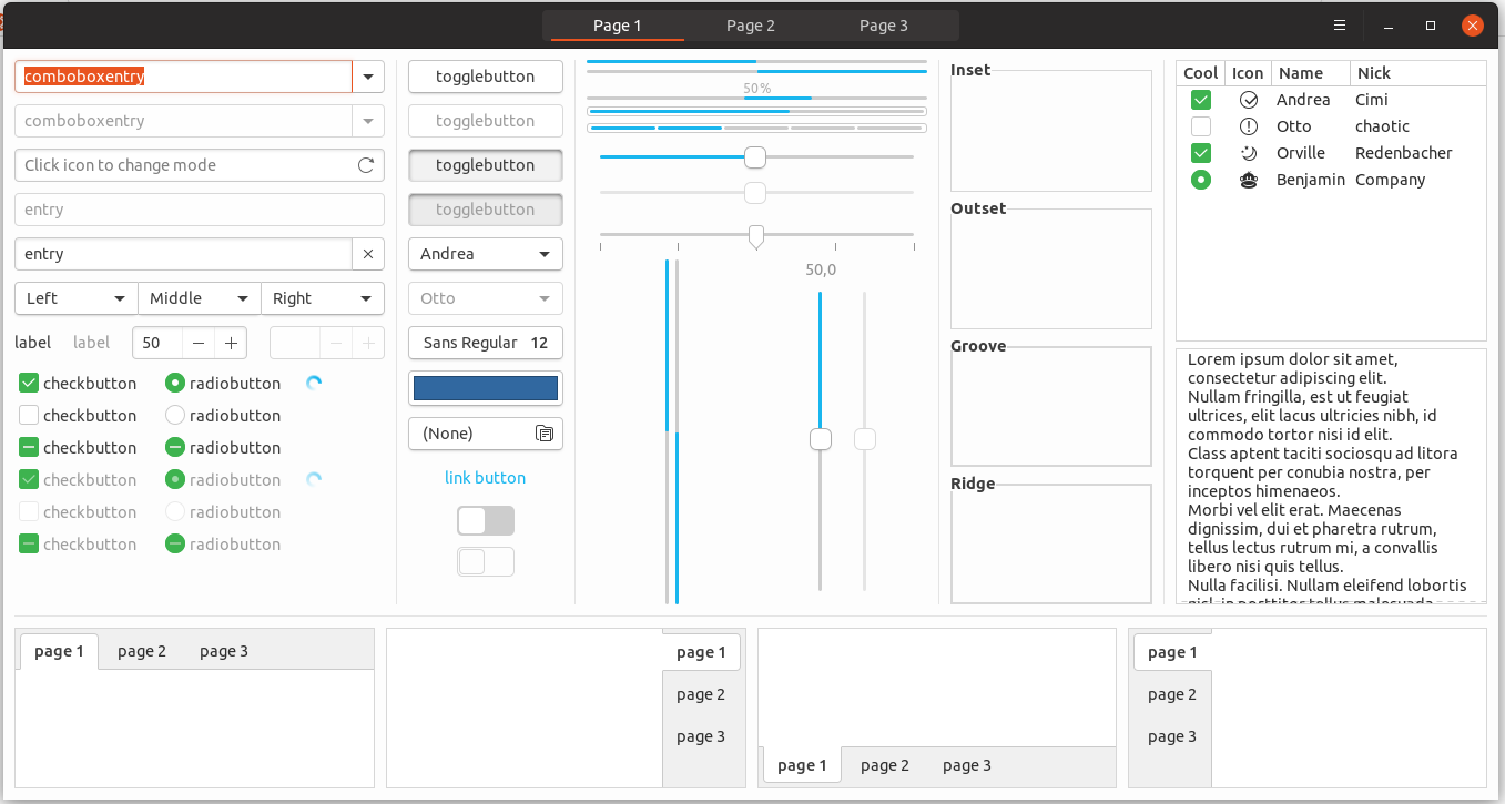
I put together a little collection of buttons in other themes to give some inspiration:
communitheme-buttons at the moment (27.02.2018)
EDIT: communitheme-buttons (08.03.2018)
1 adapta-theme buttons
2 arc-theme buttons
3 pop-theme buttons
4 united-theme buttons
5 numix-theme buttons
6 ambiance-theme buttons
7 adwaita-theme buttons
EDIT: added button from @ya-d
8 macOS (left is pushed down)

 ghost
on 27 Feb 2018
ghost
on 27 Feb 2018
Thanks for putting those together! 👍 So the more common theme seems to be brighter buttons (Mac OS too). Adwaita clearly (and much more so) suffers from the same muddy, triste look IMHO.
I like the United buttons (white with softer border and shadow) but I also like the current 3-dimensional inner shadow for active/pushed down state (though it might be a bit too soft/blured currently which makes it a bit unrealistic from a lighting perspective).
8 macOS (left is pushed down)

// edit
Referencing #172.
ya-d
on 27 Feb 2018
IMHO a combination of 3 and 4 could fit the best.
shadows: from 3 because they look the most realistic.
shape: from 4 because the corners are more rounded and that would fit more to the suru-style.
EDIT: and yes, +1 for brighter buttons
ghost
on 27 Feb 2018
MacOS buttons work fine because the background is darker than communitheme's one. It's basically a color inversion and maybe also a gradient
EDIT: and pushed button is terrible :smile:
 clobrano
on 27 Feb 2018
clobrano
on 27 Feb 2018
Regarding MacOS: Those were actually "header bar" buttons, sorry. In app buttons are straight white against rgb 236 or 227 background. Maybe @NusiNusi can replace the screenshot.
8 macOS buttons
ya-d
on 27 Feb 2018
So what are the parts we need to think about?
- shadows/glow
- shape
- colour
- possible gradient
- size
EDIT: I found a site where people with no technical expertise can build buttons:
http://css3buttongenerator.com/#
Sure, there are not many options but maybe it helps us building mockups?
EDIT 2: Found a better site:
https://dabuttonfactory.com/
ghost
on 27 Feb 2018
Also, macos button does not have any hover effect (they have very limited effects in general). Maybe simplifying is the way? :smile:
clobrano
on 28 Feb 2018
Hey! Here's my humble opinion:
Adapta and POP buttons lacks contrast.
Adwaita, Adapta and POP buttons are HUGE.
Community theme, Adwaita and partially Ambiance looks dated.
Arc and Numix lacks borders or/and shadow and without either it reduce discoverability (is this a button?)
I really like Arc (and the derivatives) except for what I just mentioned, so below is a mockup based on that with a darker border and a shadow on buttons. I was going for a PopOS shadow, but it didn't turn out like that. I also forgot the suru round corners so imagine these ;)
_(click to view in full size)_
madsrh
on 28 Feb 2018
I like them! Especially the little shadow underneath the button is really nice! We already discussed this on another issue (which was closed #164 ), but: how would they react when hovered or clicked? This will surely depend on #184 . My opinion: your buttons should be implemented ASAP!
EDIT: They look a lot like 4 united-theme buttons.
EDIT2: @madsrh I like the hover-effect a lot. Would it be possible to let this effect fade in?
ghost
on 28 Feb 2018
Work in progress
with transition
clobrano
on 28 Feb 2018
@clobrano Wow, You're fast! The deactivated border looks darker than the active ones, but I guess you already know that. Except for that, it looks really good!
madsrh
on 28 Feb 2018
looks best with transition. With suru round corners like @madsrh planned it would look perfect. at least for me.
ghost
on 5 Mar 2018
@NusiNusi I acutally think this looks great
madsrh
on 5 Mar 2018
Reopening this because gtk2 style hasn't not been addressed yet
clobrano
on 7 Mar 2018
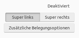
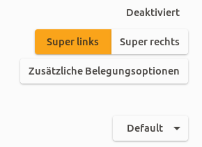
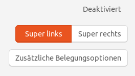
I've been working on buttons a little bit to fix the contrast and border issues. They're darkened _just_ a bit.
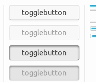
I was hoping to have a fusion of the old style and the new style. I'd really like the dark theme to have the bottom highlight like the old style as well, as I think the dark theme buttons look too flat but that depends on what everyone else thinks of it, of course.
The orange focus ring will need to be changed to outline-offset: -3px; or similar as you can see in the gif (for non-flat buttons) that it's hard to tell when a button is being hovered on while it's in focus (so I made hovering darken the background color a little).
 godlyranchdressing
on 23 Mar 2018
godlyranchdressing
on 23 Mar 2018
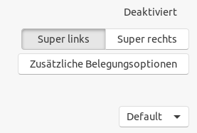
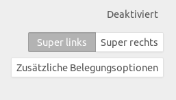
I like this proposal, just not sure about the dark border of pressed button. Maybe a little more similar to the active insensitive one?
clobrano
on 23 Mar 2018
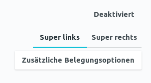
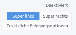
Updated: 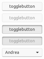
godlyranchdressing
on 23 Mar 2018
godlyranchdressing
on 23 Mar 2018
Nice!
clobrano
on 23 Mar 2018
@godlyranchdressing:
I've been working on buttons a little bit to fix the contrast and border issues. They're darkened just a bit.
I suggested (Hangout #150) a background change to fix the contrast issue. Did you (or @clobrano ) argue against the background change to #f7f7f7 (porcelain)?
madsrh
on 24 Mar 2018
I'm not against changing bg color, in fact I wondered whether too much white could be annoying.
Here is a selection of intermediate color though, since I also lik
Current (#FDFDFD)
porcelain (#F7F7F7)
F9F9F9
FAFAFA
clobrano
on 24 Mar 2018
I guess we should move this conversation to issue #259 😄
I'm still +1 for porcelain (#F7F7F7)
madsrh
on 24 Mar 2018
No please :smile: , that was only sidebar's color
clobrano
on 24 Mar 2018
+1 for #fafafa
fitojb
on 24 Mar 2018
IMHO the buttons looked this way the best:
https://user-images.githubusercontent.com/2883614/36802888-68189d98-1cb6-11e8-847a-123a855fb404.gif
what where the reasons for the change?
ghost
on 13 Apr 2018
@NusiNusi please look for the bug about reverting button change.
clobrano
on 14 Apr 2018
Related issues
 YamiYukiSenpai
·
3Comments
YamiYukiSenpai
·
3Comments
 Feichtmeier
·
3Comments
Feichtmeier
·
3Comments
 eaglersdeveloper
·
3Comments
eaglersdeveloper
·
3Comments
 mivoligo
·
3Comments
mivoligo
·
3Comments
mivoligo
·
3Comments
mivoligo
·
3Comments
Most helpful comment
Work in progress

with transition
