Yaru: Style application dialogs to match interactive dialogs
It seems inconsistent with three different kinds of dialogs. Especially the white dialog with rounded corners _(that nothing else in the UI has)_ jumps in my eye.
Could we change the white dialog design to match the dark look of system menu, calendar, brightness, ...?
 madsrh
All 19 comments
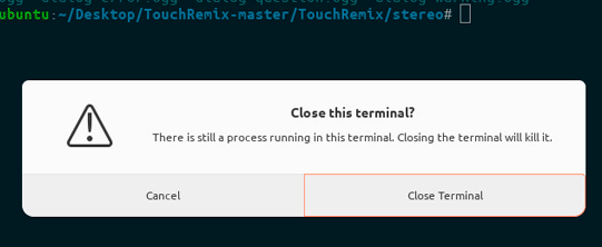
It's weird, but the two dialogs show above from gtk (close terminal one and confirm close) are actually two different things. The first is a message dialog/box, the latter an interactive dialog. Not sure about why this distinction, but I think we should keep it, so that I styled only the first in my PR, since the latter already shows a "communitheme valid" style.
Just my opinion though, so let me know your feedback
 clobrano
on 11 Feb 2018
clobrano
on 11 Feb 2018
@clobrano Sorry, yes that was a bit unclear from my post. The gif was merely to emphasize that three different styles are used. But YES the Firefox dialog shouldn't change, only the "white dialogs" should match the dark look. Apologizes for the confusion.
madsrh
on 11 Feb 2018
@madsrh no worries, I didn't even recognize the dialog came from Firefox 😂.
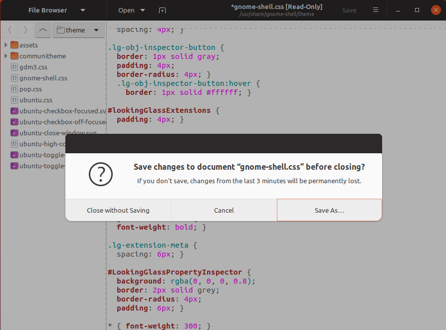
I used gtk3-demo>dialog-and-message-boxes demo and there are two different demos there, so it would make sense style them similarly, but since one of the two (the interactive one) is already styled, I thought it wasn't necessary to do it differently.
clobrano
on 11 Feb 2018
Closing this issue since we think it's better to keep the difference between the application message dialog and the shell dialog. It will help users figure out what is happening. To quote @didrocks:
I think that having them differentiated actually help: "is it something from the system or is it something specific to the app?". (without talking about security, just user's hint here).
Feel free to reopen it if you think it needs more discussion.
 galgalesh
on 14 Feb 2018
galgalesh
on 14 Feb 2018
https://community.ubuntu.com/t/mockups-new-design-discussions/1898/263
I'm going to reopen this issue for "add blank headerbar and less rounded corners on application dialogs and change background to #f7f7f7"? _(I forgot to change the roundness in the mockup)_
madsrh
on 23 Feb 2018
Why not also change the buttons into our regular buttons?
galgalesh
on 24 Feb 2018
That would make it the same as another type of dialog window. So if we decide to do it, they have to be exactly the same, but at this point, as @didrocks said, we won't know which dialog is anymore
clobrano
on 24 Feb 2018
@galgalesh Yes, that would make sense to me.
@clobrano Well this one has an empty headerbar ;)
Aren't they both application dialogs? As I understood @didrocks comment, the issue was only to distinguish application dialogs from shell dialogs. I really don't understand why the average user would want to know if it's an application dialog or an interactive dialog.
madsrh
on 24 Feb 2018
Yes, they are both application dialogs, the dark ones are different, those should stay the same, but this proposal is only for the light ones, right?
galgalesh
on 24 Feb 2018
@galgalesh right!
madsrh
on 24 Feb 2018
What about this?
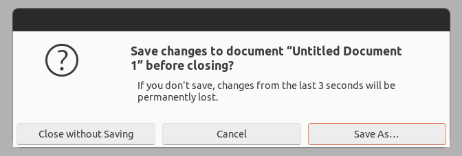
I'm still investigating whether this kind of window dialog forced the button to stay centered in their positions or not
clobrano
on 24 Feb 2018
Yes @clobrano! 👍This, to me, feels much more as part of the theme.
madsrh
on 24 Feb 2018
It seems I made a too big deal about differences between interactive and message dialogs, sorry!
Looking at the code in gtk3-demo, it looks that interactive dialogs are just a lot more manually styled, while message dialogs are a simpler way to do dialogs.
So, I'm going to propose this change as it is.
clobrano
on 25 Feb 2018
:+1: Thanks for getting us back on track @madsrh ;) (Yes, I'm backlogging your current crazy 355 github messages while I was away :p)
 didrocks
on 1 Mar 2018
didrocks
on 1 Mar 2018
@didrocks Yes, I'm backlogging your current crazy 355 github messages while I was away :p)
Only surpassed by @clobrano at 356 :stuck_out_tongue_winking_eye: ...and welcome back!
madsrh
on 1 Mar 2018
I just saw my first newly styled dialog, and I really like it! Good job!
galgalesh
on 3 Mar 2018
I'm not so sure about the new design but since the community has voted for it, it should definitely be accepted.
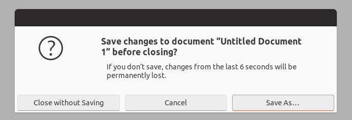
Looking at dialogs closely however something seems to be off to me. Would it be possible to make the margin/padding beneath the buttons a bit bigger? Since the margin on the side seem to be bigger this looks a bit weird to me (tested this with gedit) ;).
 pojntfx
on 6 Mar 2018
pojntfx
on 6 Mar 2018
Well spotted @pojntfx +1
madsrh
on 6 Mar 2018
Would it be possible to make the margin/padding beneath the buttons a bit bigger?
very possible :wink:
clobrano
on 7 Mar 2018
Related issues
 Feichtmeier
·
3Comments
Feichtmeier
·
3Comments
 8none1
·
3Comments
Feichtmeier
·
3Comments
madsrh
·
3Comments
Feichtmeier
·
3Comments
8none1
·
3Comments
Feichtmeier
·
3Comments
madsrh
·
3Comments
Feichtmeier
·
3Comments
Most helpful comment
I'm not so sure about the new design but since the community has voted for it, it should definitely be accepted.

Looking at dialogs closely however something seems to be off to me. Would it be possible to make the margin/padding beneath the buttons a bit bigger? Since the margin on the side seem to be bigger this looks a bit weird to me (tested this with gedit) ;).