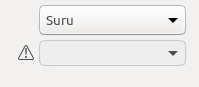
Yaru: Deactivated switches and switches in off state looks the same
At a glance, deactivated switches and switches in off state looks almost the same. Adding a bit of gray to the white knob itself, would emphasize that this is deactivated. If possible I would use the same gray as the background (of the switch) at 50% opacity.
 madsrh
All 21 comments
This is with 50% opacity
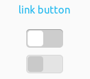
I also tried transparent by 20%, what do you think?
 clobrano
on 30 Jan 2018
clobrano
on 30 Jan 2018
@clobrano Ahhh, I see what you did there :) I meant 50% of the deactivated gray (#e4e4e4) which then becomes something like #f0f0f0. But the 20% one you posted looks good
madsrh
on 30 Jan 2018
I prefer the 20% transparency: they look more like the same buttons in different state. I don't know why, but with the 50% case, I feel like it's 2 different items, not the same.
 didrocks
on 31 Jan 2018
didrocks
on 31 Jan 2018
@madsrh sorry, I misunderstood :D. Let me try with #F0F0F0, then I'll do the PR
clobrano
on 31 Jan 2018
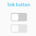
Here is #F0F0F0
I think I'll go with 20% transparency, though
clobrano
on 31 Jan 2018
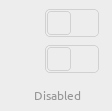
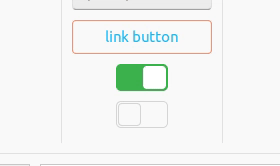
Also consider colors for inactive windows, please. Top switch is off, bottom is on. Makes no sense to me that they use different colors, especially for the 'knobs'. IMHO the grey for off-state should be the same brightness as the green for on. So that a desaturated on-switch in an inactive window is of the exact same grey than an off-switch.
// sidenote
If design is reaching finalization you should definitely go over the many shades of grey used in this theme and consider the meaning of contrast for active/inactive state of elements. On the appearance screen of Tweaks I count 10+ rgb-values alone: 255, 250, 240, 237, 230, 220, 205, 192, 167, ~100(?), ~66(?), 61, + header bar.
 ya-d
on 31 Jan 2018
ya-d
on 31 Jan 2018
What's also an option is to give disabled elements the same colors as the background. That is strong signalling to the user: backgrounds are not clickable, so everything that looks like a background is unclickable. An example in ambiance; enabled vs disabled listbox
(also; make all elements flat when disabled, this is a very common design pattern; but I think we're already doing that so :+1:)
 galgalesh
on 31 Jan 2018
galgalesh
on 31 Jan 2018
Makes no sense to me that they use different colors, especially for the 'knobs'.
I agree about the knobs
So that a desaturated on-switch in an inactive window is of the exact same grey than an off-switch.
Do not agree. I think it's important that widgets with different states keep the difference in an inactive window
clobrano
on 31 Jan 2018
I like the one at 20%. I fully agree with both ya-d and Merlijn. I'm not sure how well the background-less switch will work here though. Like these? @clobrano can you post a screenshot with a transparent background?
@ya-d Good points! I could try a few color combinations and post the result here.
We already discussed this, but the "colored-knobs switches", I suggested earlier might also be better for usability. Here with icons
madsrh
on 31 Jan 2018
@clobrano can you post a screenshot with a transparent background?
It would roughly be this way. We can play a little more with borders' color, but I'm not convinced with the result, too evanecent to me

clobrano
on 31 Jan 2018
I think that looks good for switches in backdrop @clobrano :
Could we use that for deactivated switches in active windows also or would that be confusing?
madsrh
on 1 Feb 2018
I like the transparent switches, especially for an unfocused window, but I think it needs some tweaking.
What about having the background transparent but making the knob/button itself grey? I like this conceptually because this way, the background of the switch signals its "state":
- colored = enabled and on
- grey = enabled and off
- transparent = disabled
Another thing you could try is to only make the knob/button transparent and make the background 20% or something. This is also nice conceptually because the thing that you can change, i.e. the button itself is the same color as the background, because the button is disabled. The switch itself is still there, and has a position, you just can't change it because the button of the switch doesn't work.
galgalesh
on 1 Feb 2018
Also, what are the Canonical design guidelines for the switch? How did they solve the issue?
galgalesh
on 1 Feb 2018
Good point, we should try that.
Canonical does this a bit different. They are using their switches on a white window background. The background of thedeactivated switches are light gray (same light gray as our window background): https://github.com/CanonicalLtd/desktop-design/blob/master/Switch/Switch.png
madsrh
on 1 Feb 2018
@madsrh
I think that looks good for switches in backdrop
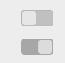
But then how can we keep the difference between checked and unchecked switches in backdrop?
If we get rid of any color, all switches will look the same. As example, the picture below, are they both disabled or one is disabled and one just unchecked?
Could we use that for deactivated switches in active windows also or would that be confusing?
Do you suggest to use transparent for both unchecked and deactivated/disabled switches? That would be confusing, I think
@galgalesh
What about having the background transparent but making the knob/button itself grey?
There was a proposal from @madsh very similar. At some point we decided for colored backround and knob white, since I think that let us use more colors to distinguish different states
Also, what are the Canonical design guidelines for the switch? How did they solve the issue?
The picture misses the backdrop variation of those states (and I really don't like Unity8 version, sorry :D)
clobrano
on 1 Feb 2018
I also would see the deactivated with a border only, but the not in focus (not deactivated) with a slight grey.
 Luxamman
on 5 Feb 2018
Luxamman
on 5 Feb 2018
@clobrano the difference between checked and unchecked deactivated buttons is the position of the knob of the button. In your example, both buttons are unchecked.
galgalesh
on 6 Feb 2018
In your example, both buttons are unchecked.
I thought that at least one was unchecked and disabled
clobrano
on 6 Feb 2018
So, this is the current state before @Luxamman request
as I said before, backdrop:unchecked and disabled look the same
@Luxamman by "not in focus" do you mean the checked ones when the windows is not on focus (backdrop)? If that so, I tried some combination, but the light gray tends to merge with the border color, so that the switcher looks too different respect the others (disabled and unchecked).
clobrano
on 6 Feb 2018
I feel as if there is some miscommunication here so excuse me if I'm repeating stuff that's already said.
A disabled button can be either disabled+checked or disabled+unchecked. The difference between these is in the position of the "knob" of the button: left = unchecked, right = checked.
The current discussion is about the difference between focused/backdrop right?
galgalesh
on 6 Feb 2018
@galgalesh no worries, surely it's better to clear any misunderstanding 😉
You're right, the position of the knob is perfect for checked/unchecked switches in backdrop state.
What I am worried now is that, when in a backdrop state, there is no difference between an unchecked switch and a unchecked-and-disabled one because they are both totally transparent (one could even says "does it matter?" 😄).
In the picture below, the upper switch is just unchecked, the bottom one is disabled
clobrano
on 6 Feb 2018
Related issues
 Feichtmeier
·
3Comments
Feichtmeier
·
3Comments
 CDrummond
·
3Comments
CDrummond
·
3Comments
 mivoligo
·
3Comments
Feichtmeier
·
3Comments
Feichtmeier
·
3Comments
mivoligo
·
3Comments
Feichtmeier
·
3Comments
Feichtmeier
·
3Comments
Most helpful comment
Also consider colors for inactive windows, please. Top switch is off, bottom is on. Makes no sense to me that they use different colors, especially for the 'knobs'. IMHO the grey for off-state should be the same brightness as the green for on. So that a desaturated on-switch in an inactive window is of the exact same grey than an off-switch.
// sidenote
If design is reaching finalization you should definitely go over the many shades of grey used in this theme and consider the meaning of contrast for active/inactive state of elements. On the appearance screen of Tweaks I count 10+ rgb-values alone: 255, 250, 240, 237, 230, 220, 205, 192, 167, ~100(?), ~66(?), 61, + header bar.