Yaru: Switch button smaller and included inside border
Like in settings, make the switches (green/grey) smaller and so more elegant. If possible, shrink the inner toggle also a little to not touch the border of the switch.
 clobrano
All 38 comments
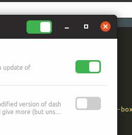
(Borders are done with box-shadow so as to not add pxs to the switch)
 godlyranchdressing
on 14 Jan 2018
godlyranchdressing
on 14 Jan 2018
@godlyranchdressing are we working on the same bug?
clobrano
on 14 Jan 2018
@clobrano nope, just copy and pasting the mockup and notes to here. Though I did close issue #55 (which was due to border-color being used instead of overwriting the last box-shadow)
godlyranchdressing
on 14 Jan 2018
Awesome, thanks!
clobrano
on 14 Jan 2018
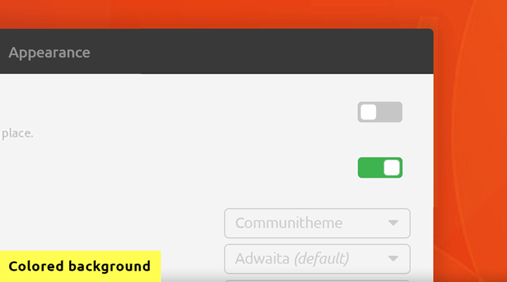
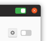
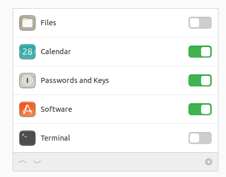
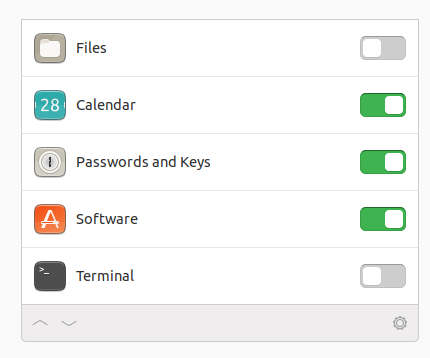
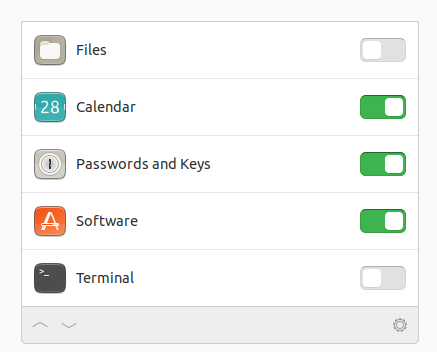
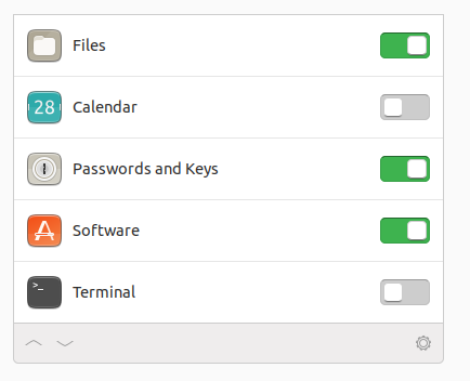
I still think the switches look huge. What do you guys think, can I reopen?
Here compared to Arc:
 madsrh
on 15 Feb 2018
madsrh
on 15 Feb 2018
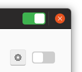
I had hard time trying to reduce the size more than that, not sure why, but let me try again
clobrano
on 16 Feb 2018
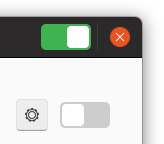
I actually like them the way they are now. I don't mind big buttons, I think it's part of the Suru look; much like the folder icons and the font, which look a bit bloated too. I think it makes it look a bit more friendly.)
 galgalesh
on 16 Feb 2018
galgalesh
on 16 Feb 2018
Suru was very much for mobile and touch input, I also would like see if they can be a little smaller (at least in height) to look less clumsy.
Let's see what @clobrano can do :)
 Luxamman
on 16 Feb 2018
Luxamman
on 16 Feb 2018
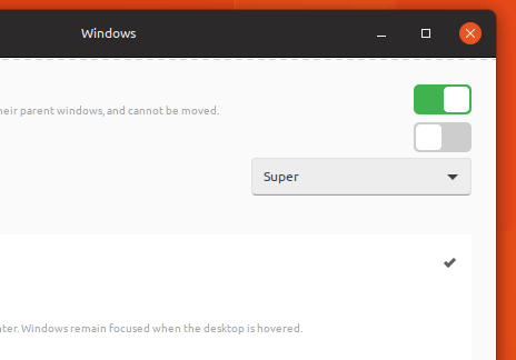
Currently I am stuck with this
I couldn't style headerbar switch, no idea why, and couldn't make knob square :thinking:
clobrano
on 28 Feb 2018
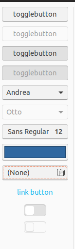
I played around with switches as well to adopt the new check/radio button style and mix that with that (now obsolete) button design. I can't currently think about that any further or update the design to reflect the new direction for buttons, so I simply post it as a thought.
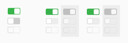
- "Improvements": white knob with borders as radio/check buttons; background reflects button design (what it used to be); white knob in backdrop windows indicates active state
- Versions: left is current design – middle is proposed design – right adds border to the background as have buttons and pretty much anything else but button overlays.
- As for size we could at least try to match the size of the knob with checkboxes and/or volume sliders and see how that looks. (I didn't mean to change size for the mockups.)
 ya-d
on 1 Mar 2018
ya-d
on 1 Mar 2018
@clobrano
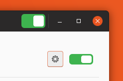
couldn't style headerbar switch
It needs to increase top/bottom margin for headerbar switch.
headerbar switch {
  margin-top: 10px;
  margin-bottom: 9px;
}
couldn't make knob square
Try switch { font-size: 0; } :smile:
However, IMHO 15px knob looks too small.
I'd prefer 20px knob (which is same size with the current scale slider)
...or 22px knob (which is only 1px smaller than the current knob).
 nana-4
on 1 Mar 2018
nana-4
on 1 Mar 2018
+1 for 20px on first sight.
// edit: Checkbutton field is 18px which could be a fourth possibility to try.
ya-d
on 1 Mar 2018
I agree with @nana-4, 15px doesn't look too bad, but it's weird
Rounded maybe?
squared and 18px looks this way
clobrano
on 21 Mar 2018
IMO the rounded one will lose consistency with the GtkScale's slider. I personally like the current roundness (even if we round the GtkScale's slider or not).
(Sorry for nitpicking, but the knobs of the bottom picture seems to be actually 20px. I measured it. :) )
nana-4
on 21 Mar 2018
Weird, but correct... it's 18px in the code, but not in the picture...
clobrano
on 21 Mar 2018
@clobrano It's because there is an invisible 1px border. So that need to be 16px in the code. :)
nana-4
on 21 Mar 2018
It would be nice if squares inside were smaller. They are too big right now and create too much contrast because of green background that also looks like a green border outside of a square
 zappedfish
on 17 Apr 2018
zappedfish
on 17 Apr 2018
@clobrano I am somehow unsatisfied with the togglebuttons, too :|
They could either use a small grey border or any other trick I don't know. They look... unfinnished (to me! :) )
 Feichtmeier
on 20 Apr 2018
Feichtmeier
on 20 Apr 2018
Better if we can have material like switches.

This is from PopOS theme.
 gamunu
on 28 Apr 2018
gamunu
on 28 Apr 2018
@gamunu I disagree, while they look good on material inspired themes like materia/pop/adapta, they won't look fitting for this theme. This is not very close to material design. It's mostly flat yes, but it's different. I don't think our just needs some refinement when we have time for this.
Feichtmeier
on 28 Apr 2018
Trying again some mockups
clobrano
on 2 May 2018
I really like the 3d-effect! 👍
But it looks slightly different to the one for (pressed) buttons, doesn't it? Would be great if you could match those. Also I still think matching the design of sliders, check boxes and radio buttons by adding a grey border is a good idea (see my earlier proposal). Maybe a border to the "background" is also what's missing to make it more like the button style.
ya-d
on 2 May 2018
Much better! I agree a super light grey 1px border could increase the desire to toggle them other than that I'd prefer those to the current ones
Feichtmeier
on 2 May 2018
I was aiming at replicating not pressed buttons actually. I'll try again with your suggestions
clobrano
on 3 May 2018
New iteration
clobrano
on 3 May 2018
I think that fits to the "3d depth" of pressed buttons! I like it - @madsrh ?
Feichtmeier
on 3 May 2018
I think that fits to the "3d depth" of pressed buttons! I like it
Me too! 👍 Should the off background be slightly lighter (225 instead of 205 rgb) to match pressed buttons? (205 is used by inactive elements like check boxes and stuff.) Just a thought.
ya-d
on 3 May 2018
I think unchecked switches should not match pressed buttons colors, since they represent opposite states (even if different widgets), maybe unpressed buttons?
EDIT: nevermind, button bg color is definitly too bright
clobrano
on 3 May 2018
This way is probably too bright
clobrano
on 3 May 2018
I like both versions but lean a bit towards the brighter one. Thanks for trying 😉
What bothers me more is how users recognize it as "off" compared to "disabled". The depth already helps with that, maybe even more if you lift the knob by the same effect. Borders might be enough though.
ya-d
on 3 May 2018
The knob could indeed receive a super soft border, like the progress sliders in gnome music
Feichtmeier
on 3 May 2018
I am a bit torn here. I added a border to the knob and increased the box-shadow to look more like the one in the switch. It looks good to me when unselected, but the selected one puzzles me
I have tried first using a darker success_color, but it creates some glitches at the round corners, so here I am using the very same colors as the unselected switch. Maybe too many colors (green, grey, white) in the same little spot?
EDIT: it is still better than the previous iteration, though :D
clobrano
on 4 May 2018
IMO there's too much shadow here. I liked the previous one better.
madsrh
on 4 May 2018
Too much shadow on the knob, or also on the switch?
clobrano
on 4 May 2018
Yes was an idea and you tested it. The previous one looked definitely better
Feichtmeier
on 4 May 2018
The knob 🎛
Doesn't it look a bit too 3D next to the other UI elements?
Sorry, I should let @Feichtmeier and @ya-d comment, because I was very happy with the version 23 hours ago 😆
madsrh
on 4 May 2018
:smile: so we have a winner I think https://github.com/ubuntu/gtk-communitheme/issues/44#issuecomment-386249751
EDIT: awesome, I'm going to merge it, so that it will be promoted in stable today :tada:
clobrano
on 4 May 2018
Yes the super 3d one looks almost like it would fall of the slider like a piece of paper upon a board that has not enough glue xD
Feichtmeier
on 4 May 2018
Related issues
Feichtmeier
·
3Comments
 matthewpaulthomas
·
3Comments
matthewpaulthomas
·
3Comments
 pojntfx
·
3Comments
pojntfx
·
3Comments
 YamiYukiSenpai
·
3Comments
Feichtmeier
·
3Comments
YamiYukiSenpai
·
3Comments
Feichtmeier
·
3Comments
Most helpful comment
Trying again some mockups