Yaru: boxed hover effect on window control buttons
This idea comes from madsrh's mockup.

It requires background-images for control buttons, so it's not a high priority task
 clobrano
All 12 comments
But no circle on hover for min and max, right?
 madsrh
on 5 Jan 2018
madsrh
on 5 Jan 2018
No circles, correct
clobrano
on 5 Jan 2018
I did some testing with this, but I decided to omit the boxed effect. It doesn't work without the white circle present in the mockup. Since the current buttons themselves rely on a circle effect when interacted with you end up with this double background color that looks like an error, too.
Should we merge the changes or try with another design instead?
 godlyranchdressing
on 13 Jan 2018
godlyranchdressing
on 13 Jan 2018
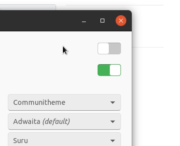
Can you post a picture of the result?
clobrano
on 13 Jan 2018
Sure.
Background-image lets us use larger buttons without the background-color taking up the full dimensions of the box which would look awkward:
(Result of the pull request)

With the boxed effect, a 1:1 ratio would make the buttons too wide and the close button can't reach the edge of the headerbar unless we remove the headerbar's padding:
godlyranchdressing
on 13 Jan 2018
What do you think of removing the circle hover from the second picture?
clobrano
on 13 Jan 2018
I thought about it. We could make them look and work like regular headerbar buttons, but then the orange circle will need to go.
I think I might reduce the target space since it's too probably a little unreasonably large the way it is now. 2-3px outside of the circle's radius should be fair.
godlyranchdressing
on 13 Jan 2018
- I too think the hover in the second picture should be removed.
- I really like the large target space ;)
madsrh
on 13 Jan 2018
If I understood correctly, the effect should be this one
clobrano
on 18 Jan 2018
@godlyranchdressing do you mind if I commit this?
clobrano
on 20 Jan 2018
Of course, though I think it'd be better if they have a radius to match the other headerbar buttons.
godlyranchdressing
on 20 Jan 2018
Of course, though I think it'd be better if they have a radius to match the other headerbar buttons.
That'd be surely better
clobrano
on 21 Jan 2018
Related issues
 Feichtmeier
·
3Comments
madsrh
·
3Comments
Feichtmeier
·
3Comments
Feichtmeier
·
3Comments
madsrh
·
3Comments
Feichtmeier
·
3Comments
 YamiYukiSenpai
·
3Comments
YamiYukiSenpai
·
3Comments
 Muqtxdir
·
3Comments
Muqtxdir
·
3Comments
Most helpful comment
If I understood correctly, the effect should be this one