It would be nice to have a good looking banner for the README/Wiki, and a square logo/icon for the executable, that could also be repurposed as a badge for system notifications.
Ideas for what would be suitable graphics for these purposes are welcome.
If anyone has experience with this kind of work and want to contribute, that would be great!
To stick with the spirit of the rest of this project, I would like any contributed graphics / design to be made available under a permissive license (CC0?).
Thanks for taking an interest in this software.
 koekeishiya
All 26 comments
@koekeishiya Hi, my name is Richard. I'm a graphic designer and I love making contributions for open source projects. I see that they want a new logo for your application. If you wish, I can do it for you without any problem ... I can present some modern ideas that would improve the appearance and image of your project.
 richardbmx
on 24 Jun 2019
richardbmx
on 24 Jun 2019
@richardbmx
That would be great, I'd like that a lot. Looking forward to see what ideas you can come up with
koekeishiya
on 24 Jun 2019
@koekeishiya Perfect I will work on it
richardbmx
on 27 Jun 2019
@koekeishiya Happy first day I want to apologize for the delay I had some problems with the internet connection.
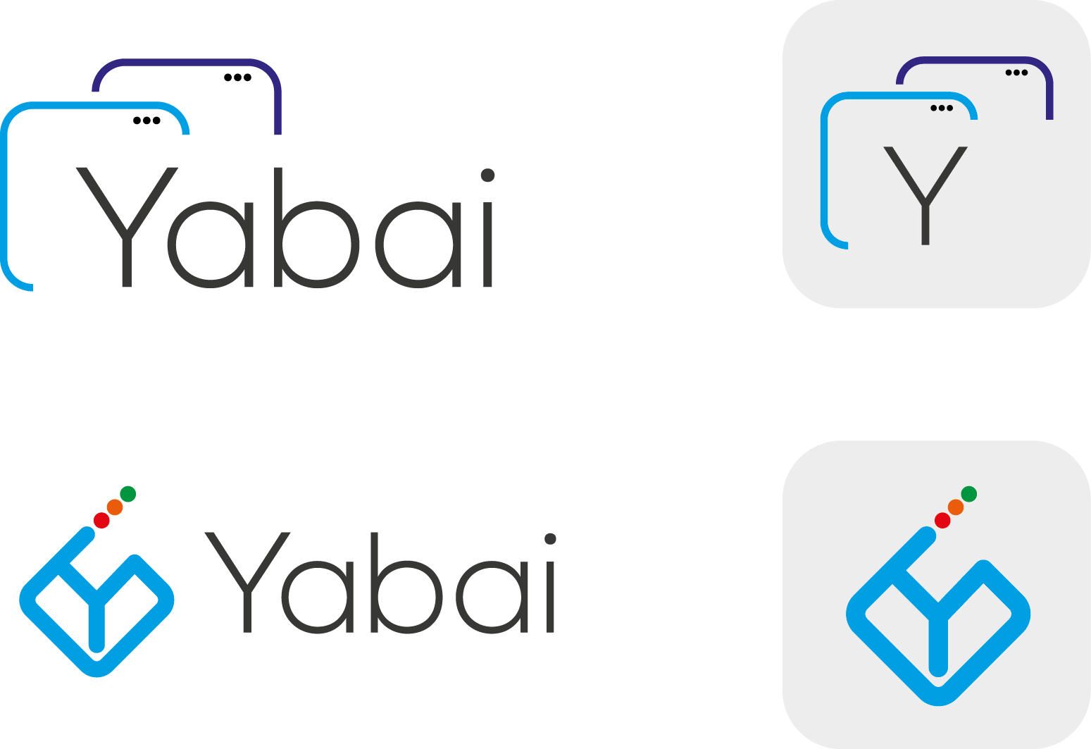
Here I want to present these two ideas that I developed for your project in both I express the management of windows for IOs, in the second idea I created a figure that works a window with the letter Y to give a more unique personality for your project, I hope you please if you want some change you just have to request it and I will gladly do it
richardbmx
on 8 Jul 2019
@richardbmx
No need to apologize for the delay. Thanks again for doing this!
I think both are pretty great. I think the first one would fit best as a banner used in the README/wiki, where as the Y in the second one would be a great fit as the executable icon.
What do other people think?
koekeishiya
on 8 Jul 2019
I particularly like the idea of the top right icon, so I tried to re-create it using the 10px border radius of macOS windows and the traffic light buttons original size, position and colours and gave the front window a 2px shadow. I think this fits a bit better.
I'm not sure about using a Y on the icon. I think logo + "yabai" to the right (bottom left) is the best layout for the banner. I like the the font you used very much.
I experimented with using fontawesome icons that signal automation or power user tools instead of the Y on the icon, but I'm not too sure I like it.

Logo

Banner (ignore the font)
 dominiklohmann
on 8 Jul 2019
dominiklohmann
on 8 Jul 2019
I really like the multiple windows, but shouldn't the windows be somewhat tiled? The second design could be visually confusing since it can resemble the Kodi icon.
 hello-party
on 14 Jul 2019
hello-party
on 14 Jul 2019
My idea:
The icon represents tiling while rotated to present a "Y." And of course, the colors in the lettering signify window controls. Simple.
 r3volution11
on 15 Jul 2019
r3volution11
on 15 Jul 2019
My idea:
The icon represents tiling while rotated to present a "Y." And of course, the colors in the lettering signify window controls. Simple.
Maybe a different font? Either way I'm loving it as is.
Edit: It'd be pretty cool to make the y represent the splits within the window too.
 capaldo
on 18 Jul 2019
capaldo
on 18 Jul 2019
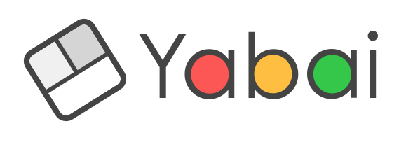
Hi i just created a logo/iocn for Yabai, tell me where you need improvement. When the logo will be finalized then i will move to the banner. feel free to criticize.

 ayaz-qureshi
on 3 Aug 2019
ayaz-qureshi
on 3 Aug 2019
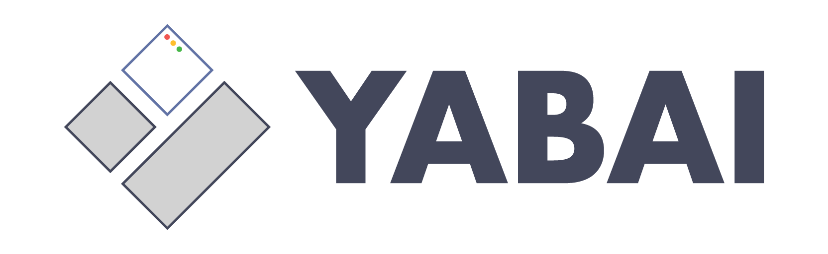
The stacked windows don't really reflect a tiling window manager.
I think @r3volution11 has the right idea. Either the logo should be literal (representing tiling) or absolutely not literal (text with another illustration.)
Like r3v's, I think it should be more along lines of something like this -- but not this because it's not good.
hello-party
on 4 Aug 2019
The idea of @r3volution11 is very clever and I want to contribute my version to it. So I tried to make the logo a bit more playful.
I hope you like it.

Edit: uploaded wrong color combination
 fools-mate
on 30 Aug 2019
fools-mate
on 30 Aug 2019
@fools-mate I like this one a lot actually.
There are a lot of great ideas present here, and I'm not sure how to go about deciding on which one to go with.
koekeishiya
on 30 Aug 2019
@fools-mate Thanks for the comment. I like what you've done as well. I'm not so sure about overlaying the font when showing the full name but I see how it makes sense in keeping it together. I wonder if removing the window control colors would be it look less cluttered (just a white fill).
r3volution11
on 30 Aug 2019
@koekeishiya & @r3volution11 - Thank you for the feedback!
@r3volution11 - I fully understand your arguments and I think the new variant could be a good approach to make the logo cleaner.
I also fixed the optical illusion that the Y looked thinner than the rest.

fools-mate
on 5 Sep 2019
@fools-mate I mostly like the last variant, it's great!
Can you tilt the 'y' a little more? I feel that the slope of the right line of 'y' is too steep.
 pcr910303
on 5 Sep 2019
pcr910303
on 5 Sep 2019
I really, really like that last one by @fools-mate. That‘s the one for me, I think.
dominiklohmann
on 5 Sep 2019
@fools-mate I like that last variant one as well. Could you upload in this issue or send me a
512x512 1024x1024 version of the icon and I'll add it to the repository. As @dominiklohmann is responsible for the wiki he would need the banner image. I suppose that could also be stored in the repo if necessary, but it is probably sufficient to simply upload it in an issue and refer to it by url like I do with screenshots.
koekeishiya
on 5 Sep 2019
I‘d prefer Sketch/PSD if possible, then we can always adjust the size later. Also icons are 1024x1024 per Apple Human Interface Guidelines for the 2x version.
dominiklohmann
on 5 Sep 2019
Also icons are 1024x1024 per Apple Human Interface Guidelines for the 2x version.
Hmm weird, the following docs say 512: https://developer.apple.com/documentation/appkit/nsworkspace/1529882-seticon?language=objc
koekeishiya
on 5 Sep 2019
dominiklohmann
on 5 Sep 2019
@koekeishiya & @dominiklohmann - I'm really glad you like it!
In the archive you will find everything you need.
(banner & icons as svg and png (16px up to 1024px))
This is a version without drop shadows. If you want one, just tell me.
fools-mate
on 5 Sep 2019
Thank you so much! 👍
dominiklohmann
on 5 Sep 2019
@fools-mate in the banner, there is a white circle around the red dot in the a, while there's no white circle in the yellow and green dots. Can you make it transparent for the a as well so the banner doesn't look off on backgrounds other than white? That'd be very much appreciated!
dominiklohmann
on 5 Sep 2019
@dominiklohmann - Oh, I missed that. Here you get the corrected version.
fools-mate
on 5 Sep 2019
Thanks to everyone who participated with ideas, and designs. I've decided to go with the version made by @fools-mate. Closing this issue.
koekeishiya
on 6 Sep 2019
Related issues
 haze
·
4Comments
koekeishiya
·
4Comments
haze
·
4Comments
koekeishiya
·
4Comments
 brorbw
·
4Comments
brorbw
·
4Comments
 fuckbitchesgitmoney
·
4Comments
fuckbitchesgitmoney
·
4Comments
 eraserhd
·
4Comments
eraserhd
·
4Comments
Most helpful comment
@koekeishiya Happy first day I want to apologize for the delay I had some problems with the internet connection.
Here I want to present these two ideas that I developed for your project in both I express the management of windows for IOs, in the second idea I created a figure that works a window with the letter Y to give a more unique personality for your project, I hope you please if you want some change you just have to request it and I will gladly do it