Xamarin.forms: SegmentsView Control
Summary
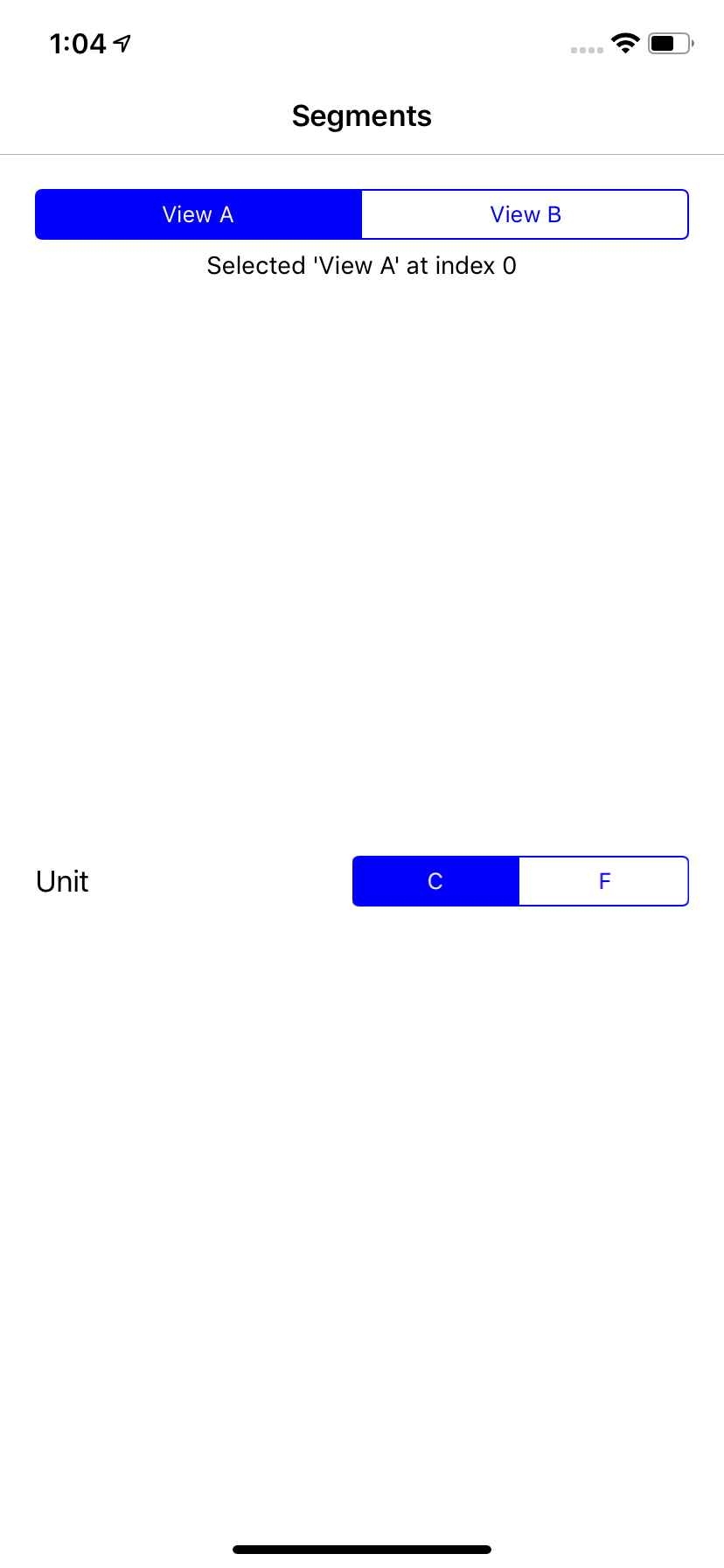
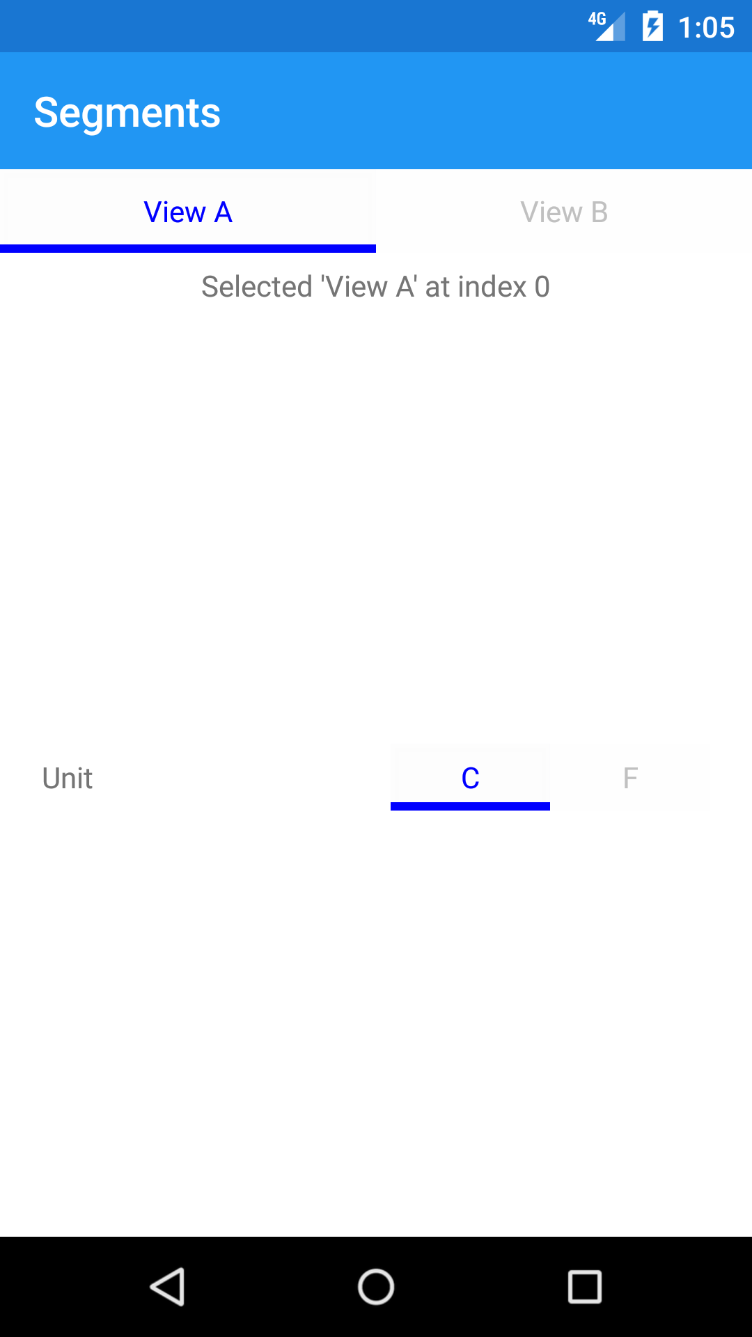
Have a segmented control for Xamarin.Forms. iOS has UISegmentedControl, but Android does not. This control will provide native looking segments in tab form for Android platform.
iOS | Android
--|--
 |
| 
 |
| 
API
The SegmentsView implements IViewContainer<Segment> where Segment is a simple view that shows up on the UI.
SegmentsView:
class SegmentsView : View, IViewContainer<Segment>, IBorderElement {}
Note:
IBorderElementcan be used on iOS forCornerRadiusandBorderWidthusing
IPlatformElementConfiguration. Android does not have border (yet).
Segment:
class Segment : View {}
Properties
SegmentsView
Name | Type | Description
---|---|---
TintColor | Xamarin.Forms.Color | Main color for the control (background, border, etc.)
Children | IListSegment
SelectedIndexChanged | Event | Event handler for when a segment is selected. Raises SelectedItemChangedEventArgs with segment and selected index
UnselectedTintColor | Xamarin.Forms.Color | Background color for the unselected segment
SelectedTextColor | Xamarin.Forms.Color | Text color of the selected segment
UnselectedTextColor | Xamarin.Forms.Color | Text color of the unselected segment
SelectedIndex | System.Int32 | Index of selected segment
Segment
Name | Type | Description
---|---|---
Title | System.String | Title of the segment
Usage
XAML
<SegmentsView SelectedIndexChanged="OnSegmentSelected">
    <SegmentsView.Children>
        <Segment Title="View A"/>
        <Segment Title="View B"/>
    </SegmentsView.Children>
</SegmentsView>
C#
var segments = new SegmentView
    {
        Children = new List<Segment>
        {
            { new Segment { Title = "View A" } },
            { new Segment { Title = "View B" } }
        }
    };
segments.SelectedIndexChanged += OnSegmentSelected;

// handler
void OnSegmentSelected(object sender, SelectedItemChangedEventArgs e){ }
Platforms
iOS
On iOS, this is simply a UISegmentedControl.
Android
On Android, this is be a RadioGroup with a custom RadioButton to make it look like an ActionTab that Android users are used to and expect.
class FormsSegmentsView : Android.Widget.RadioGroup
UWP
👀
Initial Implementation
I initially implemented this control inspired by Alex Rainman's SegmentedControl, but decided to enhance the Android version to match the native experience.
Sample code: https://github.com/hnabbasi/Segments
iOS | Android
--|--
 |
| 
Android Design Inspiration
As an Android user, I expect this control be a simple toggle (equivalent to iOS Segment control for iOS users). Hence the design is inspired by some of the popular apps on Android that also employ this (native) design,
😘 | 👀
--|--
Twitter | Instagram
 |
| 
YouTube | Fitbit
 |
| 
Enhancements
Some of the enhancements that are not part of current implementation include,
- Support binding for
Children - Icons in
Segmentitem - Material implementation !?
Feedback
I have started to port this control from the sample code above to Xamarin.Forms following CheckBox as example. You can follow progress over at hnabbasi/Xamarin.Forms.
I would love any feedback from you (the XF team and community) on,
- do you even need this
- does it look like something you/your users would expect on their platform
- and making it better before it is anywhere near PR-ready 😄
Enjoy! 👍
All 19 comments
1) As someone who has written their own control to do this already, YES I think it is useful.
2) iOS looks totally native/expected - I really like the Android implementation too, I just cant speak to if its expected or not.
Nice work! +1
I want this but it would be nice if android one also looks the same as iOS
Correct me if I am wrong, if you wanted to create and effect or renderer to make it look consistent I'd wager you can. I actually like that ootb Android looks more Droid native.
I want this but it would be nice if android one also looks the same as iOS
That is exactly what I am trying not to do 😄 I want the Android users to get a native experience and producing iOS experience on Android is not ideal here.
However, if you want that kind of consistency on both platform for this control, check out the control built by Alex Rainman's SegmentedControl
Correct me if I am wrong, if you wanted to create and effect or renderer to make it look consistent I'd wager you can. I actually like that ootb Android looks more Droid native.
Correct. Looking at popular apps - Twitter, Instagram, YouTube, Fitbit, etc - they all follow the same design. So the users are used to it. I added the Android Design Inspiration section outlining that.
It would be great to have the same design i both platforms. I've come across the iOS style within Android design
It would definitely be useful and a lot better be able to have the same design in both platforms.
To me, the examples in the android design inspiration look like standard material top tabs.
I use both Fitbit and Twitter on Android and they don't seem like a segment control to me.
Happy to be wrong, of course 🙂
I made similar control
https://youtu.be/9FZhLZuWBsE
This is absolutely delightful and I like the idea of using the native UISegmentedControl on iOS and a tab look/feel on Android does seem rightish....
Maybe on Android we could play with something like this custom implementation:

I think it would be nice to have tabs as a control that you can place anywhere and then have segmented control look and feel similar.
Yea. I am working on another sample. Will post tomorrow. It looks similar to ios with configurable border radius.
Are you thinking of Material as well? Would the MaterialButtonToggleGroup help with that?
It seems to be the equivalent of ios UISegmentedControl?
Are you thinking of Material as well? Would the MaterialButtonToggleGroup help with that?
It seems to be the equivalent of ios UISegmentedControl?
Yes. I love MaterialButtonToggleGroup and plan to try it out as well 👍
Ahhh yeah perhaps we have a Material version of it that uses that! I couldn't find it, but that looks like what we want ;)
iOS coming along pretty well. I think that's all I am going to do with that for now.
Implemented IBorderElement which gives us,
Color BorderColor { get; }
int CornerRadius { get; }
Color BackgroundColor { get; }
double BorderWidth { get; }
Sample,
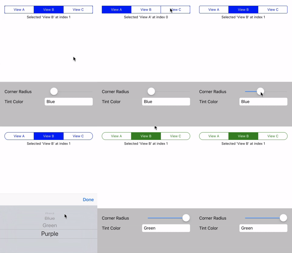
You can follow along here https://github.com/hnabbasi/Segments
Next up, Android 😃 🤖
Android progress,
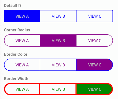
Since most of you seems to like the iOS feel for this control, here's what I have so far. Please provide feedback.
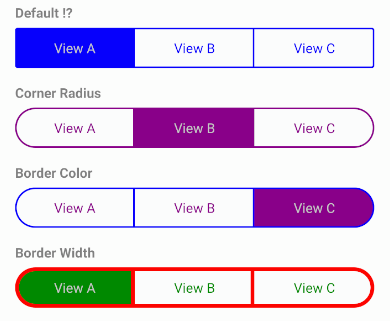
All Caps
It's looking really good. Great work!
I guess I'm used to Material on Android so I tend towards typography that fits that design pattern, so probably the caps version.
The corner radius looks great on both platforms 👍.
Will this allow you to embed page views as the same way that app shells do just by something like
Would be handy
My personal preference is using TabLayout as the native Android control for this type of view. Then if you want an Android-like appearance on iOS you can add a Material renderer for the MDCTabBar class.
Most helpful comment
Android progress,
Since most of you seems to like the iOS feel for this control, here's what I have so far. Please provide feedback.
All Caps