Xamarin.forms: Title View's content horizontal aligment
Description
Unable to center horizontally content in the TitleView.
I'm happy to see this feature in XF but I want to offer a few ideas based on this issue how to make this feature more useful.
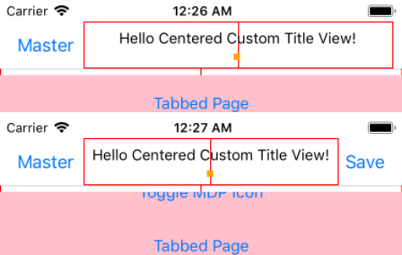
We can't center the content of custom view horizontally relatively the device screen, it depends on if there is Back button or not, Right item(s) or not, etc.
Steps to Reproduce
- Create two pages, with identical custom Title View, add Toolbar Item at the second page
- Look at the Page1's Title View behaviour.
- Navigate to the Page2, look again.
Expected Behavior
TitleView's Content should be properly centered.
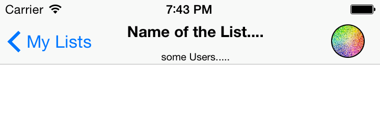
As we can see the logical horizontal center point of the TitleView's content never will be centered by phone's screen horizontal center point. So, we can't place there any image or dynamic content to create something like that (random image from the Internet):
Actual Behavior
TitleView's Content centered in a wrong way. We can't control that.
Basic Information
- Version with issue: >3.1
- Last known good version: <=3.1
- IDE: VS2017
Platform Target Frameworks:
- iOS:
Nuget Packages:
Xamarin Forms 3.4.0- Affected Devices:
All iOS
Screenshots
Reproduction Link
I made a short example, you can follow this link to see them in code, based on the XF's Xamarin.Forms.ControlGallery example in this branch - just clone and run the iOS app, then select Title View then BDF: TitleView Centered, combine it with the Toggle Toolbar Item
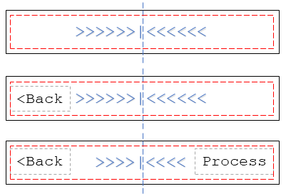
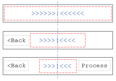
I created a few theoretical examples trying to offer a possible solution on how to solve it. In general, we need to fix the size and position of the TitleView's container to allow center its content.
Default Mode -
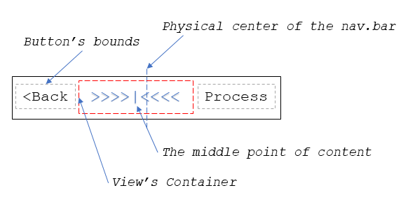
The behavior of the View Container the same as now.
Ghost Mode - (if it possible to implement this)
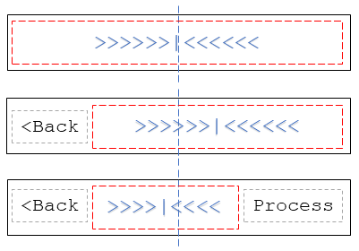
The View Container should use all the navigation bar space. We can overflow some controls by its content, but it's ok for some situations.
Unified Mode
The View Container size should take all the free space regarding the navigation bar items and pin to the bar's center.
All 28 comments
I think it's better to change the type from [Enhancement] to issue because it's more issue than the enhancement
Pretty much. At the moment if you have any other items in the nav bar it makes the appearance undesirable and not worth using at all.
That's a serious issue to us, we're currently waiting to be fixed.
@PureWeen Hi!
Do you have any updates on this?
It is blocker for us to update XF version for around 5 apps
Thank you!
This continues to be an issue in Shell and one that has no reasonable workaround that I'm aware of. Negative margin hacks are prone to miscalculation. Bumping up the impact.
Hi,
Amazing job all around!! However for this control "TitleView" seems to have been closed everywhere ,is this issue not longer going to be fixed? Is just not usable at all if not centered. Is it a rewrite? I have put a negative margin as a hack too but wonder if my hack work on all devices... Can somebody tell us what to do on this one. Many thanks
I recently butted up against this very issue in a Xamarin iOS project and there's no way to solve it using the iOS-supplied UI elements. If you use UIBarButtonItems in your UINavigationItem the OS will not tell you how wide they are after it renders them, so there's no way to set constraints or sizes on the Title view to compensate.
In the end I abandoned the whole thing and implemented my own Toolbar using a plain UIView container, and UIButtons for the toolbar buttons, with a UILabel in the middle (properly centred, because it was easy).
What we need from Xamarin Forms at this point is the ability to supply a ContentView that Forms will put into the UINavigationBar, stretched across the whole bar. It's easy to do, but don't use the UINavigationBar's Title property - Forms will have to add the ContentView as a subview of the NavigationBar itself. Then we can set our own content inside the ContentView using Buttons, Labels etc and line them up properly.
I'm also looking for a solution for this. It's been marked as a duplicate but the duplicate has been closed and references this issue. Is there a solution for this being considered?
@samhouts Hi, any plan to fix this? As far as I know, many people are paying attention to this problem.
But almost two years past, it has yet to be repaired.
Sadly the issue remains even with the introduction of shell
Sadly it doesn't look like it's a priority.
Celebrating 1-year for the issue. 🍾🥂 🎂
It seems like some of the default Android apps have the described behavior

This blows. Makes our apps look bad.
This is quite annoying. Does anyone have a workaround?
@julioas09 I did once make it but forgot how I did. but I was referring these two resources and made it. so I think you can also refer to them and do so.
We're currently trying to center an image in the TitleView to hit some UX designs and this is causing the image to be offset to the right due to the back button being on the left, outside of the TitleView.

Workaround: Implement a title view that has the back button in it as well as the image, then set the navigation item's buttons to null. This _should_ make the title view fill the whole width of the navigation bar.
Really need this..... zZz
@programmation Do you have an example for this?
@jaspervanmegroot
I know about hiding the hamburger icon
 <Shell.FlyoutIcon>
        <x:String></x:String>
    </Shell.FlyoutIcon>
But it is not perfect though, still the left margin is slightly bigger than the right one.
We're currently trying to center an image in the TitleView to hit some UX designs and this is causing the image to be offset to the right due to the back button being on the left, outside of the TitleView.
Alternative workaround: create a dummy, blank, do-nothing button for the opposite side of the navigation bar.
Sorry for the delay replying to you! I also posted another workaround that has worked for me in the past (however I don’t use Shell so unsure if it will help here): create a dummy button for the right hand side of the navigation bar. You can use text color == background color to make it invisible, and size it by making it have the same text as the left-hand side button.
On 24 Mar 2020, at 20:43, jaspervanmegroot notifications@github.com wrote:
@programmation https://github.com/programmation Do you have an example for this?
—
You are receiving this because you were mentioned.
Reply to this email directly, view it on GitHub https://github.com/xamarin/Xamarin.Forms/issues/4848#issuecomment-603134653, or unsubscribe https://github.com/notifications/unsubscribe-auth/ACNA4OOTRYXWHCX4GKUPEHDRJB6CLANCNFSM4GL6FIBA.
@programmation Thanks!
Basically it is working, but it is a bit awkward because if you put toolbar items, then the Shell.TitleView is pushed also to the left, so either you don't use those, either your title is navigating from one page to the other right to left and vice versa.
@eli191 I agree it's really not ideal, but that was the best workaround I had while still using the XF-provided NavigationPage. Overall however I'm not a fan of the customisations that have been applied to the underlying UINavigationController, which are partly responsible for how hard it is to do what you're trying to do. I'm _almost_ thinking it would be simpler to make a NavigationBar object with platform renderers (might not actually need any though), and then use a ControlTemplate to apply it to pages that want it, while removing the "official" navigation bar from the enclosing NavigationPage. It would certainly be simpler when it comes to things like applying custom colours to the navigation background, and it would also allow full control over right _and_ left button stacks.
@programmation Do you have an example project on github?
Still facing this issue in August 2020. We soon will hit 2 years for this bug. Is there a plan to fix it?
We now how excellent features like drag & drop and swipe view but i'm still struggling to centre the title.
Is there any possibility for this to be fixed any soon ? maybe in XF 5
Most helpful comment
That's a serious issue to us, we're currently waiting to be fixed.