Www.rust-lang.org: syntax highlighting for code blocks
Separately from my comments on #348, the styling makes the Getting Started page really hard to read for me. The thick colour bands are attractive as a marketing thing, or showing off individual features that aren't strongly connected, but I find them extremely disruptive when I'm trying to do a more careful read.
Additionally, there's no syntax highlighting on the code, which really hurts especially given that it's the first code I see coming through the site.
 alercah
All 19 comments
Seconded - I don't see any syntax highlighting in the other sections either, and I think that could help with readability.
 jonathandturner
on 19 Nov 2018
jonathandturner
on 19 Nov 2018
I would like to help with this if there isn't somebody already working on it
 andrei-cacio
on 29 Nov 2018
andrei-cacio
on 29 Nov 2018
Posting some samples here (please ignore the margin issues for now):
What do you think about the background/highlight ratio?
On the left is the original non highlight version, on the right is the new highlight version.
Sample1

Sample2

Sample3

Sample4

Sample5

andrei-cacio
on 2 Dec 2018
Oh that's hard. I guess the black background version has the best contrast (also mind WCAG), but it looks a little too strong compared to the red background. Could not you maybe try another syntax highlighting style (i.e. foreground/text color set)?
Or maybe let the light white background of the original be there…
 rugk
on 2 Dec 2018
rugk
on 2 Dec 2018
Yeah, I think it is a good idea to keep the original background. I will try to find a better highlight to match the white background.
andrei-cacio
on 2 Dec 2018
For now only this version passes the Accessibility Audit (using Chrome Lighthouse). What do you think?
I tried to keep the original white background but I couldn't match a highlight colour which passes the Audit.

andrei-cacio
on 2 Dec 2018
The best/most-likely-to-work thing here is going to be a white background, possibly with the Tomorrow theme. We're using white throughout the site, so it shouldn't look weird, and Tomorrow is the current theme used for API docs is either Tomorrow or something very close to it.
 chriskrycho
on 2 Dec 2018
chriskrycho
on 2 Dec 2018
I have found a light theme which passes the audit: https://github.com/ericwbailey/a11y-syntax-highlighting
Thoughts?

andrei-cacio
on 5 Dec 2018
Looks good, IMHO. :smile:
rugk
on 5 Dec 2018
Awesome ! I will prepare a PR then.
andrei-cacio
on 6 Dec 2018
With the risk of affecting the general theme, I think that all <code> blocks should be moved to the new theme. This way the accessibility support will be improved on the whole website.
An example of plain text with and without the theme:

andrei-cacio
on 7 Dec 2018
Here's another idea: Give <code> and <pre> a black, transparent background:
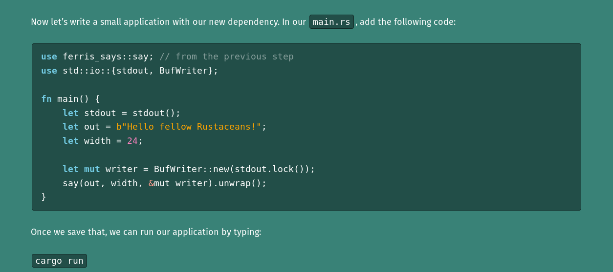
This works very well with the design of the website. However, a dark theme might not look as good in the white sections. I have a few ideas for this:
- Use a different, light theme for white sections
- Automatically invert the theme colours in white sections using CSS
filter: invert(1) hue-rotate(180deg); this, however, is not supported in IE - Use a light theme everywhere, as @andrei-cacio suggested
- Give all sections that contain code a white background, so the light theme looks good everywhere.
 Aloso
on 8 Dec 2018
Aloso
on 8 Dec 2018
As someone who is red-green color blind the a11y-syntax-highlighting theme is really hard on my eyes when combined with the background in these examples, the difference to @Aloso's version is night and day.
 sondr3
on 12 Dec 2018
sondr3
on 12 Dec 2018
@Aloso @sondr3 some great feedback ! Thank you !
andrei-cacio
on 16 Dec 2018
@Aloso
- Use a different, light theme for white sections
Right now only the a11y themes seem to be passing the accessibility audit. I couldn't find other themes which performed the same. I don't know exactly how I can mix and match or find another compatible syntax theme.
andrei-cacio
on 17 Dec 2018
@sondr3 would the dark theme be more suitable?

andrei-cacio
on 17 Dec 2018
I like the dark one better but am normally a bigger fan of light background. It looks fine in the README, I think you should just be careful not to combine the light theme with a red background.
sondr3
on 17 Dec 2018
moving the discussion tot the PR #606
andrei-cacio
on 28 Dec 2018
This has now been implemented and deployed to rust-lang.org
 XAMPPRocky
on 31 Jan 2020
XAMPPRocky
on 31 Jan 2020
Related issues
 KiChjang
·
6Comments
KiChjang
·
6Comments
 eignnx
·
3Comments
eignnx
·
3Comments
 kolloch
·
5Comments
kolloch
·
5Comments
 Diggsey
·
6Comments
Diggsey
·
6Comments
 tinaun
·
4Comments
tinaun
·
4Comments
Most helpful comment
Here's another idea: Give
<code>and<pre>a black, transparent background:This works very well with the design of the website. However, a dark theme might not look as good in the white sections. I have a few ideas for this:
filter: invert(1) hue-rotate(180deg); this, however, is not supported in IE