Www.julialang.org: More/better splash images
It was only a matter of time before people (on Slack/Zulip) decided that the main splash image wasn't exciting enough (although calling my subtly-wrought sine curves in
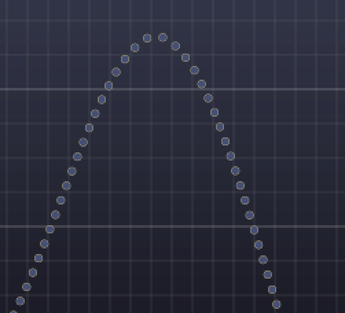
"shitty" was a bit harsh, I think. :)
It might be cool to have a set of alternating splash images. I've made a proof of concept, which you can find at:
https://julialangblogmirror.netlify.app
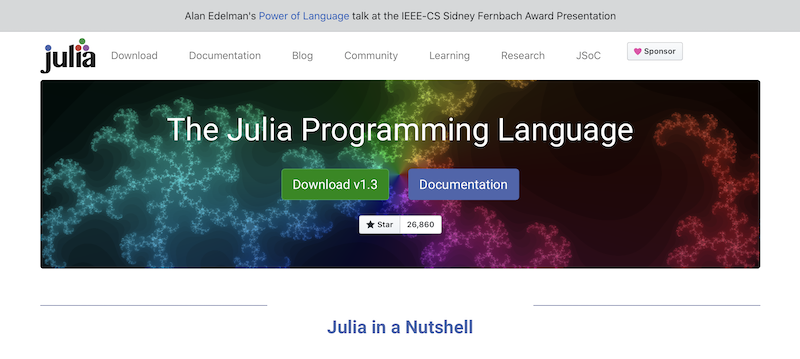
The basic idea is that there is a bank of 10 (or however many) images, and a new image is chosen each day (in sequence). For testing purposes I changed "days" to "seconds", so for now you're effectively getting a new image each time you refresh the page. But probably getting a new image each day would be better (and faster).
For the moment, I've added 9 more of my own Julia-made images more or less at random, but obviously it would be better if images from other Julian graphics maestros (eg the Makie folks) were included. The main criteria are that the PNG file is about 2000w by 525h and generally of a darker/more saturated look, so that the foreground text stands out as it should.
I know little about web development, so I don't know how much of what I've done is good enough for the official site. JavaScript is odd. :)
 cormullion
All 16 comments
That's awesome, and I guess we could just have this circulating automatically (e.g.: https://css-tricks.com/infinite-all-css-scrolling-slideshow/ but slower and pausing)
One issue to bear in mind is that these images are pretty effing heavy & when getting to the front page on a poor connection leads to seeing a big white rectangle for ±0.5sec (my case) before getting the image.
For instance this image: https://julialangblogmirror.netlify.app/assets/images/backsplash/backsplash-5.png is almost 1Mb
I'm pretty sure you generated them so you should be able to get them in SVG and get the weight to < 100kb right?
 tlienart
on 8 May 2020
tlienart
on 8 May 2020
Looks awesome @cormullion I never thought the sin curve was bad :)
 logankilpatrick
on 8 May 2020
logankilpatrick
on 8 May 2020
I did run the images through a PNG-crusher, but I suppose the more detailed ones are bound to be larger. I think imposing a size limit is probably a good idea (although I normally hate that...:).
cormullion
on 8 May 2020
This is awesome!
 abhishalya
on 8 May 2020
abhishalya
on 8 May 2020
Sorry for the excessively harsh critique of your sine curves @cormullion <3
 jessebett
on 8 May 2020
jessebett
on 8 May 2020
Is it just me? I prefer the simplicity of the current sine curve.
However I do like the idea of Julia generated images being used as background that changes every day or something. Ideally we should have a link to the code that generated that image. So if someone likes an image, they can quickly see how it was done.
 ViralBShah
on 8 May 2020
ViralBShah
on 8 May 2020
I like the colorful Julia set image. Personally, I'd just go with that one. If we could generate a Julia set image in Julia and have it link to the code like @ViralBShah suggested I think that would be awesome.
 ExpandingMan
on 8 May 2020
ExpandingMan
on 8 May 2020
I'd almost prefer no banner image, and just have a big julia logo or something? I find it mostly distracting.
Looking at the homepage of other languages like Rust, Nim, Go, I think they make much better use of their header space e.g. by describing language features, showing snippets, or interactive code evaluation.
jessebett
on 8 May 2020
That is at odds with the people who want a prominent download button on the landing page. There is something to be said about using the valuable screen real-estate better. Maybe we can reduce the height of the banner to start with?
ViralBShah
on 8 May 2020
Looking at the homepage of other languages like Rust, Nim, Go, I think they make much better use of their header space e.g. by describing language features, showing snippets, or interactive code evaluation.
Nim has a wall of text, which I am not fond of. Rust is not very different from us - but does have a tag line. Go is the only one of the 3 you mention that manages to fit in a bunch of useful things in the available space.
ViralBShah
on 8 May 2020
I think none of the pictures should have any white lines, because that makes reading the foreground text really hard.
I like the julia set and the leonardo colored one the most.
 BeastyBlacksmith
on 11 May 2020
cormullion
on 11 May 2020
BeastyBlacksmith
on 11 May 2020
cormullion
on 11 May 2020
@kolokd I think everyone will welcome a PR decreasing the assets footprint but this issue is maybe not the best place to discuss it? also removing jQuery is probably doable without much work but I would think that removing bootstrap would be a massive pain... possibly unused CSS could be chased down and removed with automatic tools, help is welcome.
tlienart
on 11 May 2020
Many other language sites are supported by professional web dev teams. Ours is completely supported by community contributions. We've made major improvements over time in a maintainable and sustainable way. Hence, file separate issues with specific clear ideas, and more than ideas, we do need people who can help realize that goal.
ViralBShah
on 11 May 2020
The change looks good, but it requires the button and title styles to be updated accordingly. Currently it's pretty much unreadable properly.
@kolokd If you want to remove a framework like Bootstrap, you'll have to replace it with yet another framework. Doing that kind of a task is a waste of time, most of the time. Bootstrap also uses jQuery itself, for the record.
 zlatanvasovic
on 13 May 2020
zlatanvasovic
on 13 May 2020
Isn't jQuery and bootstrap always cached in everyone's browser? I do think it's good to have the minimum stuff to the extent we can.
ViralBShah
on 13 May 2020
Related issues
tlienart
·
7Comments
tlienart
·
9Comments
 essenciary
·
6Comments
ViralBShah
·
4Comments
cormullion
·
8Comments
essenciary
·
6Comments
ViralBShah
·
4Comments
cormullion
·
8Comments
Most helpful comment
Many other language sites are supported by professional web dev teams. Ours is completely supported by community contributions. We've made major improvements over time in a maintainable and sustainable way. Hence, file separate issues with specific clear ideas, and more than ideas, we do need people who can help realize that goal.