Wttr.in: Temperature range is hard to read
Looks like negative temperature values (Celsius) are hard to read due to the line being all the same colour and no spacing between the temps;
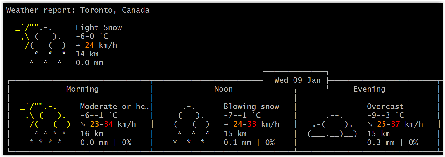
Could it be changed to have a space between the temperature range; -6 - -1 and maybe colour it cyan?
Or use a slash "/"? -6/-1
 dragozet
All 17 comments
Totally agree, it should be easily readable at a glance. Also it would be nice to put some clarification about this in the docs.
I'm still not absolutely sure how to interpret it. First, I thought it's just a possible temp range, but a range of about 7-8 degrees difference in a specific time of the day seems too much. So I suppose it's sensed temperature vs real one. Am I right?
Otherwise it's a really nice service, l like to have it available at console :)
 daarro
on 18 Feb 2019
daarro
on 18 Feb 2019
Serhiy (here) suggests using .. for the intervals, and an explicit + if the values are around zero (-X..+Y instead of -X-Y as it is now):
-2..+1
What do you think?
I think that the explicit + is a good thing without a doubt; not so sure about .., but it is probably a good thing too.
 chubin
on 19 Feb 2019
chubin
on 19 Feb 2019
I agree with Serhiy because that is me ) Let's see what @dragozet and @daarro say
 pavse
on 19 Feb 2019
pavse
on 19 Feb 2019
So here are the options:
(1) explicit + with .. -2..+1
(2) no explicit with .. -2..1
(3) explicit + with / -2/+1
(4) no explicit with / -2/1
The explicit + does not matter to me, I'm ok either way. It's a regional/cultural preference. But I do think that the / slash is easier to read than ..? (3 & 4)
Also, the temperature is a range. So the top left, or current display should show current temperature and not a range. The range should be kept for the morning/noon/evening/night reports only.
dragozet
on 19 Feb 2019
Good options. (1) and (2) seems better to me, cause .. is emphasising more, that it is actually a range.
One other option I stumbled upon when looking around a bit, would be to use "to", so like this:
3 to 6 °C
-1 to 3 °C
-6 to -1 °C
Looks a bit easier on the eyes, however there would be additional overhead of getting different language versions done.
Also, the temperature is a range. So the top left, or current display should show current temperature and not a range. The range should be kept for the morning/noon/evening/night reports only.
I agree with this.
daarro
on 19 Feb 2019
Let us try it with ... In my opinion, it looks much better now:
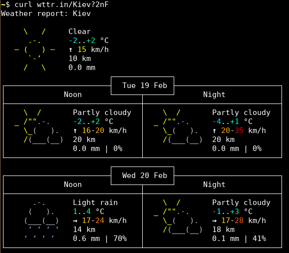
Now, if the left number is negative and the right one is positive, a plus sign is shown (it is not show if both numbers are positive).
If both numbers are negative, it looks pretty nice too:
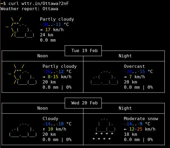
What do you think?
chubin
on 19 Feb 2019
Now it looks really good!
pavse
on 19 Feb 2019
Nice!
daarro
on 20 Feb 2019
Much easier to read now.
The current temperature (Top Left) should not be a range, should be current temperature.
dragozet
on 20 Feb 2019
@dragozet Actually, it is "actual temperature"/"feel like temperature". But if we would write -2 (+2), it would be to hard to understand
chubin
on 20 Feb 2019
Ooohh... I've been missreading that then!
So for your example above Kiev. The top left -2 .. +2 means it's -2 but FEELS like +2 and then in the noon forecast box underneath it says -2 .. +2 means that's the RANGE of a low of -2 and a high of +2 for noon.
And for the Ottawa example, -18 .. -11 means it's -18 but FEELS like -11 and then the noon forecast is -16 .. -12 which is a RANGE of a low of -16 and a high of -12
Yes, that still needs a bit of UX testing. I'm guessing if we replace the .. with Feels like you need to deal with all the language translations? Would there be any other symbol or character that you could use instead of .. since that causes the most confusion between "actual temperature".."feel like temperature" and "Low".."High"
dragozet
on 20 Feb 2019
Now it does look as a range, because of two dots (and i was sure it's a range): 2..6 °C
IMHO +2 (+6) °C would much better... What about using of word 'as' inside brackets? For example
+2 (as +6) °C eng
+2 (как +6) °C rus
+2 (як +6) °C ukr
Not sure about other languages though..
pavse
on 20 Feb 2019
Actually, everything is even much worse and more complicated: the problem is that depending on the data source backend, we may have sometimes real/fee-like temperature and sometimes ranges. It may also happen that for current time it is real/feel-like and ranges for forecasts. We want to make the backends configurable, because many users are not satisfied with our default datasource and they would prefer something else. We could display it as a range when it is a range, and XX (YY) when it is real/feel like.
chubin
on 20 Feb 2019
May XX (YY) would be better for current temp/feel. Or omitting feel all together. Also I think it might be backwards as of right now.
If I type 'wttr.in/?1nF' I get current temp of -9C and feels like -3C. Should that be switched?
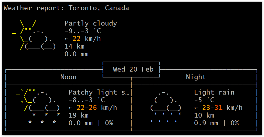
If I type wttr.in/?format=3 I get current temp only of -3C

dragozet
on 20 Feb 2019
I'm using curl wttr.in to display the first 7 lines in a geek_script box against my background. The difficulty is that the temp shows as 71..73 in yellow and the wind speed in green. These are hard to read depending upon the desktop on which they appear. Is it possible to make default be black? and possibly get rid of the funny graphic (although that's not absolutely necessary )
 woo37830
on 16 Apr 2019
woo37830
on 16 Apr 2019
@woo37830 If you append the T option (curl wttr.in/?T), the colors will be switched off. Is it not that what you need? And also you can try I for inverted colors
chubin
on 16 Apr 2019
EXCELLENT! Thanks for the quick response. I didn't see that in the documentation somehow.
woo37830
on 16 Apr 2019
Related issues
 m0lmk
·
5Comments
chubin
·
7Comments
m0lmk
·
5Comments
chubin
·
7Comments
 532910
·
7Comments
532910
·
7Comments
 mdigga39
·
4Comments
mdigga39
·
4Comments
 a0s
·
8Comments
a0s
·
8Comments
Most helpful comment
Actually, everything is even much worse and more complicated: the problem is that depending on the data source backend, we may have sometimes real/fee-like temperature and sometimes ranges. It may also happen that for current time it is real/feel-like and ranges for forecasts. We want to make the backends configurable, because many users are not satisfied with our default datasource and they would prefer something else. We could display it as a range when it is a range, and
XX (YY)when it is real/feel like.