Wp-calypso: Customer home: no stats this week confusing for new sites
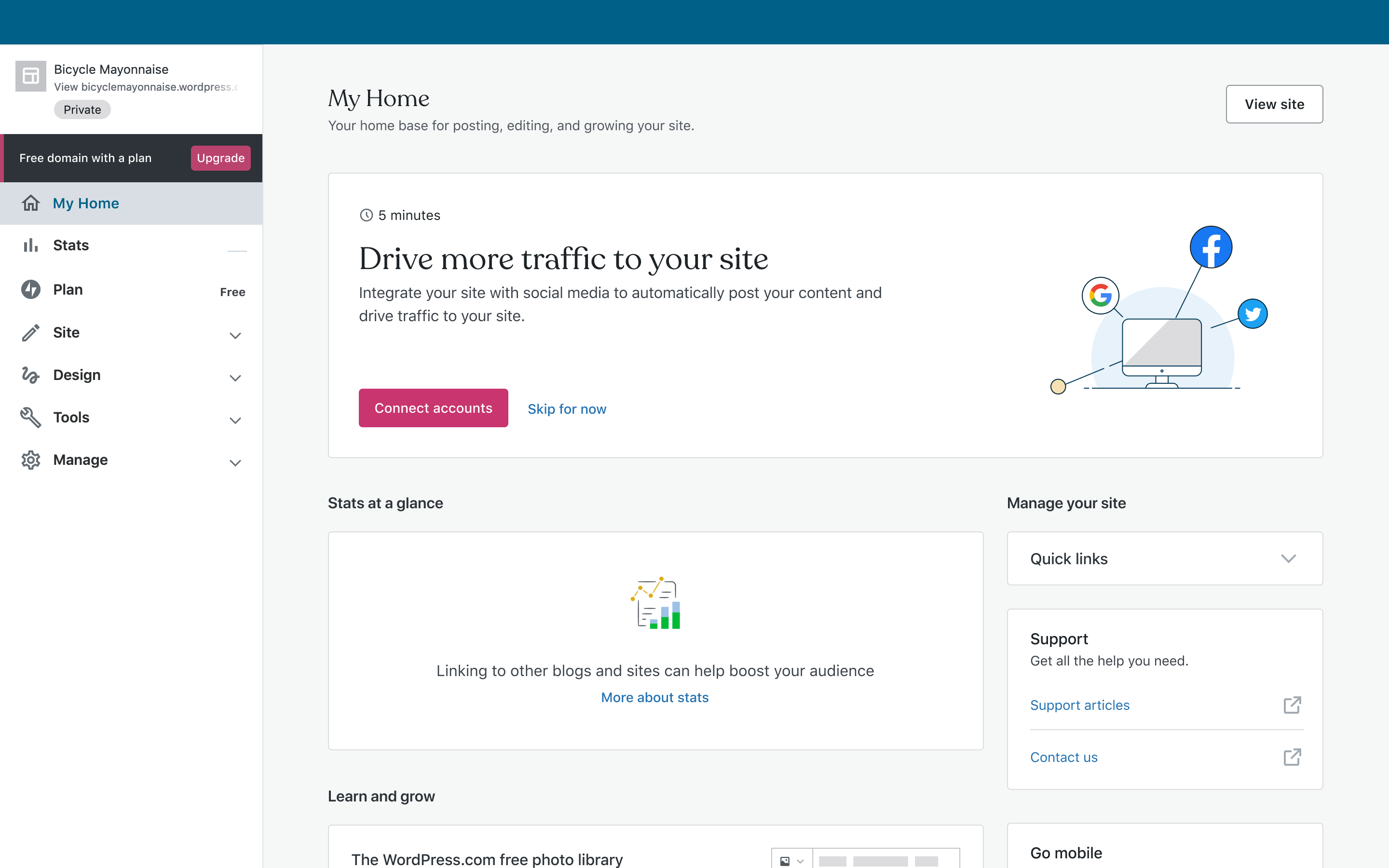
At customer home there's this stats bit for launched sites:
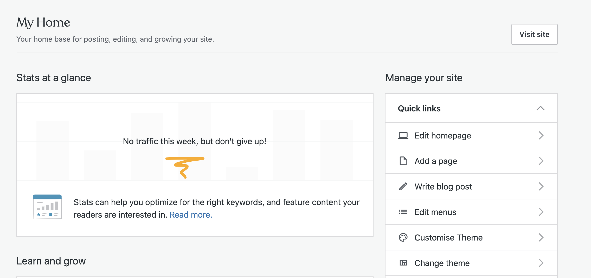
If the site was launched less than week ago, it makes sense there's none.
Could it be more hopeful and more actionable?
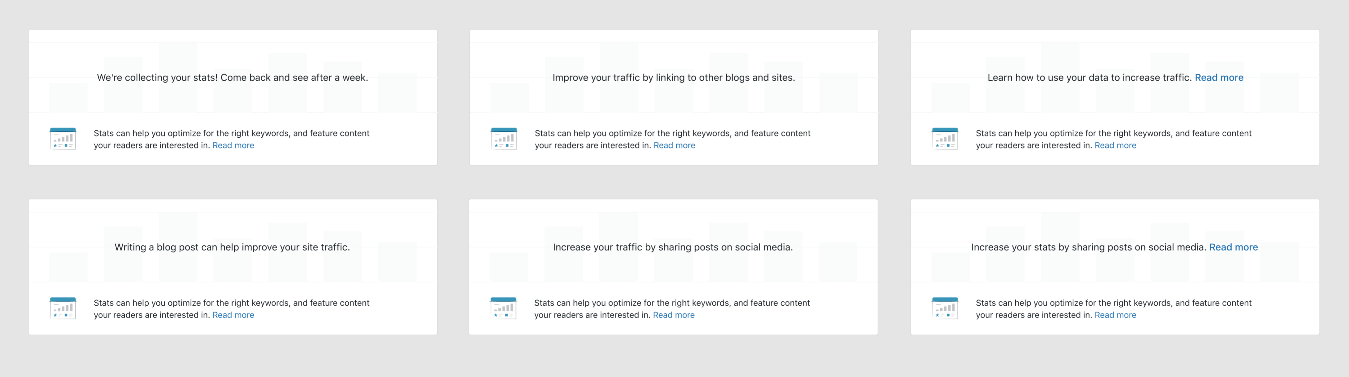
So if site launch happened within the past week and there are no stats, we show something like _"We're collecting your stats! Come back and see after a week."_
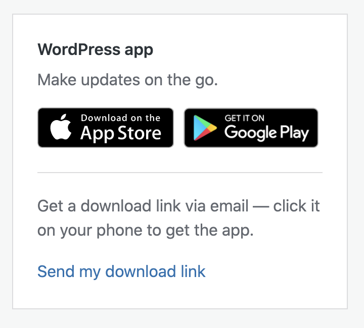
This would be a perfect spot for very subtle mobile apps nudge too. Could be just a text link, or something more substantial. Perhaps this could be moved in place of stats and it could mention statistics?
cc @rickybanister as I remember some Slack chat about this, and @lessbloat maybe you've thought about this already.
 simison
All 13 comments
@danhauk I really thought I remembered an initial stats view that had a different and more welcoming message. Am I mistaken?
 rickybanister
on 14 Aug 2020
rickybanister
on 14 Aug 2020
I was probably thinking of the pre-launch message: https://github.com/Automattic/wp-calypso/issues/41034
@lcollette could you wrangle a message for brand new sites that don't have any traffic yet? We can be creative as we want here, encouraging them to go write something, connect accounts, read an article about traffic, whatever.
rickybanister
on 14 Aug 2020
@rickybanister I collected some snippets to help teach users if there are no stats in this post pbAPfg-kk-p2. Could that be what you're thinking of? We could definitely build on those to push them toward action.
There was also a mockup somewhere that had a message something like "One of the best ways to increase traffic is by writing original content. [link]Start a new post[/link]"
 danhauk
on 14 Aug 2020
danhauk
on 14 Aug 2020
@rickybanister it's not clear to me what design is being promoted here. Can you please share the final design that you think is ready to be implemented for this?
 davemart-in
on 20 Aug 2020
davemart-in
on 20 Aug 2020
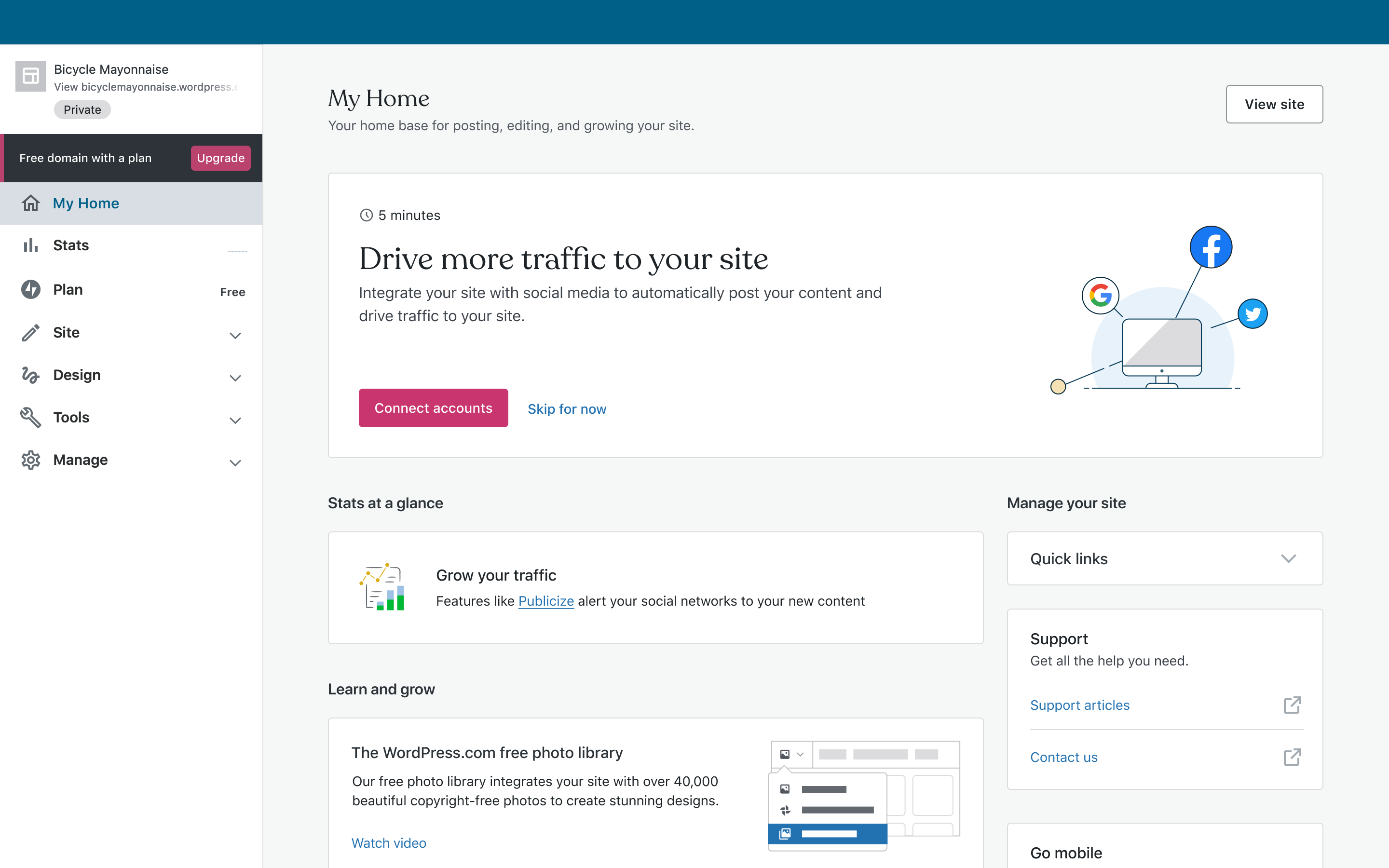
I have a handful of different messages I tried out, any preferences on these? It seems like a lot to have 2 links in this area, but I have a few options with one tied to the message.
 sfougnier
on 20 Aug 2020
sfougnier
on 20 Aug 2020
@sfougnier I'm wondering if we might want to simplify to a single tip rather than two as it is now. We'd have to adjust the design slightly but I think that's okay. We'd save some vertical real estate and in looking at My home data, it doesn't appear folks are clicking very often on the learn more link (~100 clicks per day).
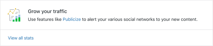
Maybe something in the ballpark of this?
 lcollette
on 21 Aug 2020
lcollette
on 21 Aug 2020
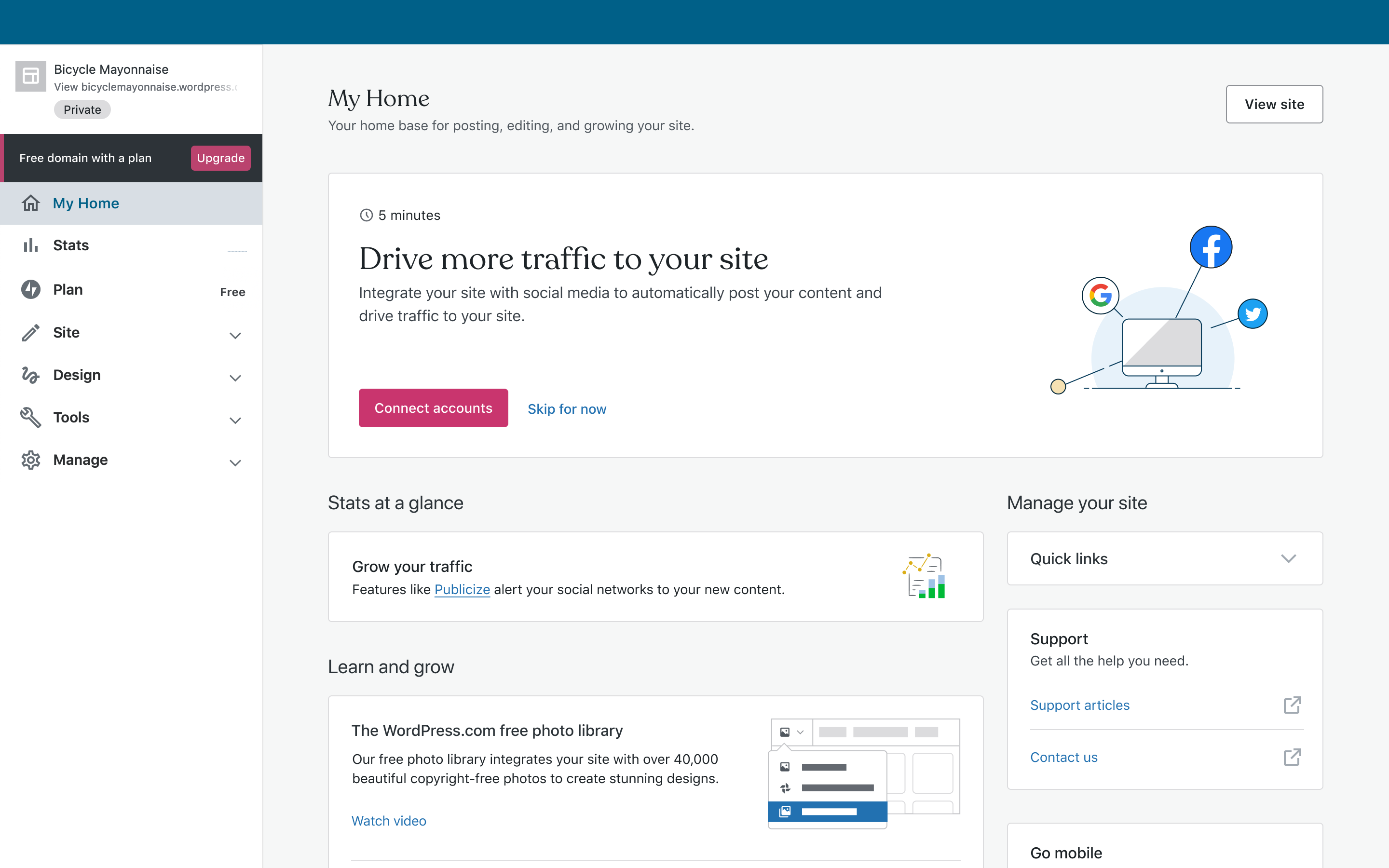
I prefer the simplified card as well. The ghost graph bars in the background are noisy in the current implementation.
rickybanister
on 24 Aug 2020
Ooh, yes love the idea of simplifying the card! I guess I didn't realize that was an option here. How is this latest exploration feeling?

sfougnier
on 26 Aug 2020
Nice. The third option feels like the best economy for the space, less like a placeholder and more like a helpful message.
We could perhaps make the whole card clickable based on the message and destination.
Super minor thing, but all 'sentences' in our UI should have punctuation. A label or a headline doesn't need any, but descriptive text is often in sentence/paragraph form.
rickybanister
on 26 Aug 2020
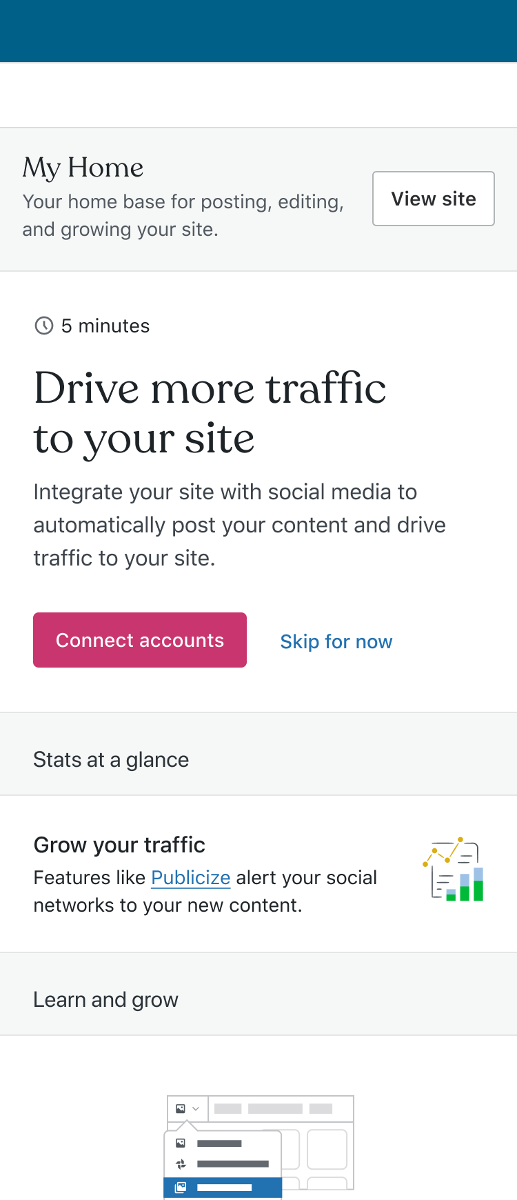
Cool! I tweaked some of the padding and shifted things so that type and illustration can be consistent with placement in other cards. Also added in a few different options for lines of copy here.
Desktop
Mobile
sfougnier
on 26 Aug 2020
That's a solid improvement. Looks good to me.
I noticed some spacing inconsistencies with our 'base-line grid' (I know we don't have one):
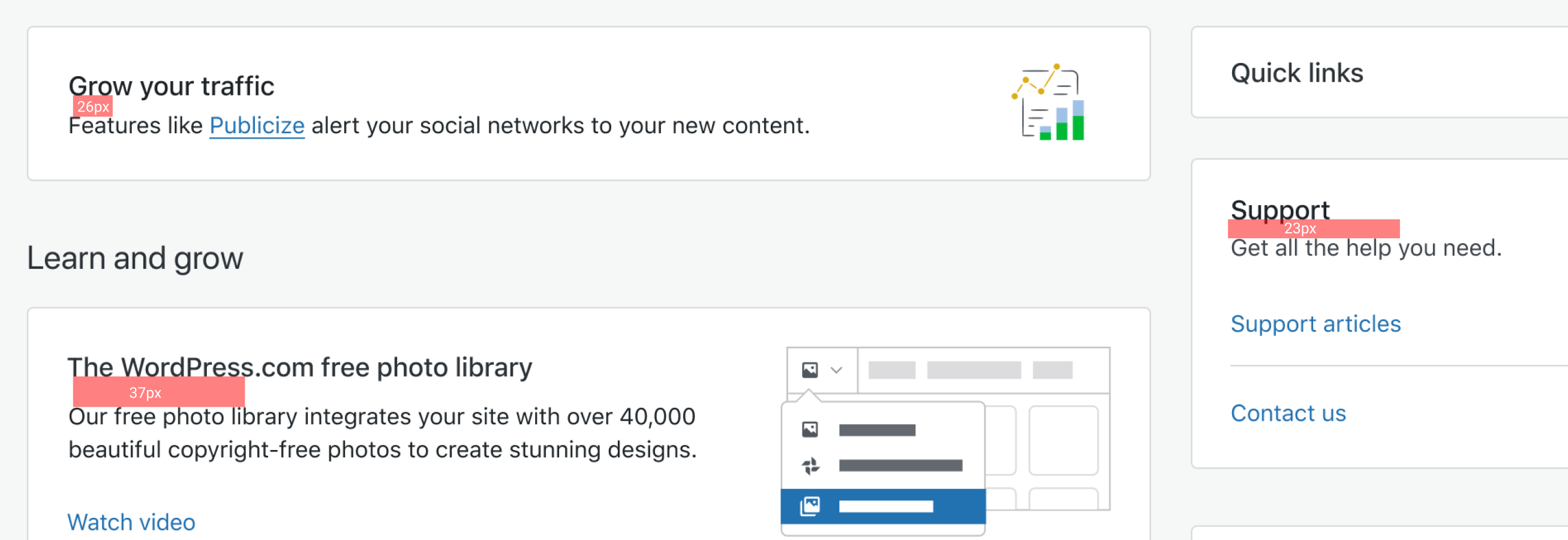
@sixhours could you see about making the sub-heading-to-paragraph spacing a bit more consistent on My Home, at least in the areas I highlighted where the font sizes are the same and it seems like we are aiming for the same treatment?
rickybanister
on 27 Aug 2020
Hmm, the live version of Customer Home doesn't seem to have this problem (all the red rectangles are copied and the same size):
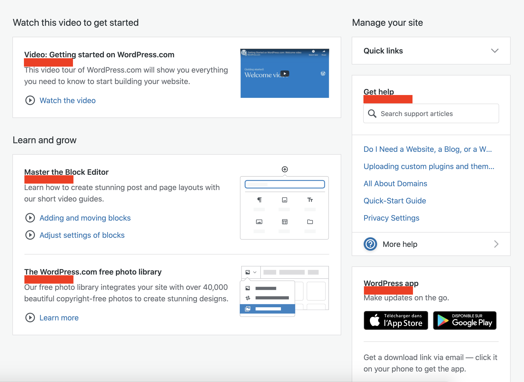
Is it possible this is a screenshot from an older mockup?
The "Grow your sites" piece should definitely observe the same spacing between the header and paragraph content when implemented 👍
 sixhours
on 31 Aug 2020
sixhours
on 31 Aug 2020
Cool! Sorry to nitpick, I'm sure it was just an issue with an out of date mockup. I highlighted just in case it was happening in production, but should have checked myself.
rickybanister
on 31 Aug 2020
Related issues
 apeatling
·
3Comments
apeatling
·
3Comments
 jjchrisdiehl
·
3Comments
jjchrisdiehl
·
3Comments
 jeherve
·
3Comments
rickybanister
·
3Comments
jeherve
·
3Comments
rickybanister
·
3Comments
 ehg
·
3Comments
ehg
·
3Comments
Most helpful comment
That's a solid improvement. Looks good to me.
I noticed some spacing inconsistencies with our 'base-line grid' (I know we don't have one):
@sixhours could you see about making the sub-heading-to-paragraph spacing a bit more consistent on My Home, at least in the areas I highlighted where the font sizes are the same and it seems like we are aiming for the same treatment?