Wp-calypso: Payments: Refresh Thanks For Subscribing Email
| Before |
| ------------- |
| 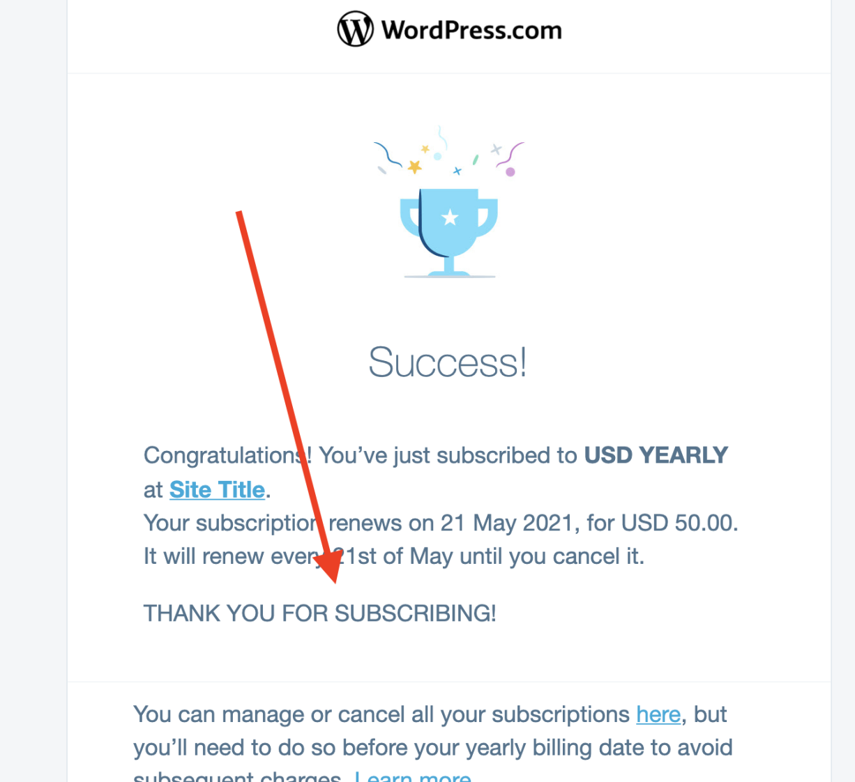 |
|
| Existing WPCOM account | Account created with Subscription |
| ------------- | ------------- |
|  |
|  |
|
All 21 comments
D43690-code updates this email to include the welcome email content.
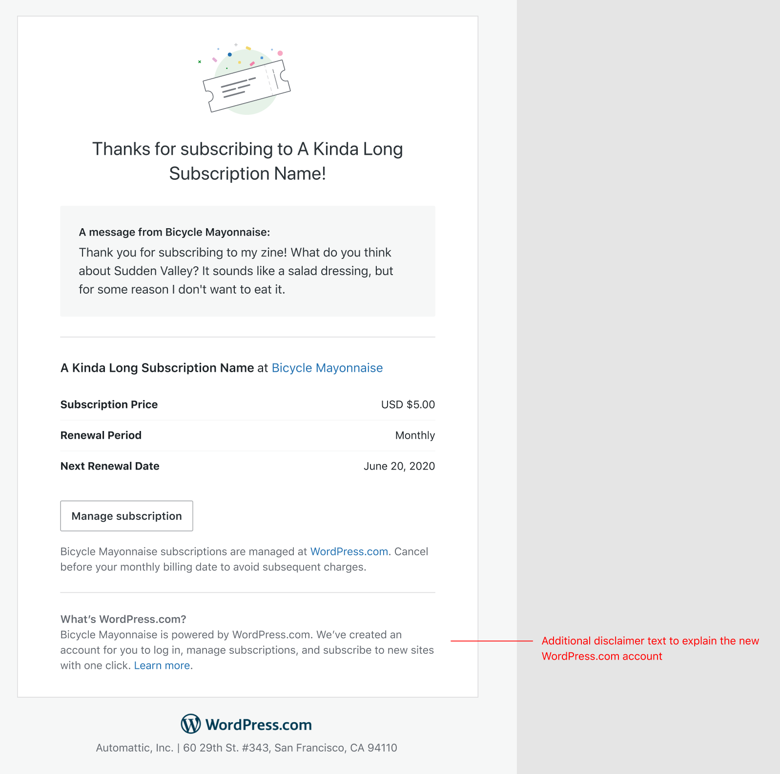
I worked on some updates to the design here. Trying to keep them relatively lightweight to avoid too much email debugging.
I'm hoping we can update the colors and branding of the template since the current ones are old colors and branding. That will also have a positive impact on other emails using this template, creating more consistency in all our touchpoints.
Here's the direction I'm leaning but still waiting on some feedback from @Automattic/dotcom-manage-design
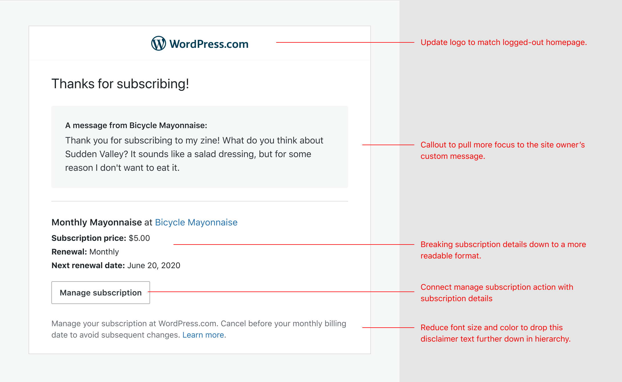
I did explore an illustration that we could use to bring more color to the template. I know there were concerns around it clashing with any custom branding we may do, but not sure if that's planned for the near future or not.
Looks great Dan. I like the illustration and centering in the second version.
@eoigal @artpi Are there any requirements or obligations to have our logo/branding at the top of the email vs. more of a white-label approach? Something similar to what Mailchimp does.

I realize we want to promote ourselves, but I have concerns (echoed by @sixhours) that having our logo at the top of the email with a "Thanks for subscribing" message may confuse some subscribers resulting in possible additional support load and/or subscription cancellations.
Are there any requirements or obligations to have our logo/branding at the top of the email vs. more of a white-label approach?
I prefer the more white label approach. There isn't any need for the WordPress.com logo at the top of the email and I agree this may cause confusion.
I prefer the more white label approach. There isn't any need for the WordPress.com logo at the top of the email and I agree this may cause confusion.
YES, definitely a more "whitelabel" version is going to be more useful.
The only consideration with that is, that the user subscribes, say on longreads.com, but uses WordPress.com account to log in.
This is exemplified in this email - which also presents something we should account for:
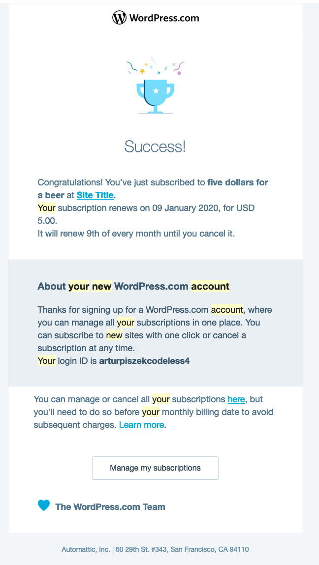
If user does not have a WordPress.com account, we create one for them. This is something we also need to communicate in the email.
Should we make a seperate task from this redesign?
@artpi We can do a quick iteration to include some communication about their new WordPress.com account in a design similar to the one above https://github.com/Automattic/wp-calypso/issues/42291#issuecomment-632896929
I'd love to rework that copy a bit to try to clear up any questions like "when/how did I sign up for a WordPress.com account?"
Thoughts on removing the login ID since they can log in with their email address? I'm just trying to gauge what can be removed.
We can do a quick iteration to include some communication about their new WordPress.com account in a design similar to the one above #42291 (comment)
The email I shared above is the same email that you redesigned - when you didnt have an account, we add a section to this email.
I'd love to rework that copy a bit to try to clear up any questions like "when/how did I sign up for a WordPress.com account?"
Please do!
Thoughts on removing the login ID since they can log in with their email address? I'm just trying to gauge what can be removed.
yes, let's do that! Especially, that when you use email you get the magic link!
The email I shared above is the same email that you redesigned - when you didnt have an account, we add a section to this email.
Ah, yes, I see that now! I'll make sure to keep in mind it's the same template.
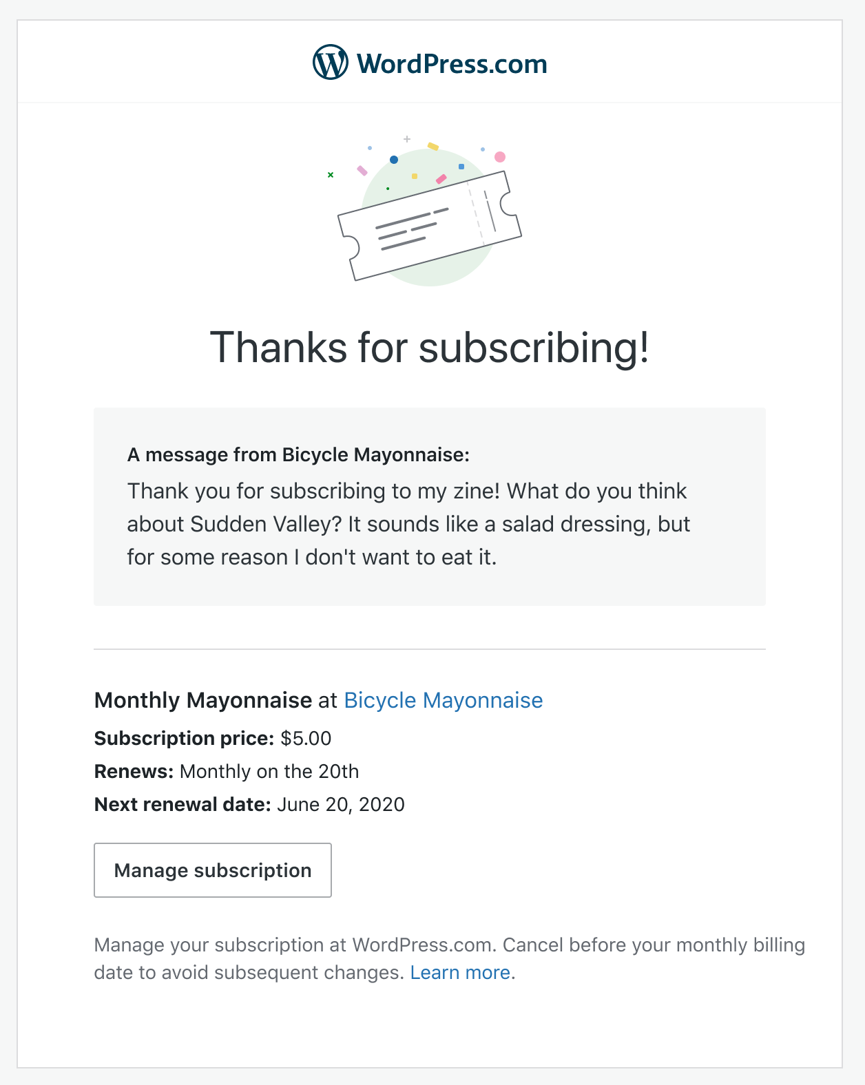
Here's an iteration on the proposed design. I'd love to get some 👀 from @Automattic/editorial on some of the copy, particularly around trying to reduce the duplication of content between the two disclaimer/explanatory paragraphs.
Existing WPCOM account
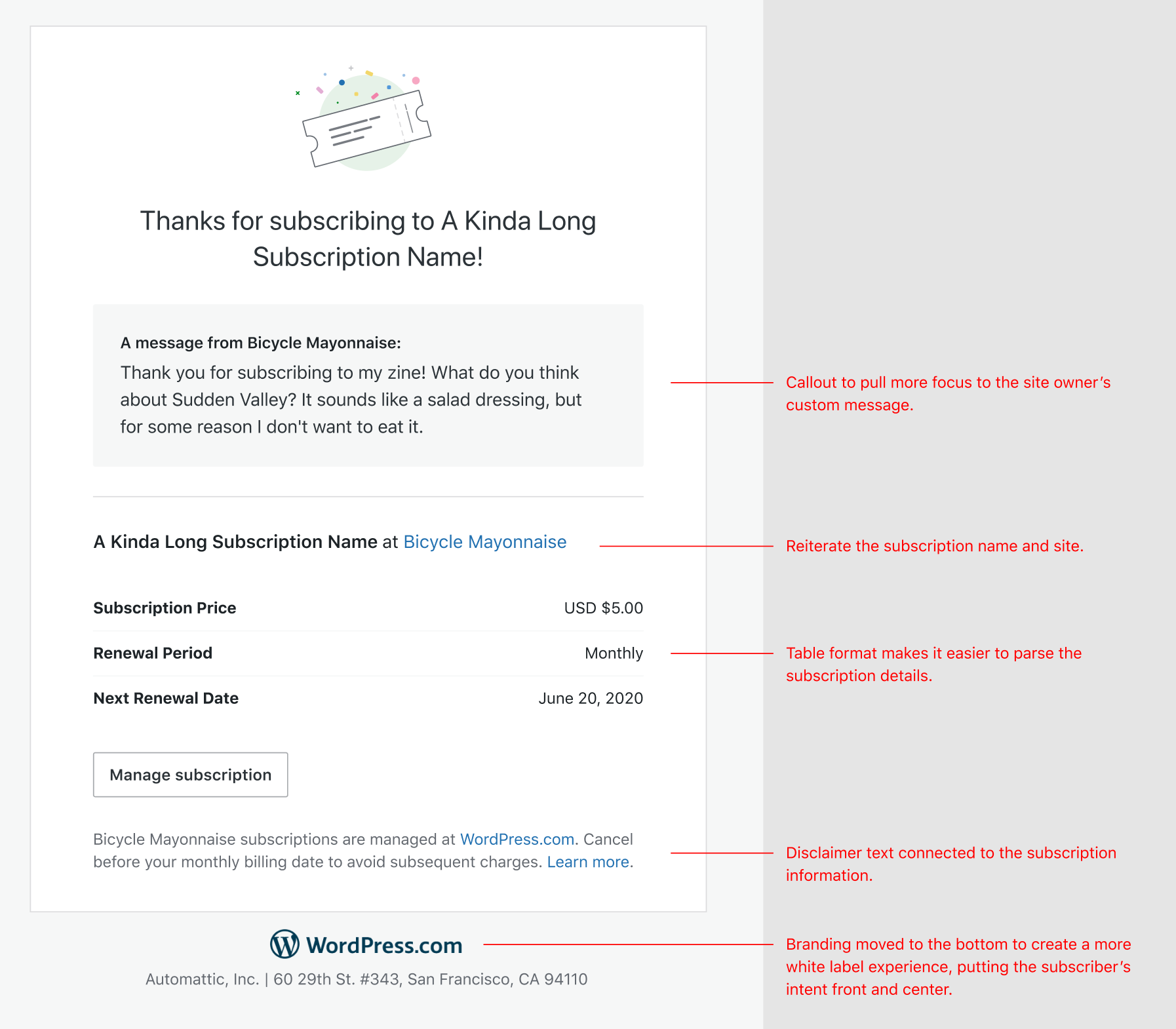
Account created with subscription
This is the same with a simple addition of copy attempting to explain the new account.

This should be ready to get started on. Any additional changes will be minimal. Also open to any design feedback. cc @sixhours @lcollette
Eyeballs! I have them. A few thoughts:
I might flip the two parts of the standard disclaimer and be a smidge more specific about the date:
To avoid being charged again, cancel your subscription before the renewal date listed above. Cancel or manage your [name] subscription at WordPress.com.
(Question: Is this bit required to say WP.com? Can it say "cancel here," or "cancel on your subscription management page"?)
And then tweak the WP.com disclaimer:
Wait, why WordPress.com?
[name] -- and lots of other websites -- runs on WordPress.com. Your subscription comes with a WordPress.com account you can use to manage subscriptions across all WordPress.com websites. Learn more.
Thanks for the eyeballs @michelleweber ! I agree flipping the standard disclaimer puts more focus on canceling before the renewal date.
Question: Is this bit required to say WP.com? Can it say "cancel here," or "cancel on your subscription management page"?
No, it's not required. The intent was to use it as a primer for setting expectations of where the "Manage subscription" button should take me.
And then tweak the WP.com disclaimer
Do you think we need to include some kind of language around logging in with this email address? At the risk of it getting too long and wordy, I worry users might not immediately understand how to use their new WP.com account.
Not quite finished tweaking everything yet, but I started setting these up with the new copy and styles in D44056-code. Will add testing instructions in the diff.
_No, it's not required. The intent was to use it as a primer for setting expectations of where the "Manage subscription" button should take me._
Gotcha. I think you have a clearer sentence without the WP.com. If you already had an account, you're familiar with WP, and if we had to make one for you, that's covered in the secondary disclaimer. I'd lean toward something like "To avoid being charged again, cancel your subscription before the renewal date listed above. Head to your subscription management page to cancel."
(My instinct is that when people are worried about money, we want language that's as plain as possible so that they're confident they're doing the right thing.)
_Do you think we need to include some kind of language around logging in with this email address? At the risk of it getting too long and wordy, I worry users might not immediately understand how to use their new WP.com account._
I lean toward no -- we say that you now have a WP.com account, and people are generally used to having accounts for websites/online services and how to access them. I feel like we can rely on that here to keep this text a little tighter.
Or, to add a little without putting in a whole line about logging in, we can do "Learn more or log in." for the last sentence.
"To avoid being charged again, cancel your subscription before the renewal date listed above. Head to your subscription management page to cancel."
Do you feel strongly about keeping that second sentence? Could we simply say "To avoid being charged again, cancel your subscription before the renewal date listed above." and assume folks would know to click the button directly above?
If not, maybe combining them to something like "To avoid being charged again, head to your subscription management page to cancel before the renewal date listed above."? Just trying to reduce duplicate "subscription" one after the other.
I'll defer to you on what's best here though.
I do not feel strongly at all, and was only trying to stay closer to the original. I think your first option is A+, given the prominence of the button.
Let's continue the redesign chat in a new issue, I can help summarize the conversation so far.
Edit: actually let me update the title/summary and we can put this up for grabs. We've completed the first implementation that allows for a custom message.
@danhauk feel free to edit the summary for latest requirements.
@sixhours does D44056-code cover this task, and are you actively working on this? (If so please assign this issue to yourself).
Yep, this is covered by D44056-code and it's ready for a final review. I've assigned it to myself and moved it to Needs Review. :)
I think this is ready to ship! I'd like to get a final look-see from someone on Serenity/Earn and from @danhauk before I deploy these changes, since I haven't worked with emails before.
These shipped this morning in 208672-wpcom!