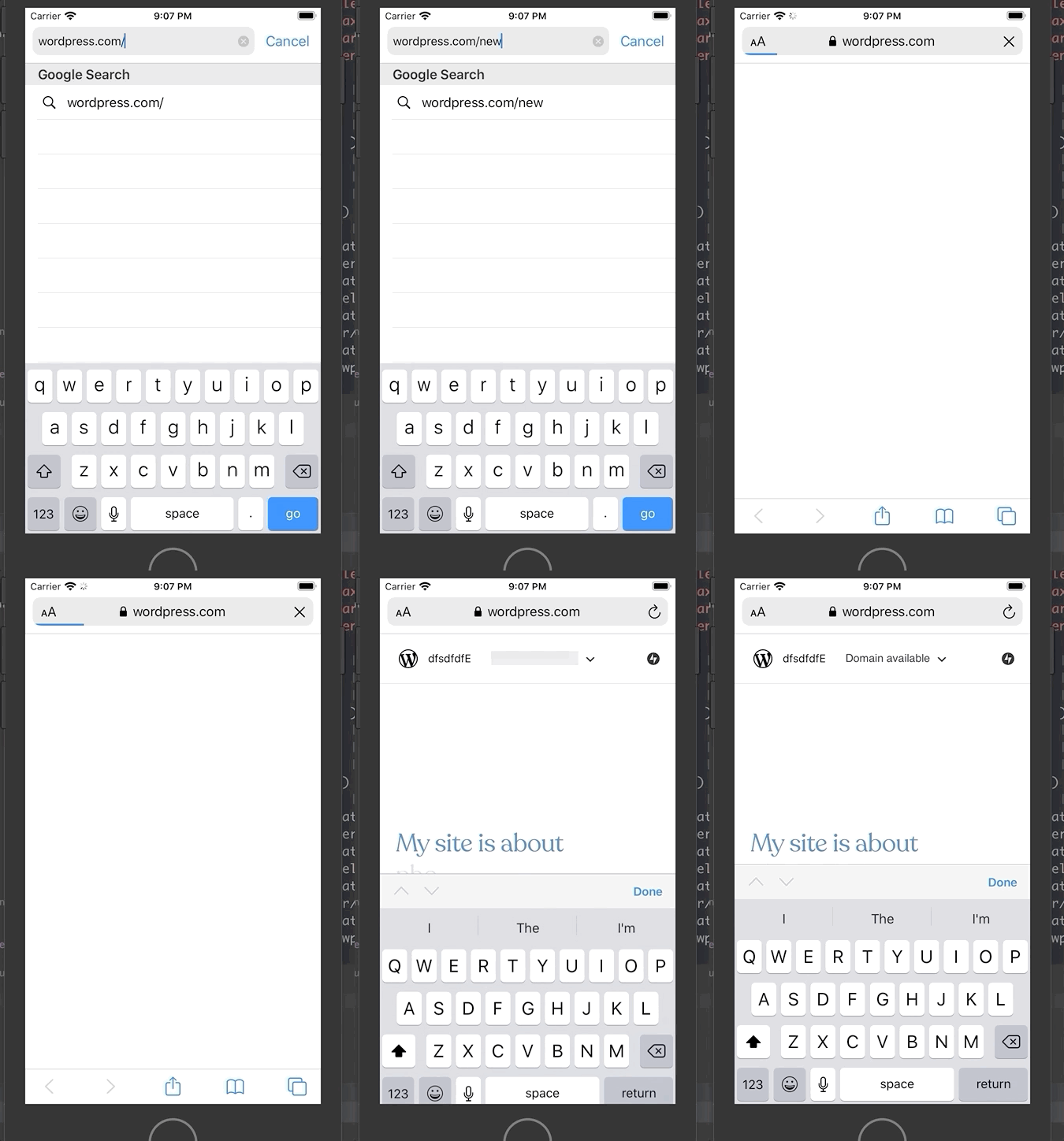
Wp-calypso: Gutenboarding: Intent Capture not adjusting layout vertically on iOS
The various elements aren't adjusting as they should on the intent capture screen. Let's try and get them fixed before launch.
- [ ] [Site category not moving up](https://d.pr/i/AD53U1) when input field is focused. Should look like this.
- [ ] [Site name not auto-focusing](https://d.pr/i/5LUyeT) when submitting site category. Should look like this.
- [ ] [Site name not moving up](https://d.pr/i/ppSOAH) when input field is focused. Should look like this
Check the whole video recording here.
All 8 comments
First point is easy to fix. We are currently move the site category input up only when there are suggestions: https://github.com/Automattic/wp-calypso/blob/master/client/landing/gutenboarding/onboarding-block/acquire-intent/vertical-select/style.scss#L11-L13
The other 2 should be mostly described in https://github.com/Automattic/wp-calypso/issues/41230
Site category not moving up when input field is focused. Should look like this.
I've been playing around with this, and I'm wondering what criteria we should use to trigger the class change that moves the elements up.
I was thinking the only easy option would be onFocus. But since we auto focus anyway, it's not much of a difference to make the position permanent on mobile.

I tried turning off auto-focus on mobile and trigging the reposition onFocus, but that causes quite jumpy behaviour.
Would it too scary just to keep things at the top of the screen for narrow widths?
It would just look visually less appealing. If we can't make it work, I'd still prefer that to having a chopped off design.
But since we auto focus anyway, it's not much of a difference to make the position permanent on mobile.
We are trying to autofocus but that doesn't work on iOS. Focusing programatically is prevented unless the user has already interacted with the page.
There are some possible hacks to force this but I'm starting to think that iOS users are already familiar with these limits - having to tap some input for keyboard to pop up or to tap outside (or press _done_) to hide the keyboard in order to see the footer of some page.
I spent a bit of time this afternoon trying to come up with solutions for some of these issues — I didn't get very far, but an idea I had was to add a site title placeholder line to make the field more visible on mobile, and on desktop when a user clicks away. It doesn't get at the main usability issues with focus, etc, but hopefully it'll make it easier for iOS users to find where to tap to enter the site title field. This one's totally optional of course, but I thought it could help a bit! PR here: https://github.com/Automattic/wp-calypso/pull/41971
If we have to move the input fields to the top of the page for these smaller screen sizes, then I think we should until we find a solution that balances UX and our design preferences.
but an idea I had was to add a site title placeholder line to make the field more visible on mobile, and on desktop when a user clicks away
I like your thinking! I'm working on a way to make the input field more prominent that doesn't use a site label. I'll make a create an issue, but let's try and solve the layout issues until then :)
This can be closed now since we've fixed things on iOS and vertical input is no-longer there.